Naming and Branding the Premium Physiotherapy Center in the Western Balkans
Every great brand begins with belief.
In this case, a belief in movement, not just as physical motion, but as progress, recovery, and human potential.
The Western Balkans Sports Medical Center was shaped by years of hands-on experience, trust earned patient by patient, and an unwavering commitment to evidence-based care.
What began as MJ Clinic – an intimate practice defined by personal dedication – has evolved into a super-modern physiotherapy and sports rehabilitation center in Prishtina. Led by Mustafë Januzaj, a renowned physiotherapist and a key member of the Kosovo national football team’s medical staff, the vision grew beyond a single name or space.
It became a call to build something larger: a center where modern science, elite performance, and human-centered care converge.From a Name to a Position
Trokit approached naming not as a label, but as a declaration of intent. Western Balkans Sports Medical Center was chosen with purpose—anchored in geography and elevated by ambition. Kosovo sits at the crossroads of the region, both physically and culturally, making it a natural heart of the Western Balkans.
The name expands the clinic’s presence from local to regional, signaling openness, leadership, and medical authority without borders. The acronym WBSMC reinforces this shift. Structured, institutional, and confident, it speaks the language of modern medical excellence. This positioning aligns seamlessly with the center’s mission: to deliver high-quality, evidence-based physiotherapy and sports rehabilitation that helps people move confidently, recover fully, and perform at their best.
Designing Movement Into Identity
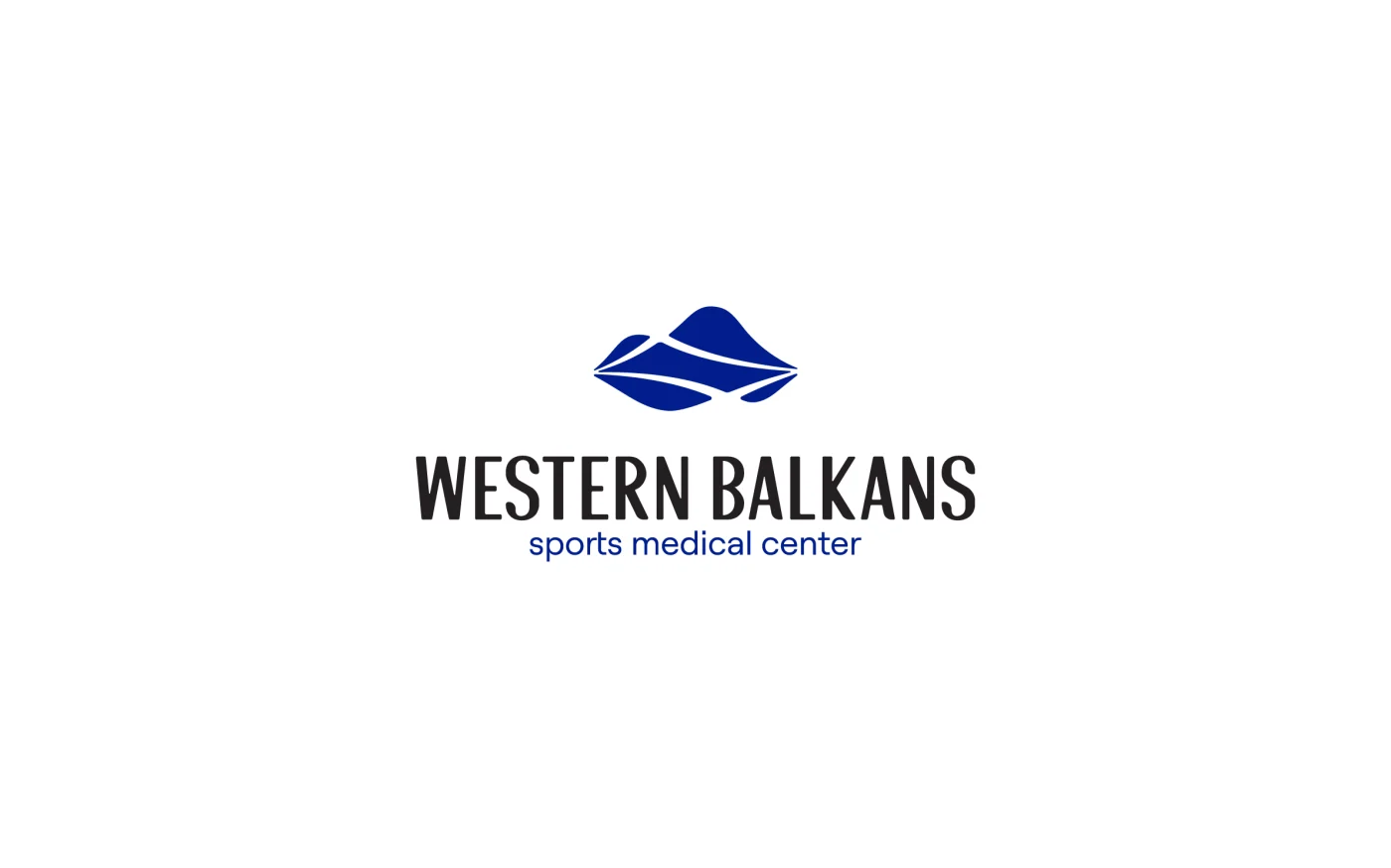
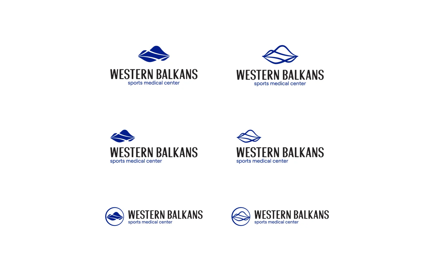
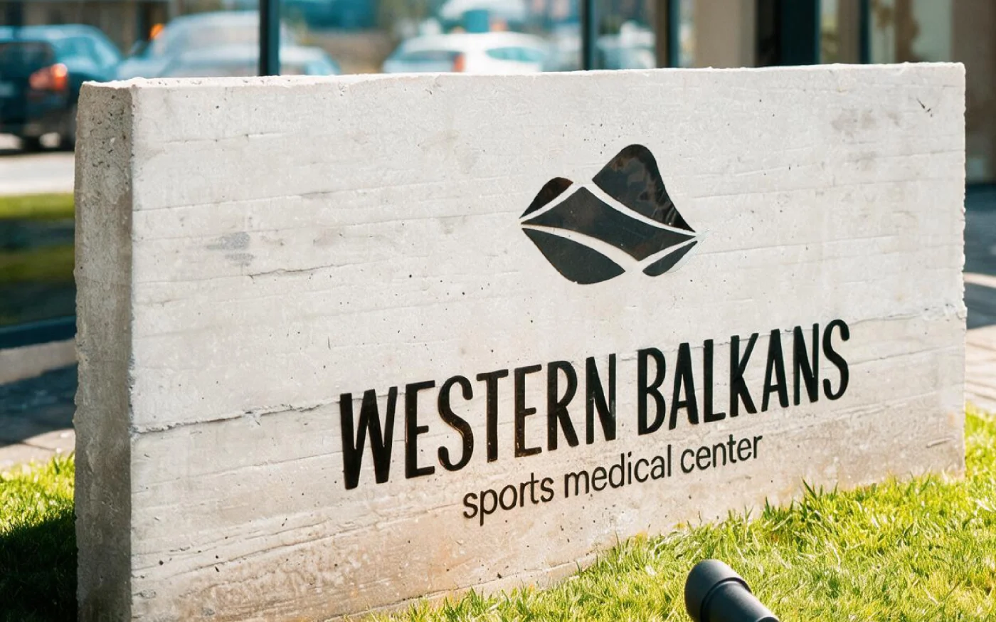
The identity system is built around a single, powerful idea: movement as structure. The symbol draws inspiration from muscles and ligaments—the anatomy that enables motion and resilience—while subtly integrating the letterforms W and B. Layered within is the hilly, mountainous relief of the Western Balkans, grounding the mark in its regional context.
Together, these elements form a dynamic, disciplined symbol that reflects strength, balance, and continuity.
Encased within a circle, the mark becomes a statement of care and completeness. The circle suggests protection, wholeness, and long-term recovery – core principles of modern sports medicine and physiotherapy.
A Language of Precision and Trust
Typography reinforces the brand’s dual nature: performance-driven and clinically grounded.
The name Western Balkans appears in a tall, condensed typeface—focused, precise, and disciplined—echoing the mindset of elite sport and high-performance medicine. Below it, Sports Medical Center is set in small caps, establishing hierarchy and institutional clarity. Rendered in navy blue, it adds depth, authority, and calm professionalism.
The color palette follows the same philosophy. Navy blue and black form the foundation—colors associated with trust, seriousness, and excellence. A turquoise accent introduces contrast and life, symbolizing recovery, vitality, and forward motion. Bringing the brand to life is not complete until it is experienced.
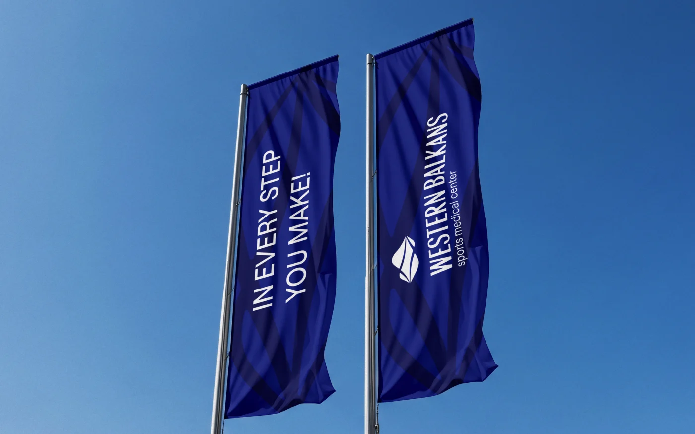
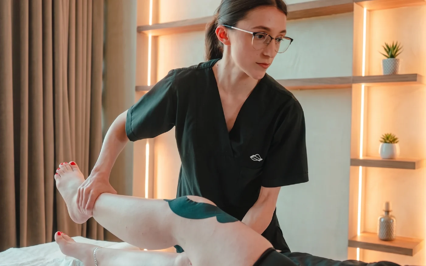
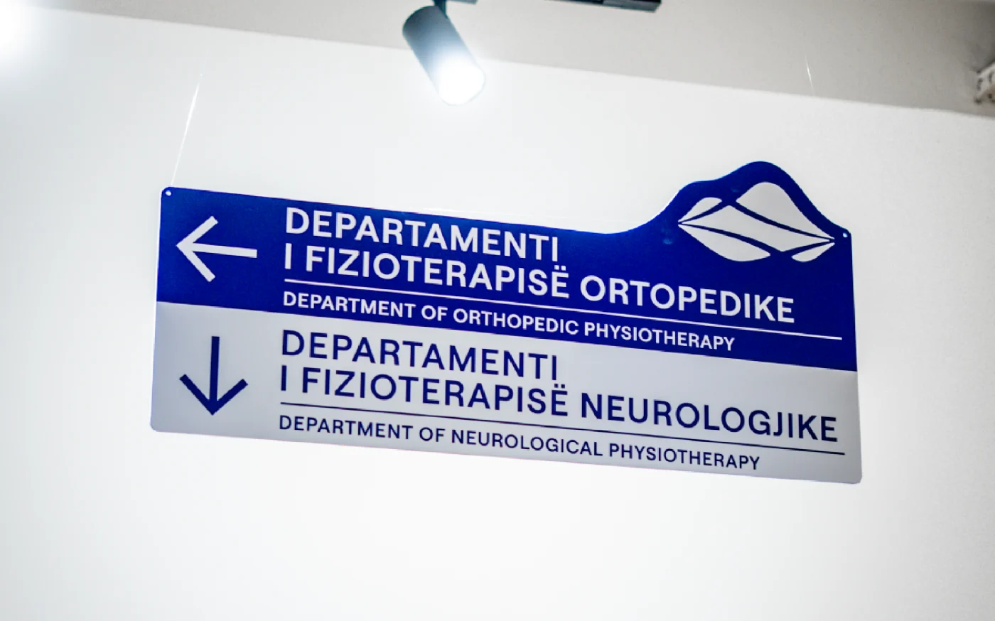
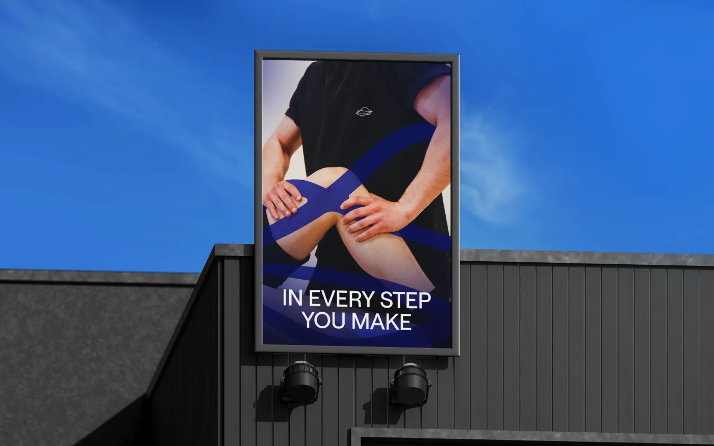
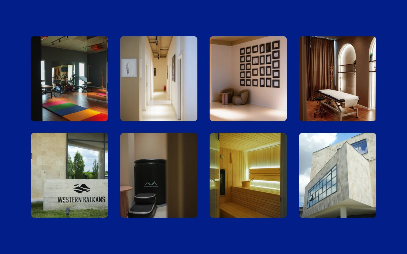
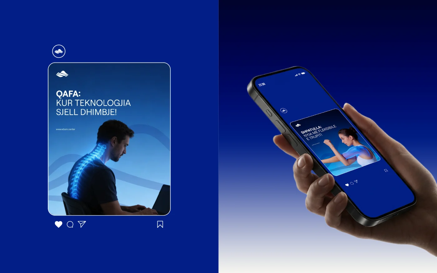
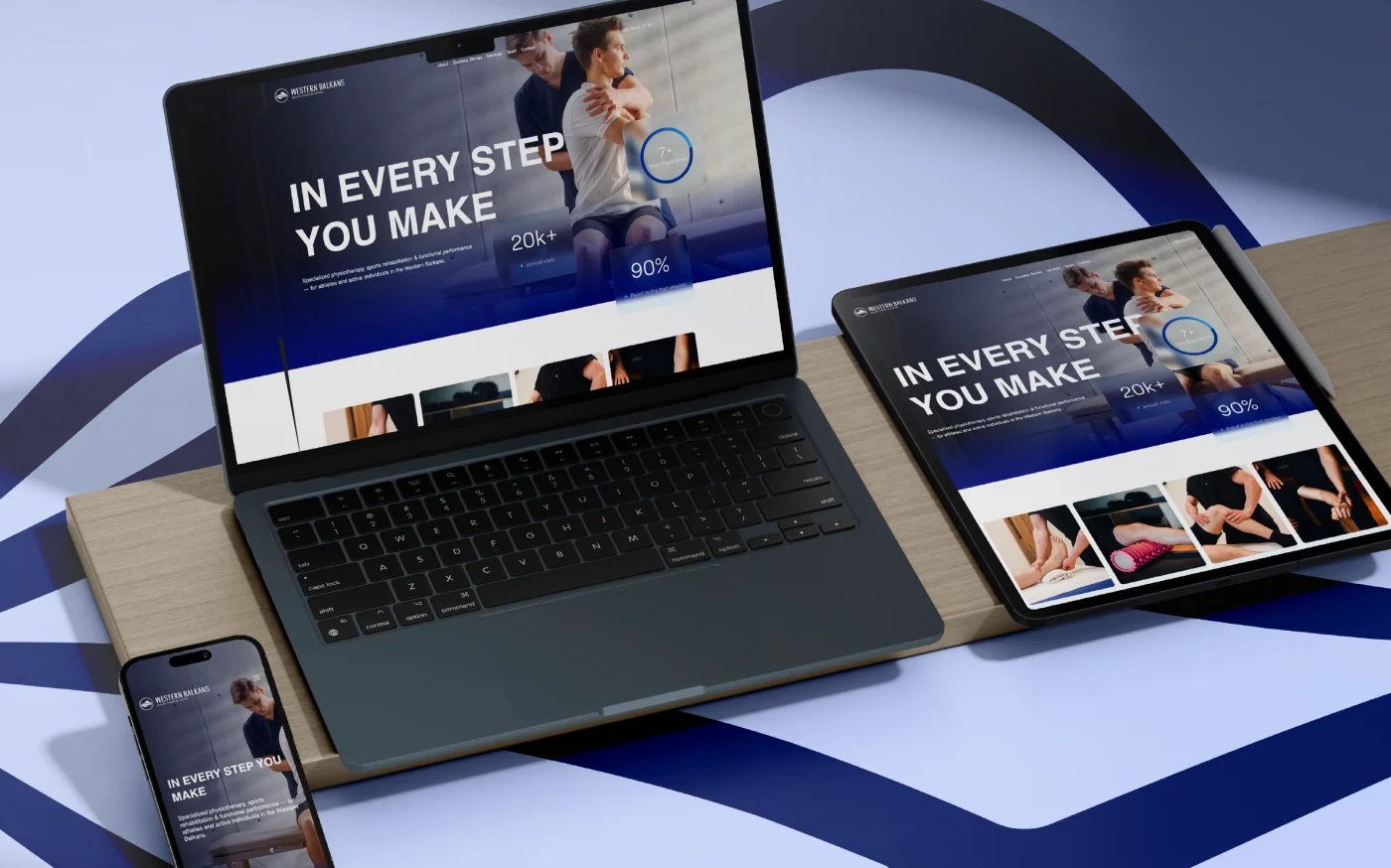
Trokit extended the identity across every touchpoint of the Western Balkans Sports Medical Center – from stationery to interior and exterior signage. Each element was designed to guide, welcome, and reassure, creating an environment that feels calm, modern, and intentional. Consistency across the physical space reinforces trust and elevates the patient experience at
every interaction.

Explore the services behind this project
Related projects
Have a project in mind?
Discuss your project with TROKIT