Score with Intel® Core™ 2025: From Inner Energy to an Epic Universe
Score with Intel® Core™ 2025: From Inner Energy to an Epic Universe
In 2025, Score with Intel® Core™ returned after a three-year hiatus with a renewed vision rooted in what has always defined the campaign: learning, competition and the people behind the technology.
Part of the Intel® Retail Edge Program, the campaign brings together retail sales associates and store managers through interactive learning, product knowledge and performance-driven challenges. Beyond professional development, it creates opportunities for recognition, rewards and meaningful community impact.
This year’s theme, “It’s Ultra Personal,” introduced a more human dimension to the experience, emphasising authenticity, emotional connection and the individual stories that shape the relationship between technology and its users.
For Trokit, this presented an opportunity to translate that philosophy into a distinctive visual identity. The challenge was to connect the performance-driven world of Intel® Core™ with the excitement of competition and the anticipation of an extraordinary destination: Universal Epic Universe in Orlando, Florida, the trip offered as the campaign’s grand prize.
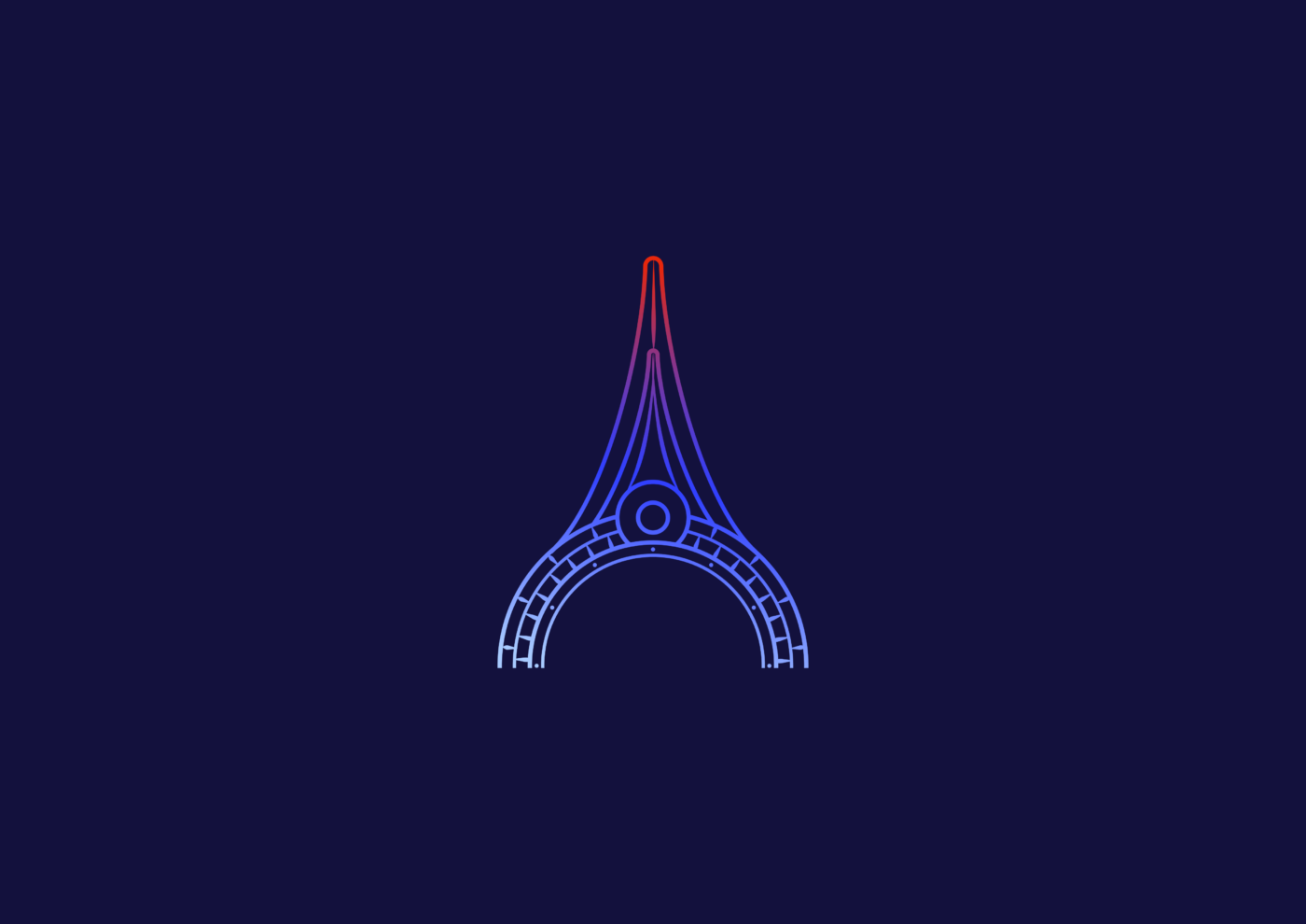
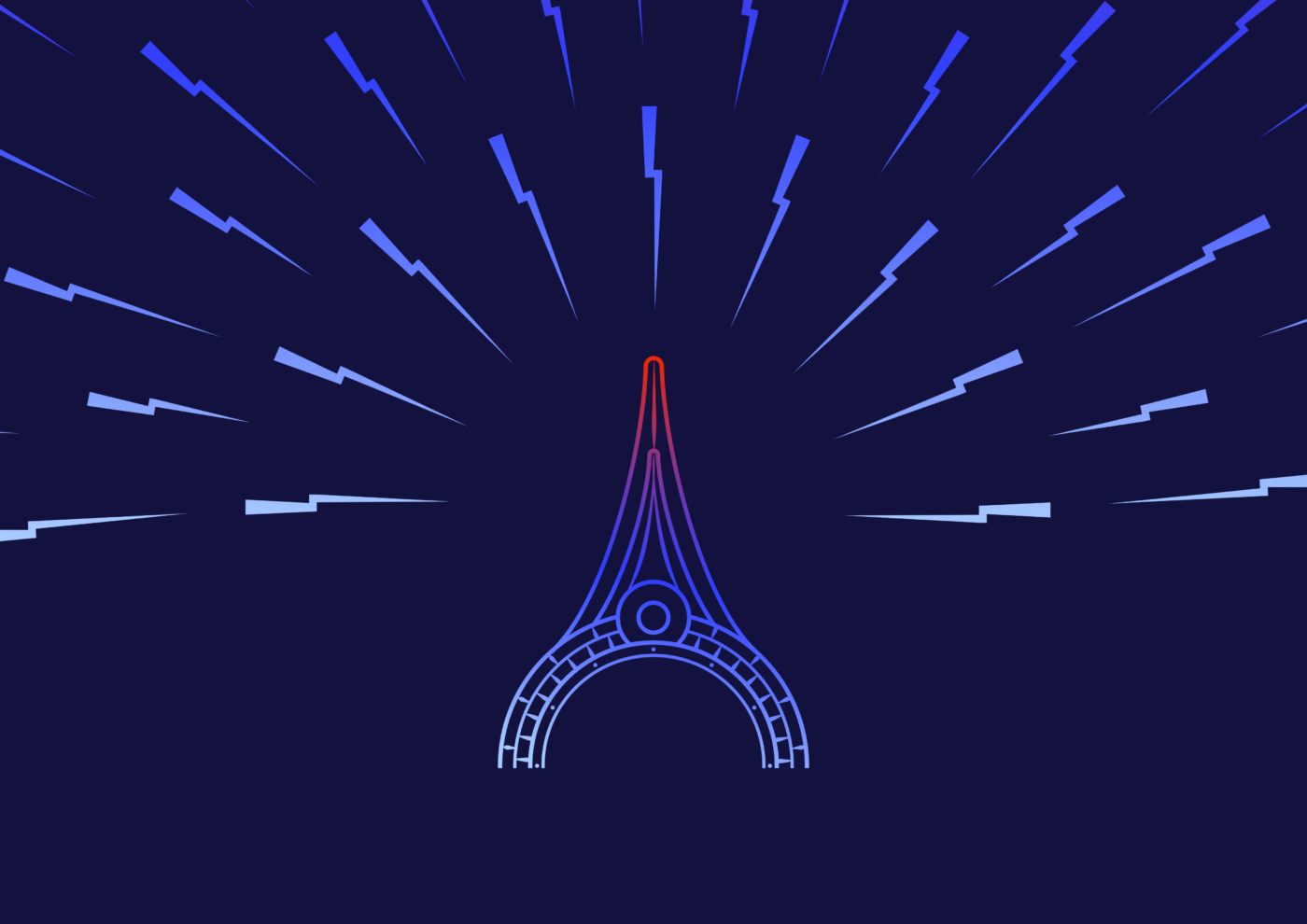
The creative direction brought these elements together through a visual language inspired by the destination’s architecture and the energy associated with performance. At its centre, a stylised representation of the Epic Universe tower became the campaign’s defining symbol, surrounded by radiating graphic elements that express momentum, ambition and the potential to go further.
The result was an identity designed to do more than promote a competition. It sought to capture the feeling behind it: the personal drive to achieve, the excitement of being part of something bigger and the prospect of an experience worth pursuing.
The Campaign: Score with Intel® Core™ 2025
Some campaigns are built around a product. Others are built around an experience worth pursuing.
Score with Intel® Core™ 2025 brought these two dimensions together through a promotional campaign designed to engage participants around performance, competition and the opportunity to win an extraordinary experience: a trip to Universal Epic Universe in Orlando, Florida.
The challenge was to translate this opportunity into a distinctive visual identity that could connect the technological world of Intel® Core™ with the excitement of the competition and the appeal of its grand prize.
For Trokit, the objective was to develop a visual language that would go beyond communicating the mechanics of the campaign. It needed to capture the anticipation of the experience, establish a recognisable identity and create a consistent presence across the campaign’s communication materials.
The result was a concept built around a central symbol, a dynamic visual language and a simple idea: every great experience begins with the energy to go further.
The Concept: It’s Ultra Personal
The campaign’s tagline, “It’s Ultra Personal,” provided an important conceptual foundation for the creative direction.
At its core, the idea was to place the individual at the centre of the experience. Performance is not simply about technical capabilities or measurable results; it is also about personal ambitions, individual motivations and the experiences people aspire to achieve.
This perspective informed the way Trokit approached the campaign’s visual identity. Rather than treating the competition as a conventional promotional initiative, the creative direction sought to establish an emotional connection between the participants, the performance-driven world of Intel® Core™ and the extraordinary experience awaiting the winners.
The tagline reinforced this personal dimension, while the visual identity translated it into a broader narrative of energy, ambition and discovery.
The campaign was about more than winning a prize. It was about making the pursuit of that experience feel personal.
The Visual Identity: From Inner Energy to an Epic Universe
Universal Epic Universe served as the primary visual inspiration for the campaign, connecting the identity directly to the destination awaiting the winners.
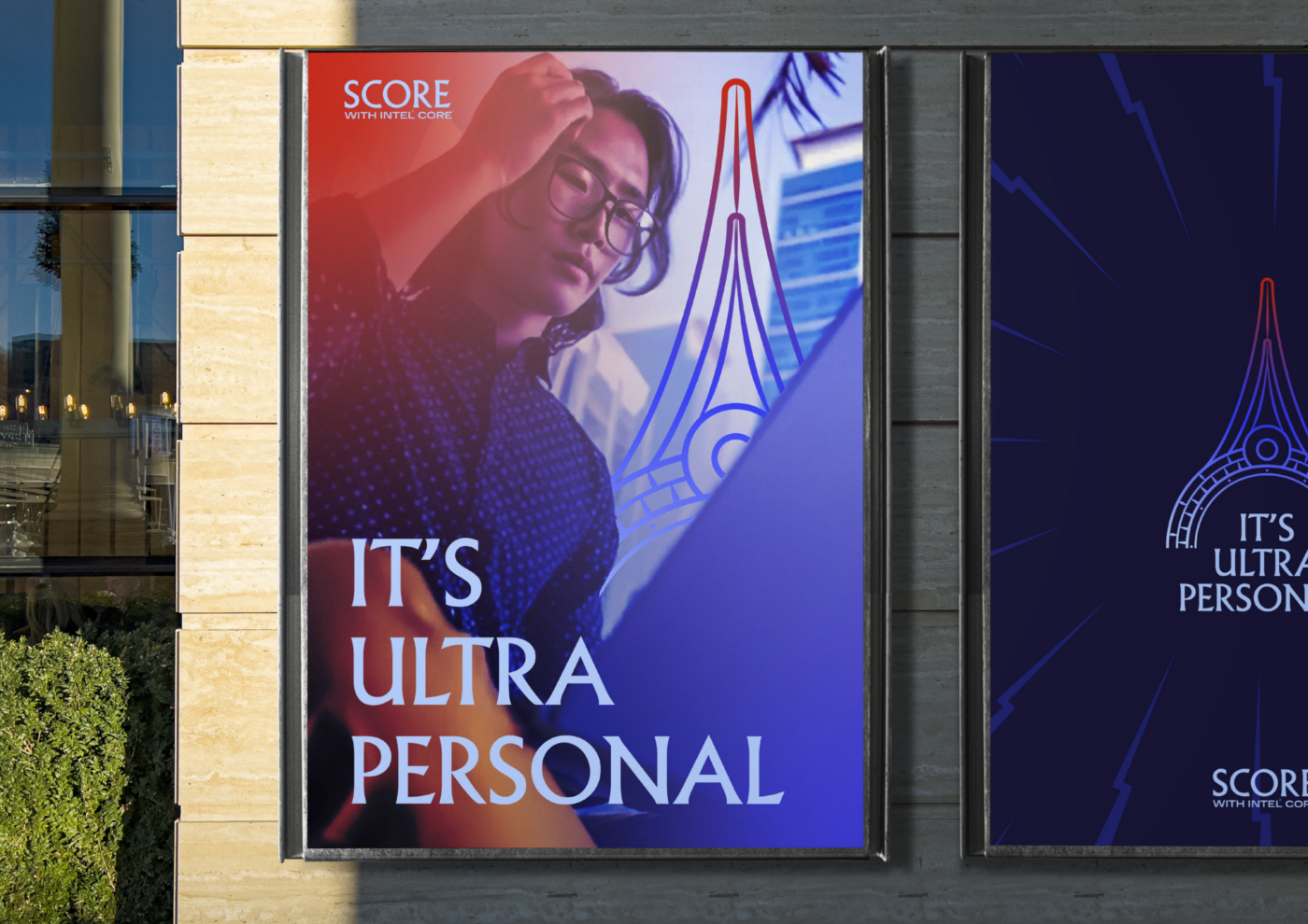
Its distinctive tower became the central graphic element, reinterpreted as a recognisable symbol that could anchor the campaign across different formats and applications. By isolating and stylising this architectural reference, Trokit created a visual signature that evoked the destination without relying on literal representations of the entire theme park.
The tower also offered an opportunity to develop a more expressive visual concept.
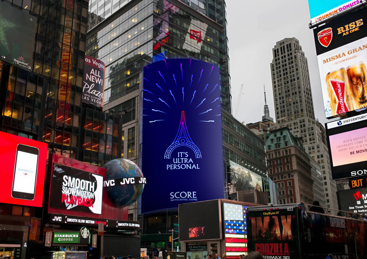
Radiating from the central symbol, angular energy beams introduced movement, intensity and a sense of expansion. These elements were conceived as a visual metaphor for the energy that drives performance: an inner force that moves outward, opens up possibilities and propels individuals towards new experiences.
Their outward direction also reinforced the idea of an expanding universe, creating a conceptual connection between the campaign’s visual language and its ultimate destination.
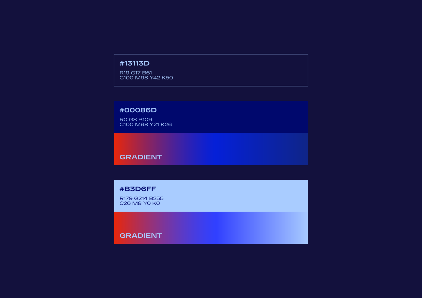
The contrast between the dark navy background and the electric blue rays established a futuristic atmosphere, while the gradient accents introduced additional depth and energy to the central symbol.
Together, these elements created an identity that connected three essential dimensions of the campaign: the technological performance associated with Intel® Core™, the competitive spirit of the promotion and the extraordinary experience represented by Epic Universe.
The Design Language: Technology Meets Experience
Consistency was central to the development of the campaign’s visual system.
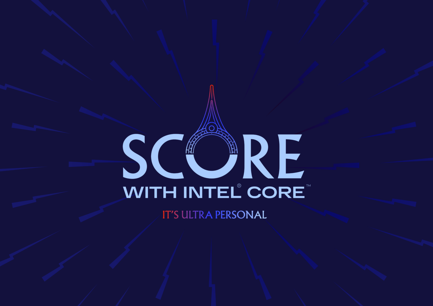
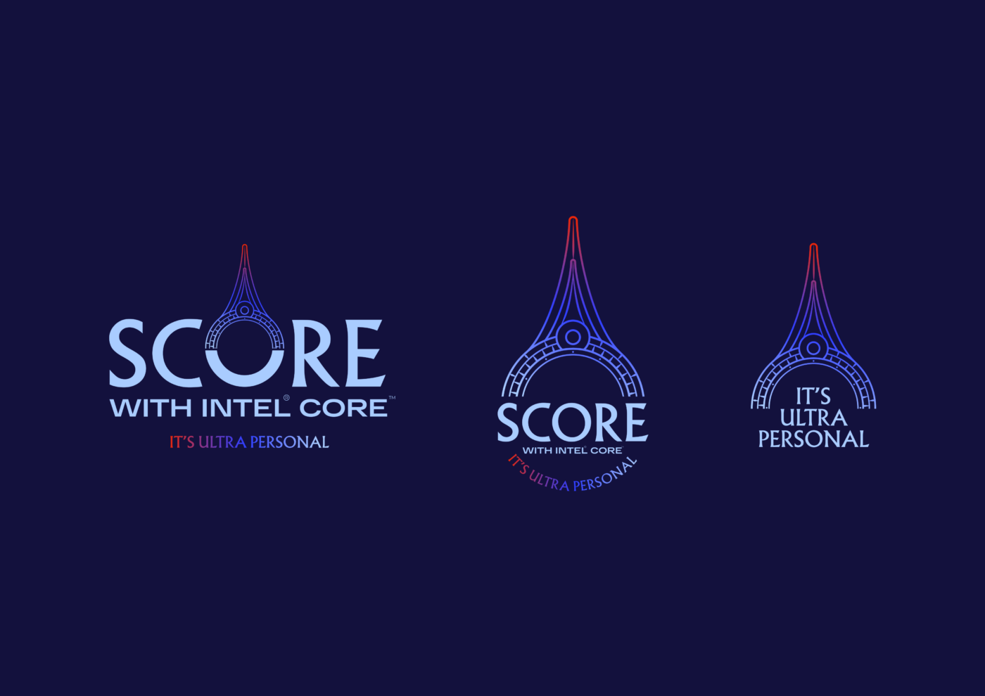
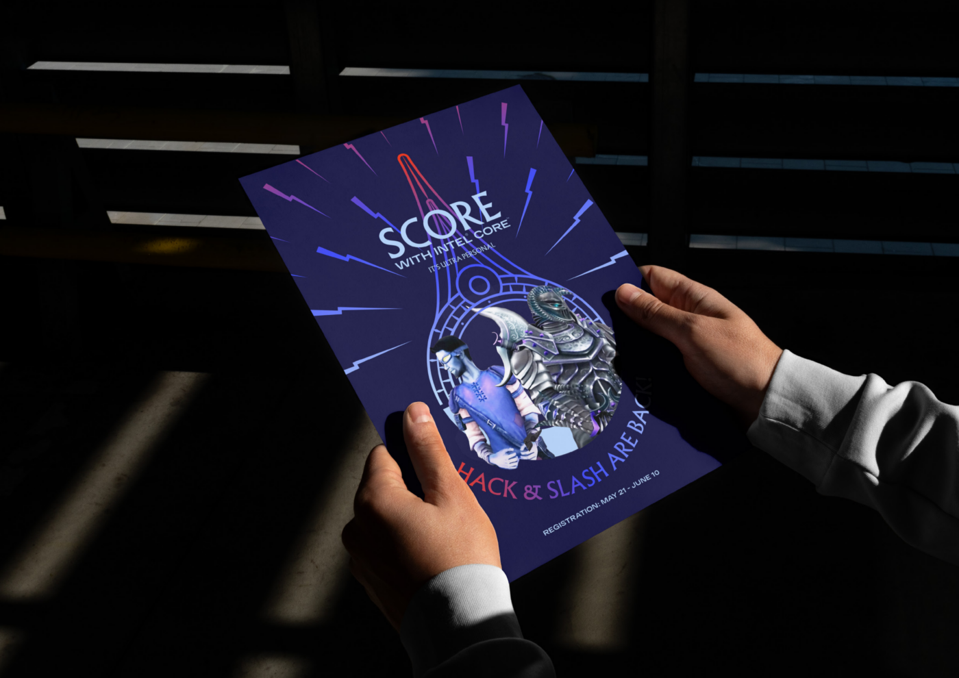
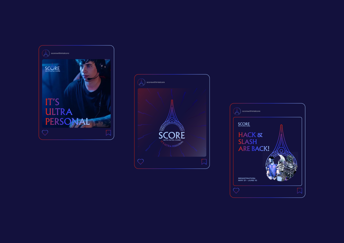
The identity was designed to remain recognisable across different formats, from digital communication and promotional graphics to large-scale outdoor applications. The central symbol, energetic graphic elements, colour palette and typography worked together to establish a coherent visual language while allowing flexibility across individual executions.
The angular rays provided a distinctive graphic asset that could be adapted to different compositions, creating movement and visual impact without compromising the identity’s core characteristics.
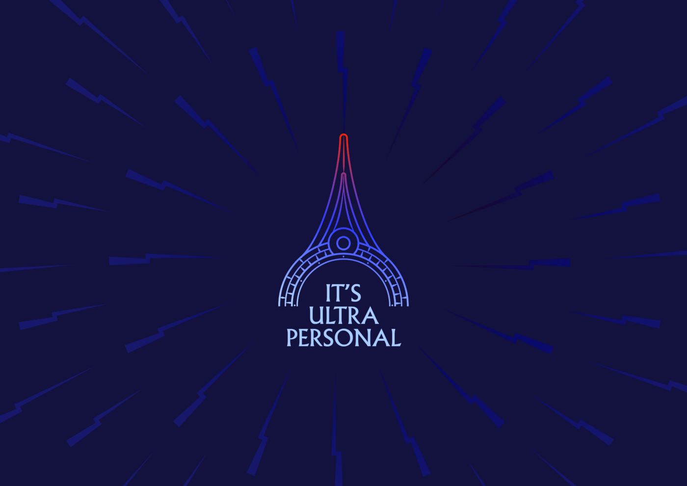
The typography and logo arrangement ensured that the campaign name remained prominent, while the tagline “It’s Ultra Personal” reinforced the conceptual connection between the brand message and the participant’s individual experience.
The colour palette played an equally important role. Deep navy established the visual foundation, electric blue communicated a sense of technological energy, and carefully placed gradient accents introduced a more expressive, contemporary character.
This balance between structure and dynamism allowed the identity to feel both technically grounded and emotionally engaging.
Rather than relying on a single static composition, the system was designed to function as a flexible visual language, capable of adapting to multiple touchpoints while maintaining a consistent campaign presence.
The Experience: Bringing the Campaign to Life
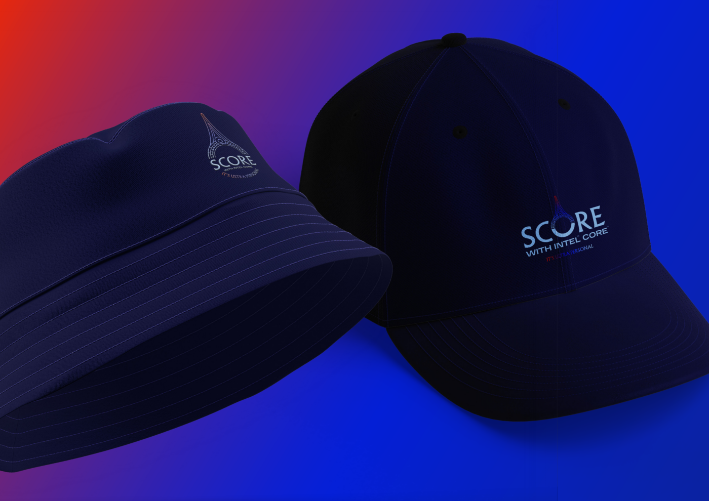
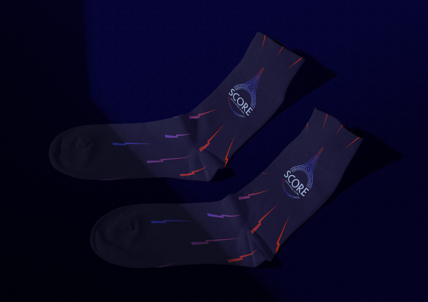
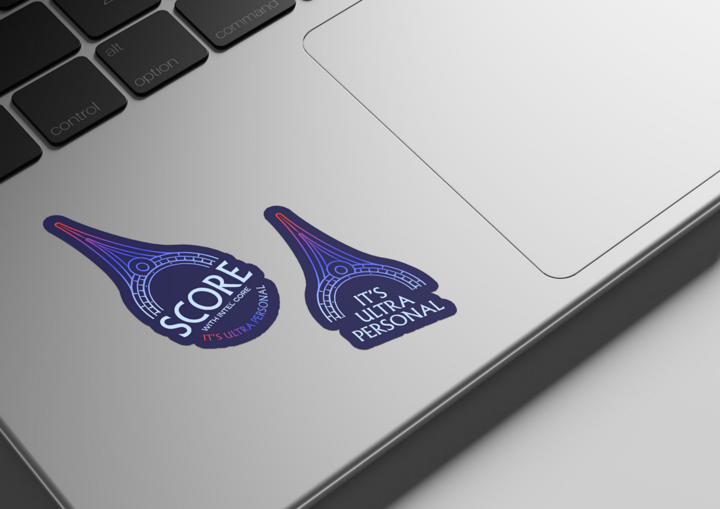
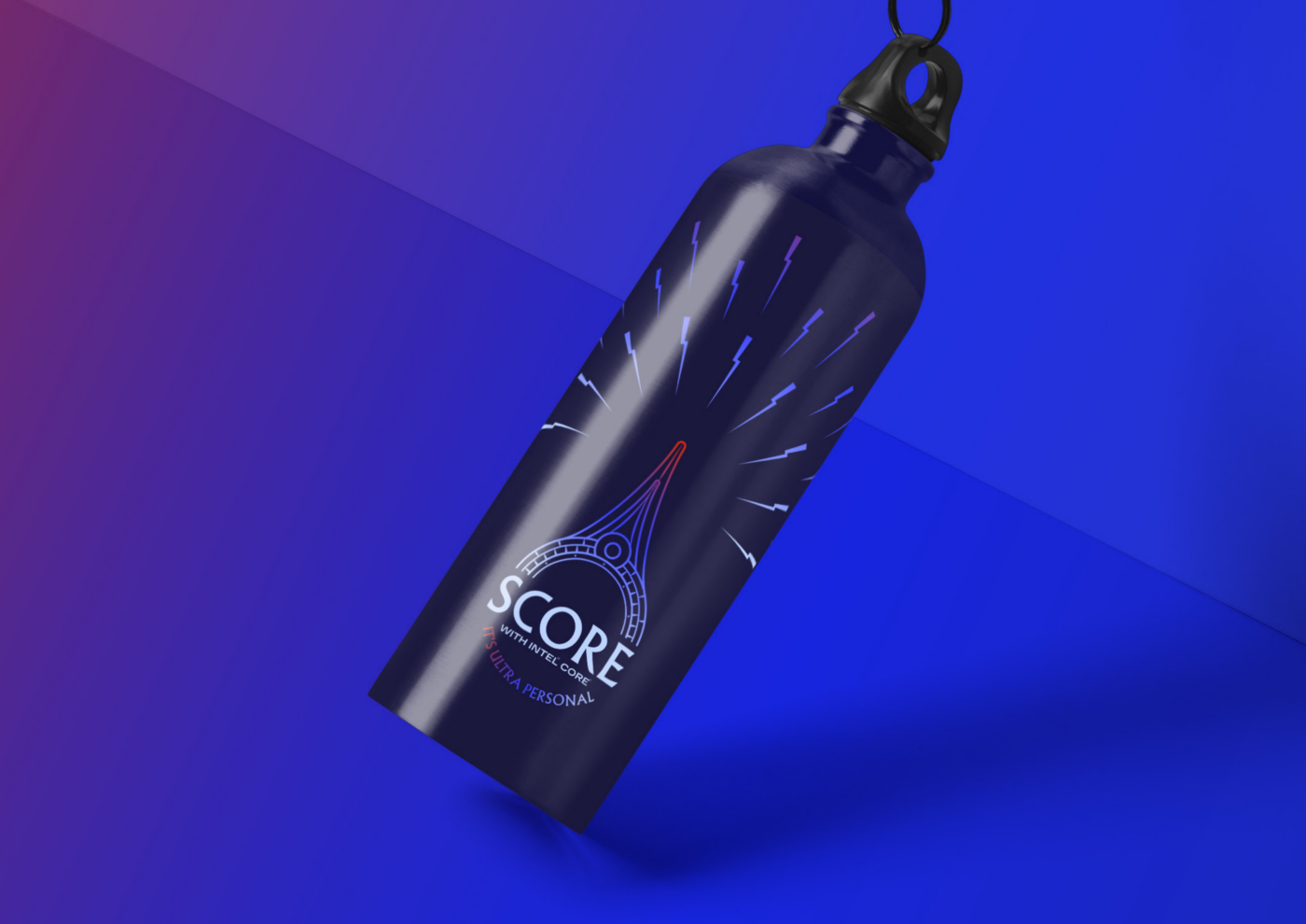
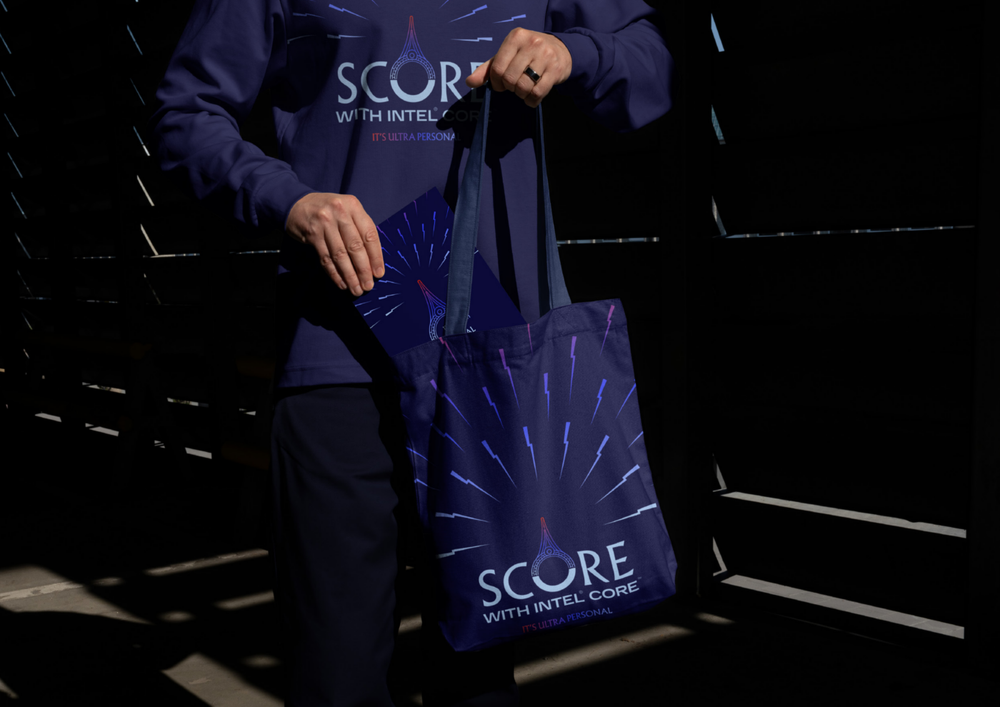
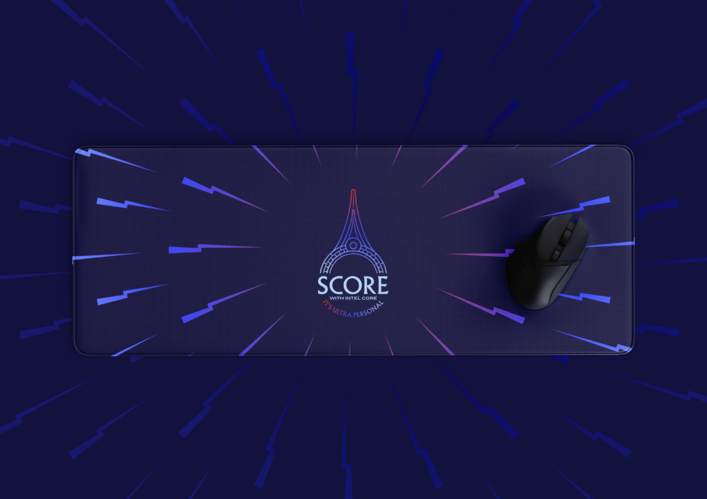
Beyond the core visual identity, the campaign extended into a broader range of branded communication materials and merchandising applications.
Trokit developed multiple campaign assets, translating the visual system into different formats and contexts while maintaining consistency across the overall brand experience.
This extended application was an important part of the creative approach. The objective was not simply to place the campaign logo on individual materials, but to ensure that the identity could function as a unified system across the different ways audiences encountered the campaign.
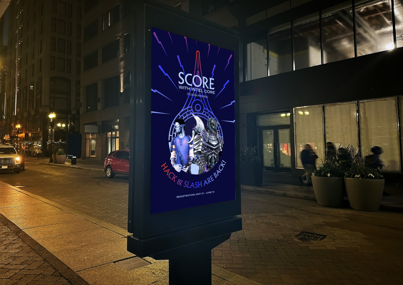
From digital executions to outdoor visibility and merchandising, the same visual principles carried through: the distinctive Epic Universe-inspired symbol, the radiating energy beams, the colour system and the campaign’s signature messaging.
The result was a flexible identity that could maintain its character across different scales and applications, from compact branded items to high-impact promotional placements.
Ultimately, Score with Intel® Core™ 2025 brought together technology, competition and experience through a visual concept rooted in energy and personal ambition.
By connecting Intel® Core™ with the visual world of Epic Universe, Trokit created an identity that represented more than the destination itself. It captured the anticipation of getting there, and the idea that every extraordinary experience begins with something personal.
The challenge
Intel® sought to bring back Score with Intel® Core™ in 2025 with a distinctive campaign identity reflecting its “It's Ultra Personal” theme, connecting technological performance and personal ambition with the opportunity to win a trip to Universal Epic Universe in Orlando, Florida.
Our approach
TROKIT developed a campaign visual identity inspired by Universal Epic Universe, using its iconic tower as the central visual element and dynamic energy rays to convey performance, ambition and the potential to go beyond the ordinary.
What we delivered
Campaign visual identity
Logo and tagline applications
Digital campaign assets
Branded merchandising

Explore the services behind this project
Related projects
Have a project in mind?
Discuss your project with TROKIT