Stitching Legacy Into Luxury: The New Minna Reimagined
Rebranding a couture fashion house is not merely a change of logo or color palette—it is an act of storytelling, a delicate balance between legacy and reinvention. For Minna, Kosovo’s iconic couture brand, this transformation was about more than aesthetics; it was about distilling decades of craftsmanship, passion, and generational artistry into a visual identity that commands attention on a global stage. Every line, every detail, and every pattern in the new identity echoes the house’s heritage while signaling a bold, modern future—where tradition meets luxury in perfect harmony.
A Heritage Sewn by Generations
Minna’s story begins in a small room, where the delicate hands of grandmother Emine guided fabric through an old Singer machine. What started as a passion for precise seams and carefully crafted gowns grew into a family legacy spanning three generations. Today, Minna is sought after by clients across continents, known for its ability to deliver hand-sewn creations that capture emotion, elegance, and the essence of a moment.
This generational craft became the soul of the rebranding process. Preserving the emotional weight of the house’s origins—while presenting the brand as globally contemporary—was the guiding thread behind the new identity.
The Power of a Signature Mark
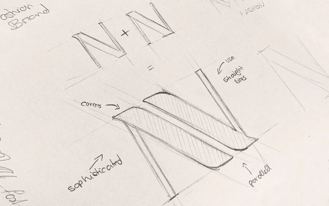
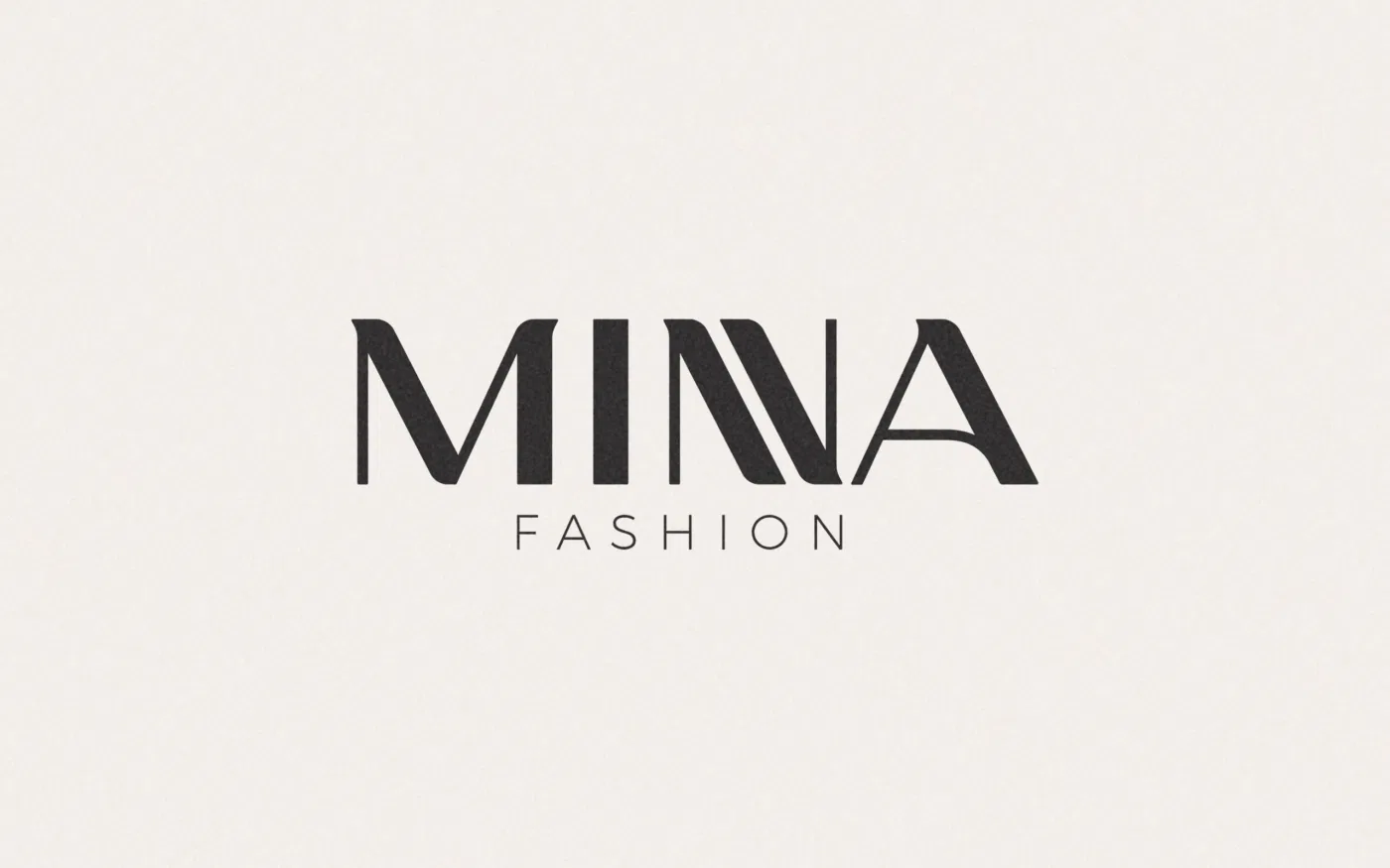
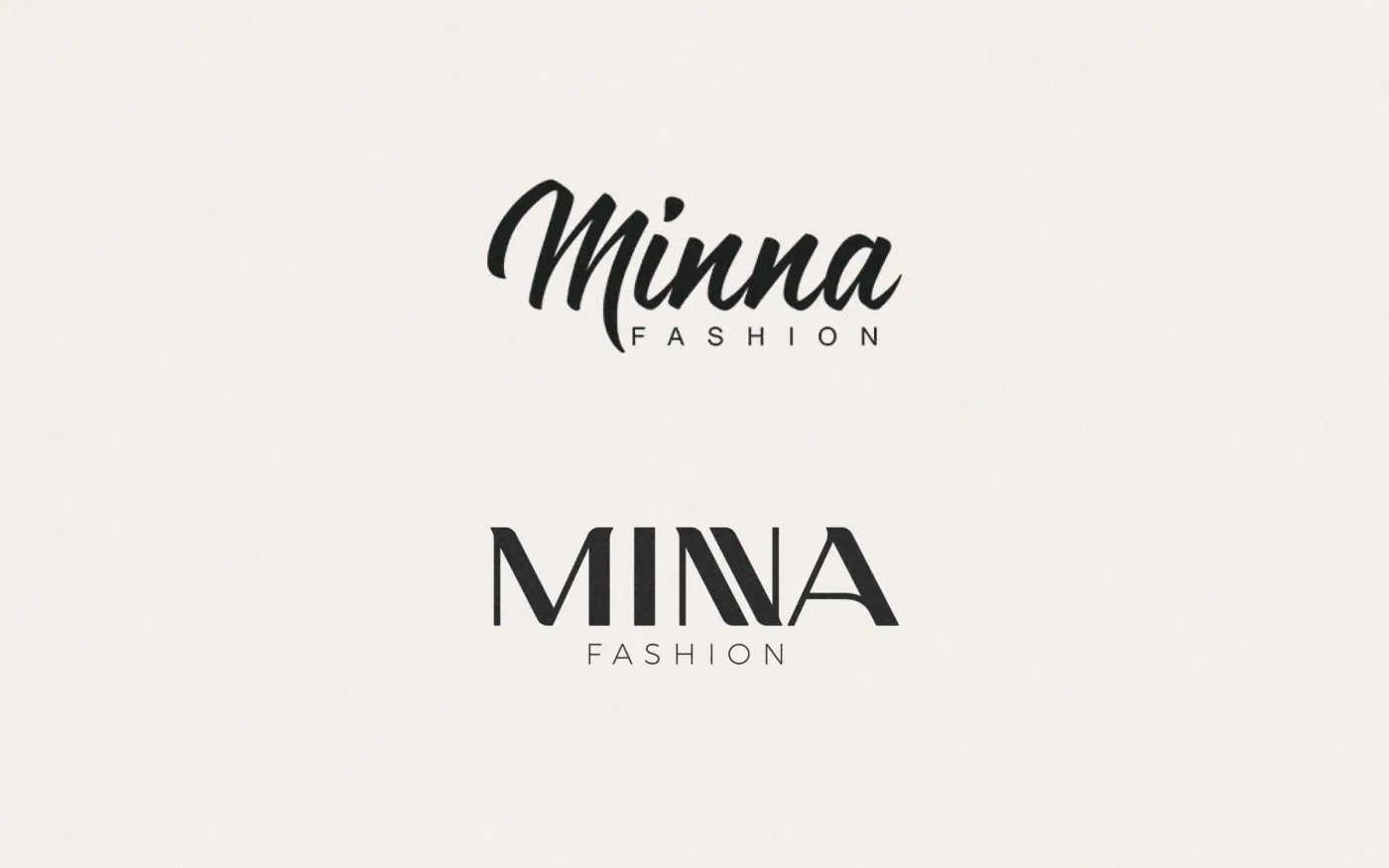
At the center of Minna’s rebrand stands a striking typographic concept: two Ns melting into one. This visual fusion is more than a stylistic choice; it is a symbolic representation of Minna’s identity—unity, continuity, and craftsmanship passed through generations.
The double-N mark balances strength with softness, echoing the duality of couture itself: structure meeting fluidity, precision meeting emotion. This typographic signature becomes the foundation of the entire visual system, anchoring Minna in both heritage and high fashion.
A Pattern Woven From Identity
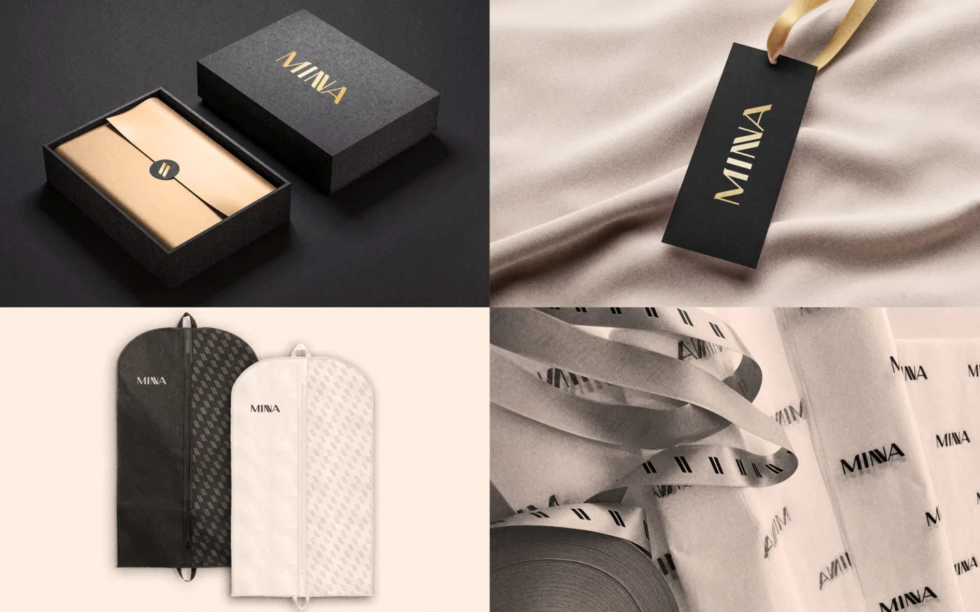
Beyond the logotype, the merged-N detail becomes a powerful design element used to create patterns that appear across Minna’s branding. From packaging to garment bags, invitation cards, labels, and digital touchpoints, the pattern creates a cohesive universe around the brand.
These repeating forms are reminiscent of stitched threads—interlocking, repeating, and forming a tapestry of Minna’s story. It’s a visual metaphor for the countless hours of handwork behind every gown, every seam, every silhouette.
Craftsmanship Meets Modern Luxury
Minna’s clientele spans brides on their most meaningful day, celebrities stepping onto the red carpet, and women seeking a gown that transforms an event into a memory. The new identity had to speak to all of them.
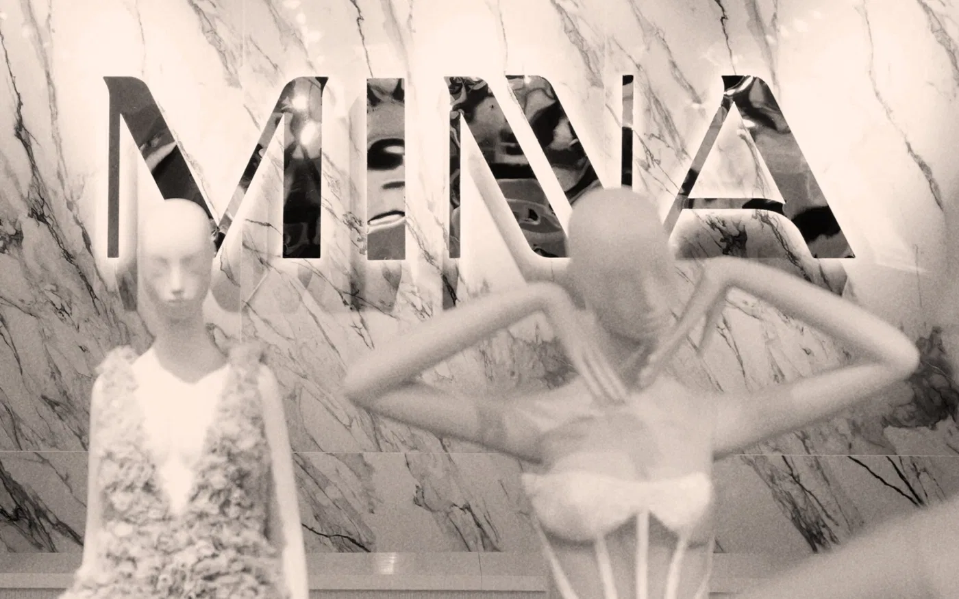
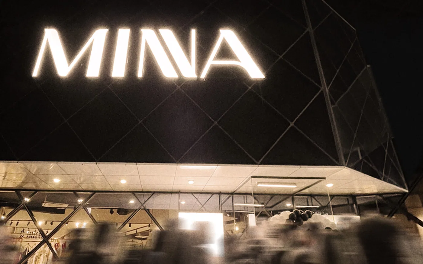
The rebrand elevates Minna into a more refined, international visual presence—one that mirrors the sophistication of its creations. Clean typography, elegant spacing, tactile materials, and a modern color palette create an aura of understated luxury. Nothing feels excessive; everything feels intentional, just as with Minna’s hand-crafted couture pieces.
Freezing Time Through Design
Every Minna creation is designed to preserve a moment—to freeze an emotion in fabric. The new identity mirrors that philosophy. It captures the intimate and emotional heritage of the brand, while giving it the clarity and confidence needed to grow globally.
Through this rebranding, Minna’s narrative becomes sharper, more iconic, and more aligned with the high expectations of its international clientele.

Explore the services behind this project
Related projects
Have a project in mind?
Discuss your project with TROKIT