April 2020 |
Rebranding a fastest growing pizza chain in Kosovo
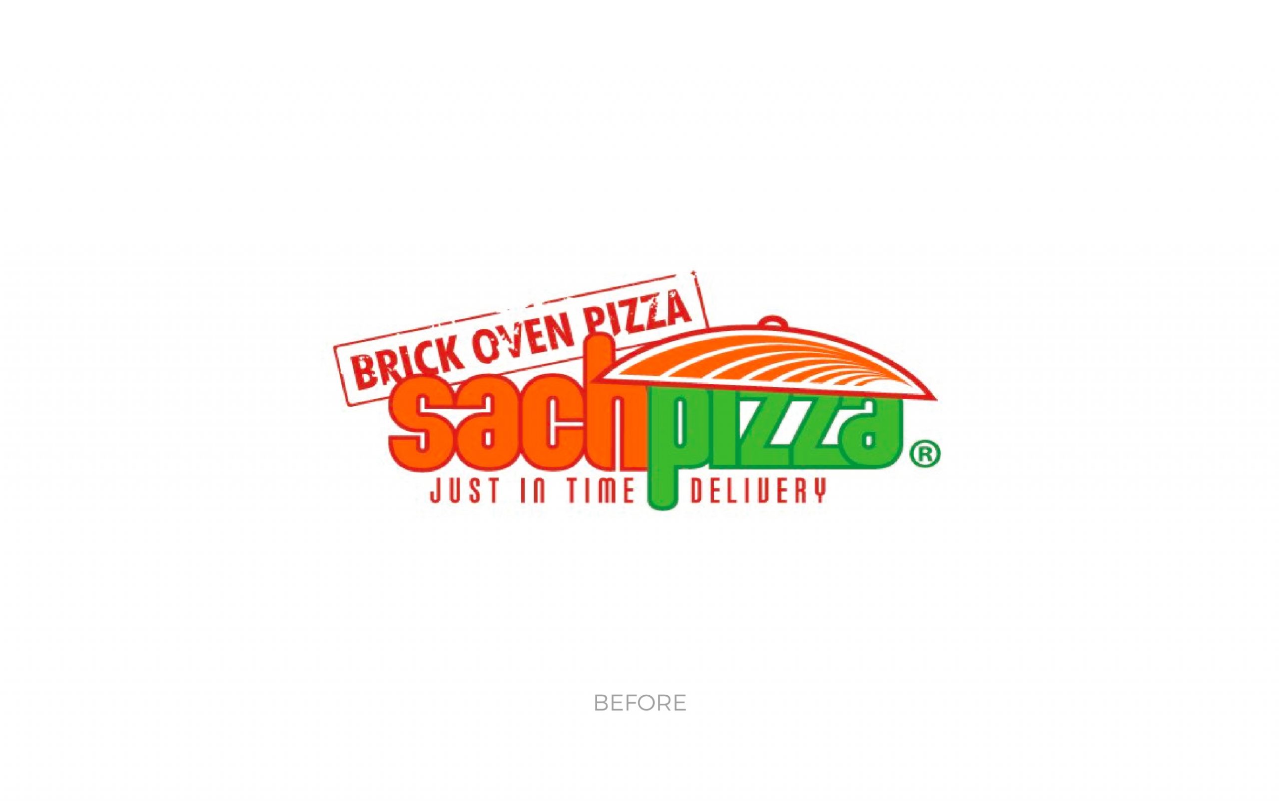
Initial meetings with the owners of SachPizza revealed an ambitious plan: opening 10 units in the next 5 years. Consequently, the idea has emerged for a new look, something that would reflect the feeling of restaurant guests and the expansion of the company.
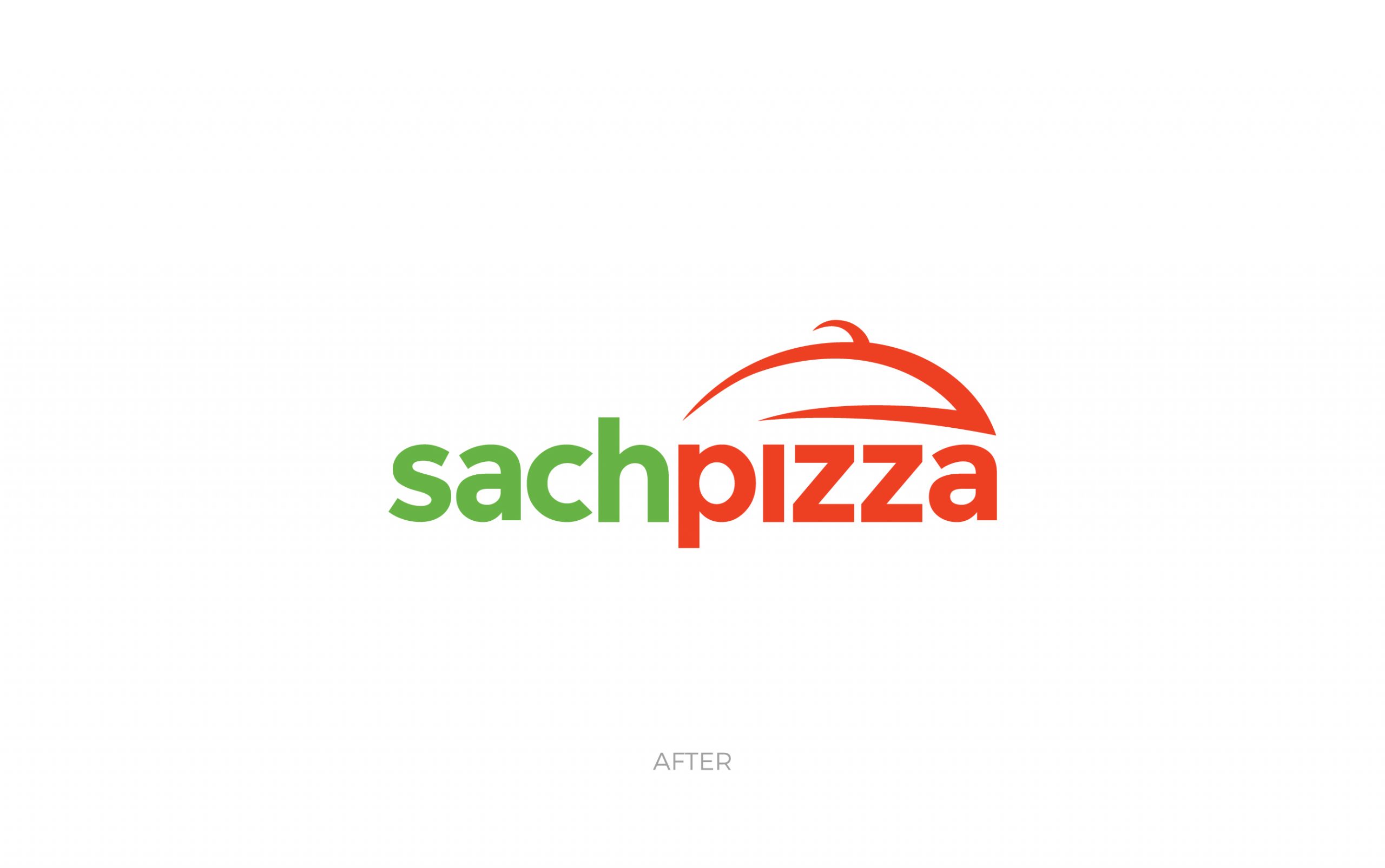
TROKIT held the foundation of the identity, main symbol – saç (a spherical baking metal lid used in our traditional cuisine), however, the team modernized it in order to appeal to a wider target. Orange/red and green remained primary colours, with black and white as secondary colours.
Upon entering the restaurant, guests will immediately notice a modern, streamlined menu board, by far one of the best marketing tools for a restaurant is the menu design.
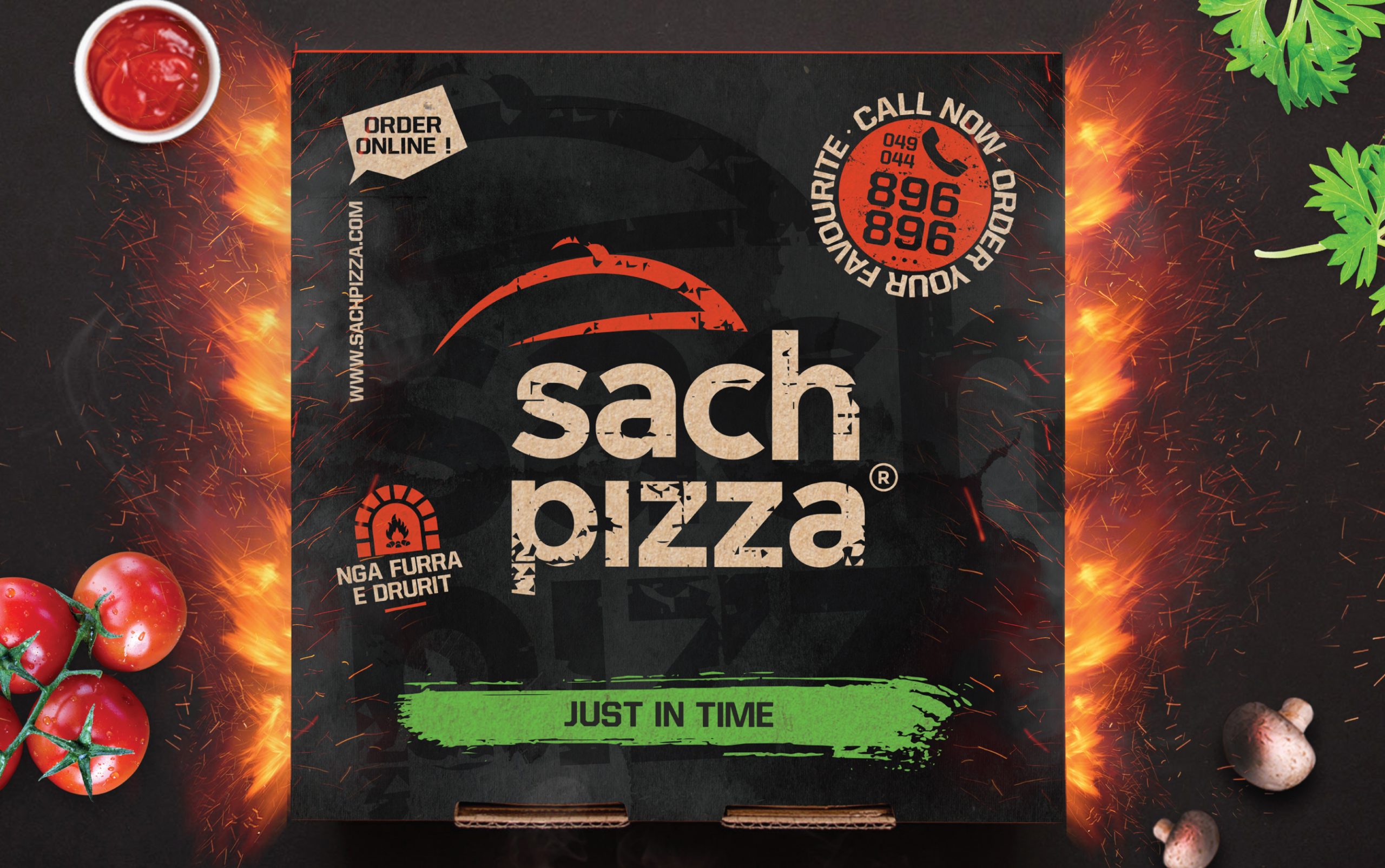
The biggest change that guests faced was pizza boxes. New boxes represented in the best manner our work and messages: brick oven pizza and just in time delivery. Pizza boxes are essentially the packaging of the product (or food in this regard). Therefore, it had to be recognisable for the audiences and translate their new brand.