March 2020 |
Full rebranding and concept development for the TV & Entertainment industry.
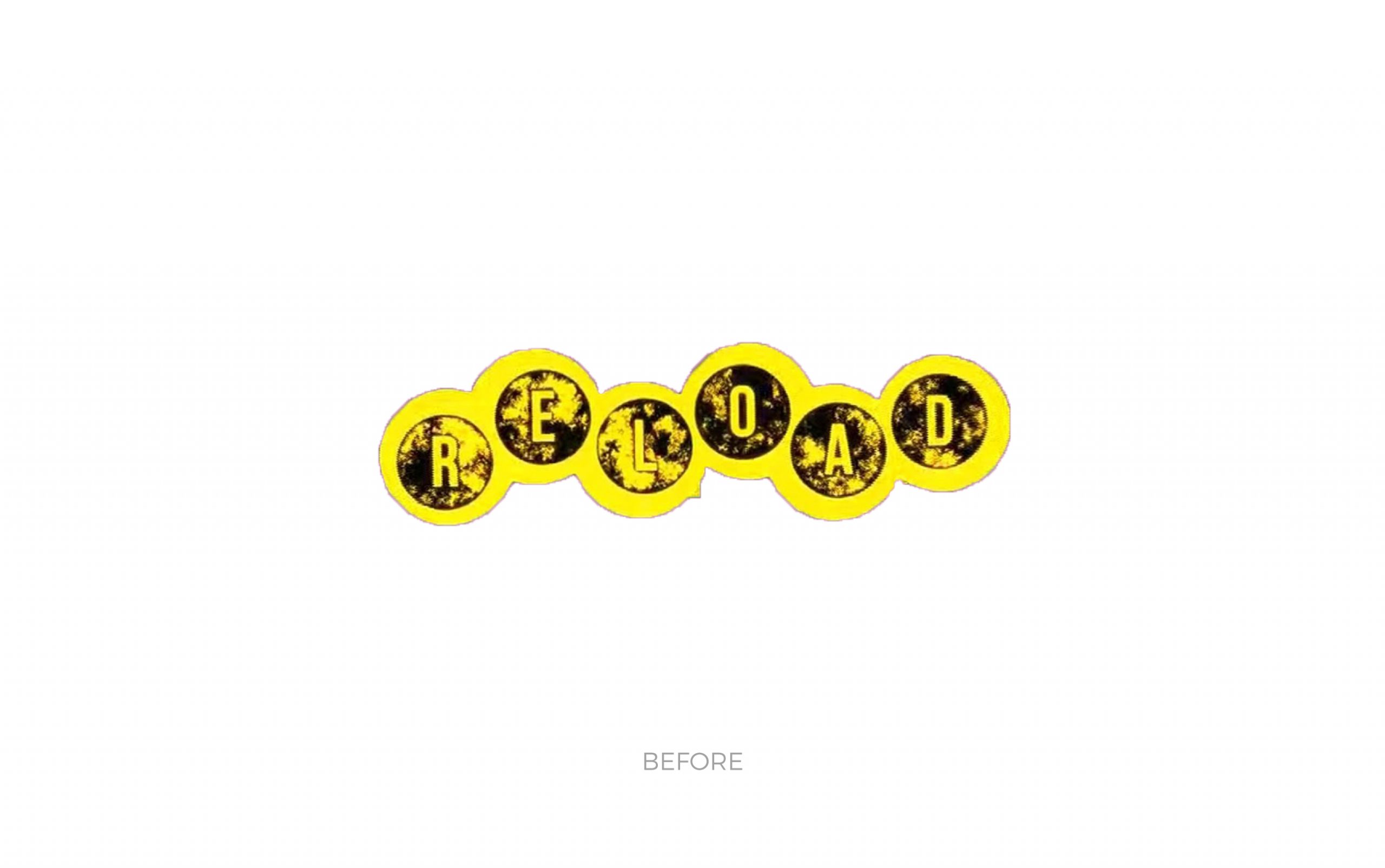
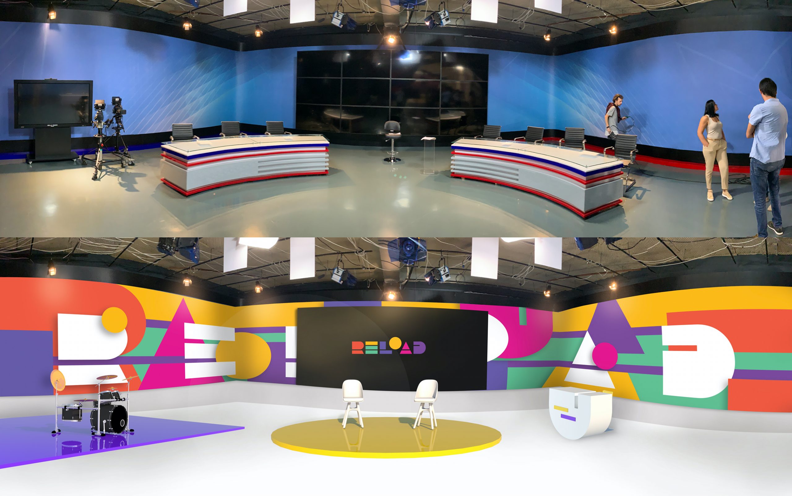
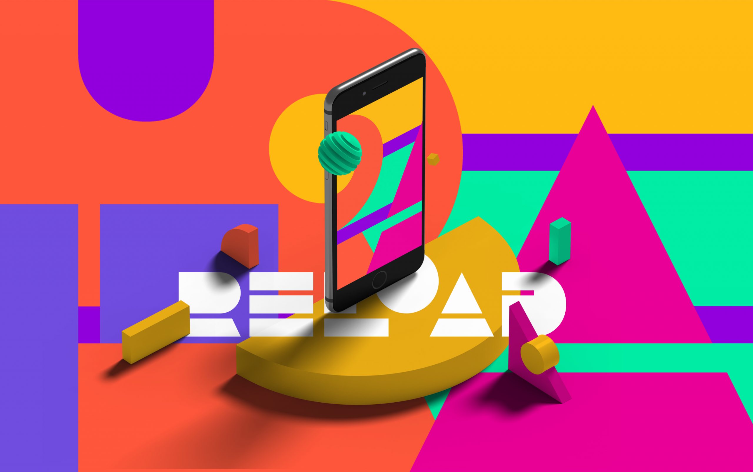
Energy and unscripted content are what makes RELOAD a popular and exciting new TV program in the region. To start developing a new identity for RELOAD, the team at TROKIT had to step into a state of mind that allowed them to create something bold, fun and eye-catching.
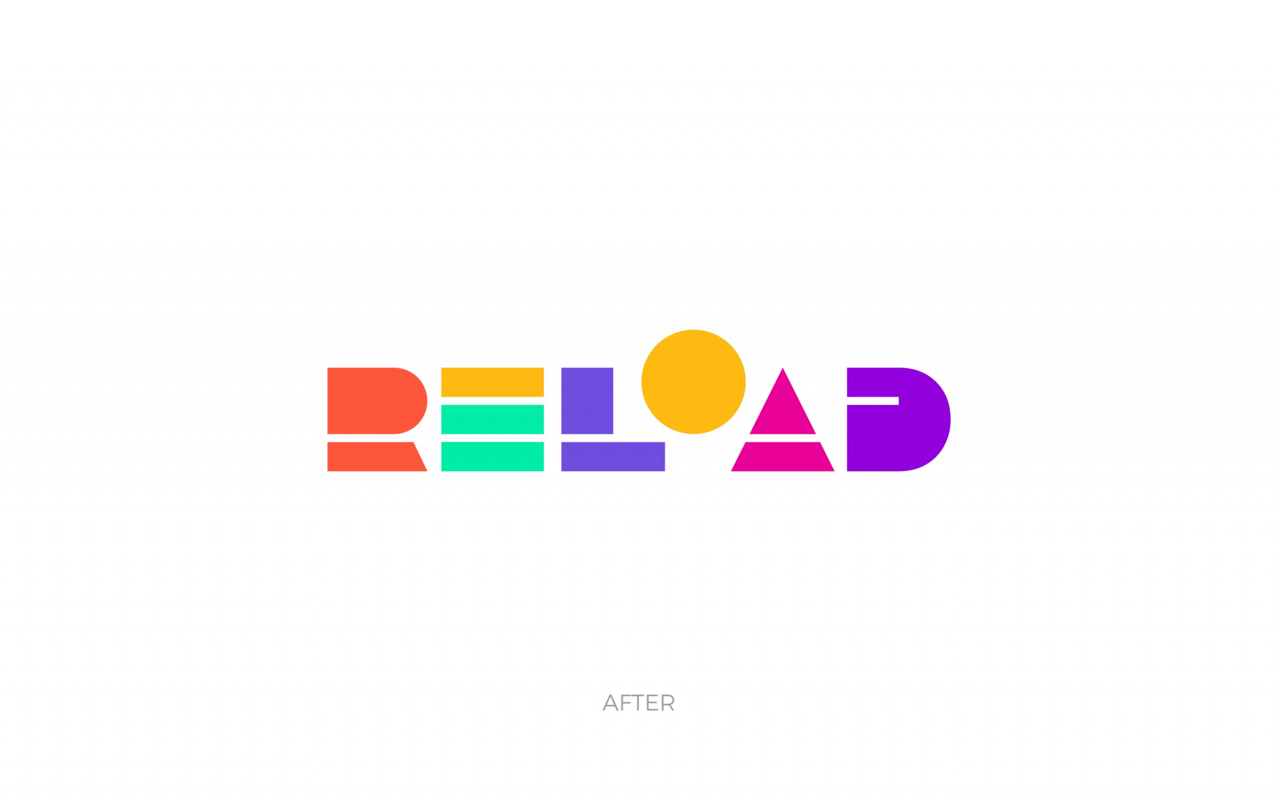
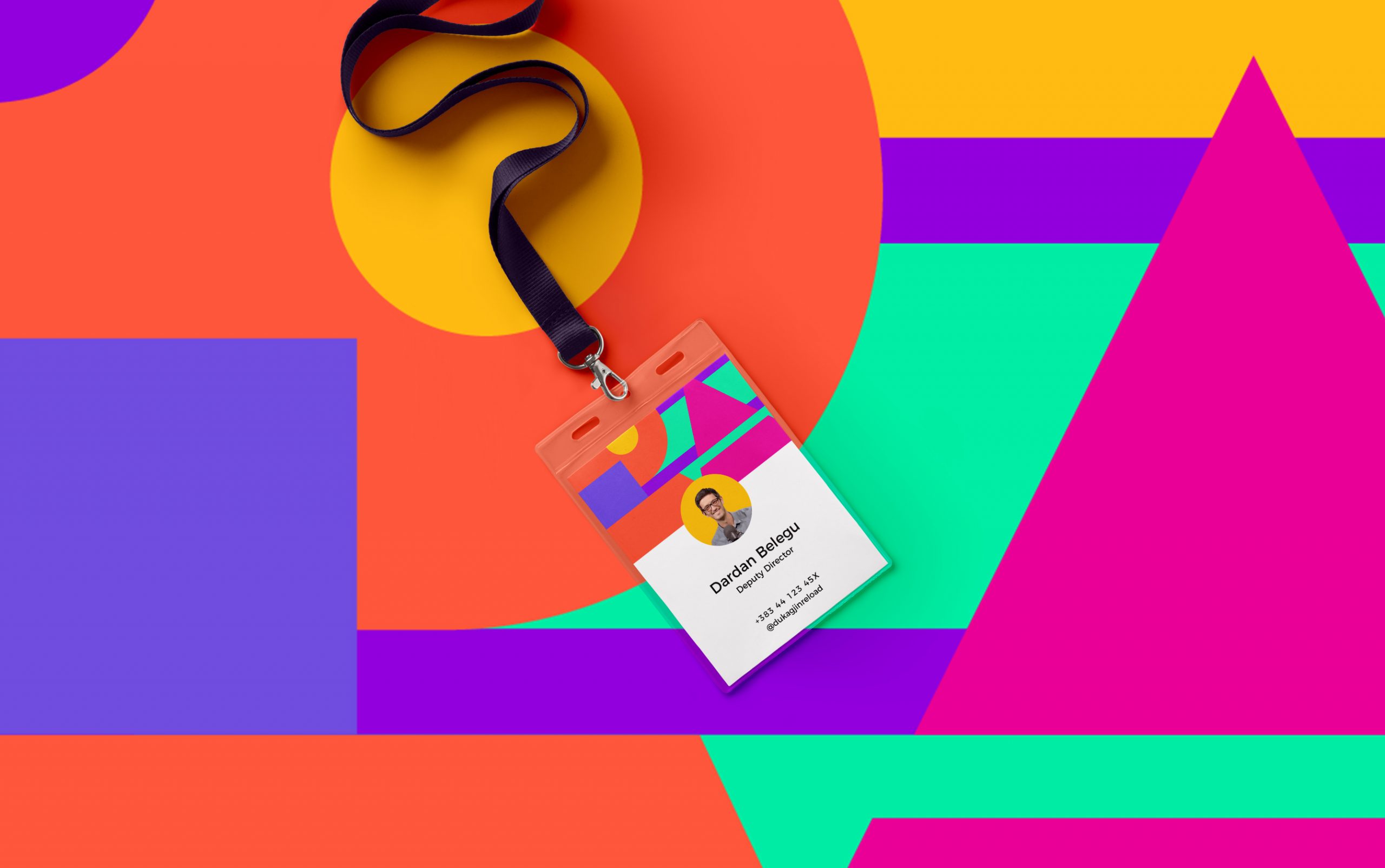
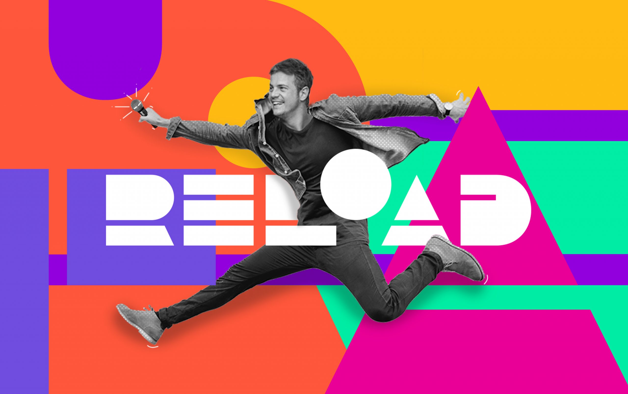
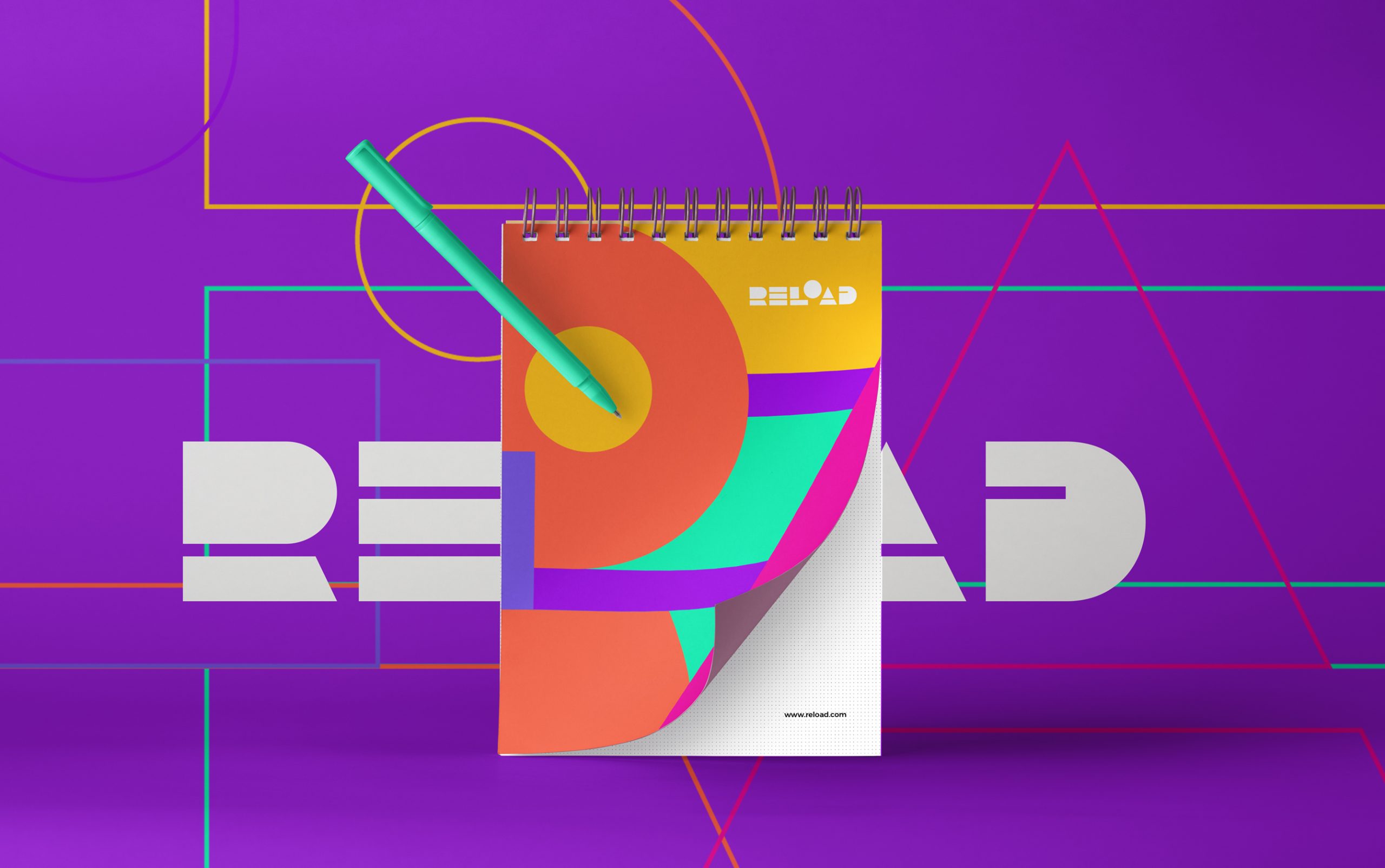
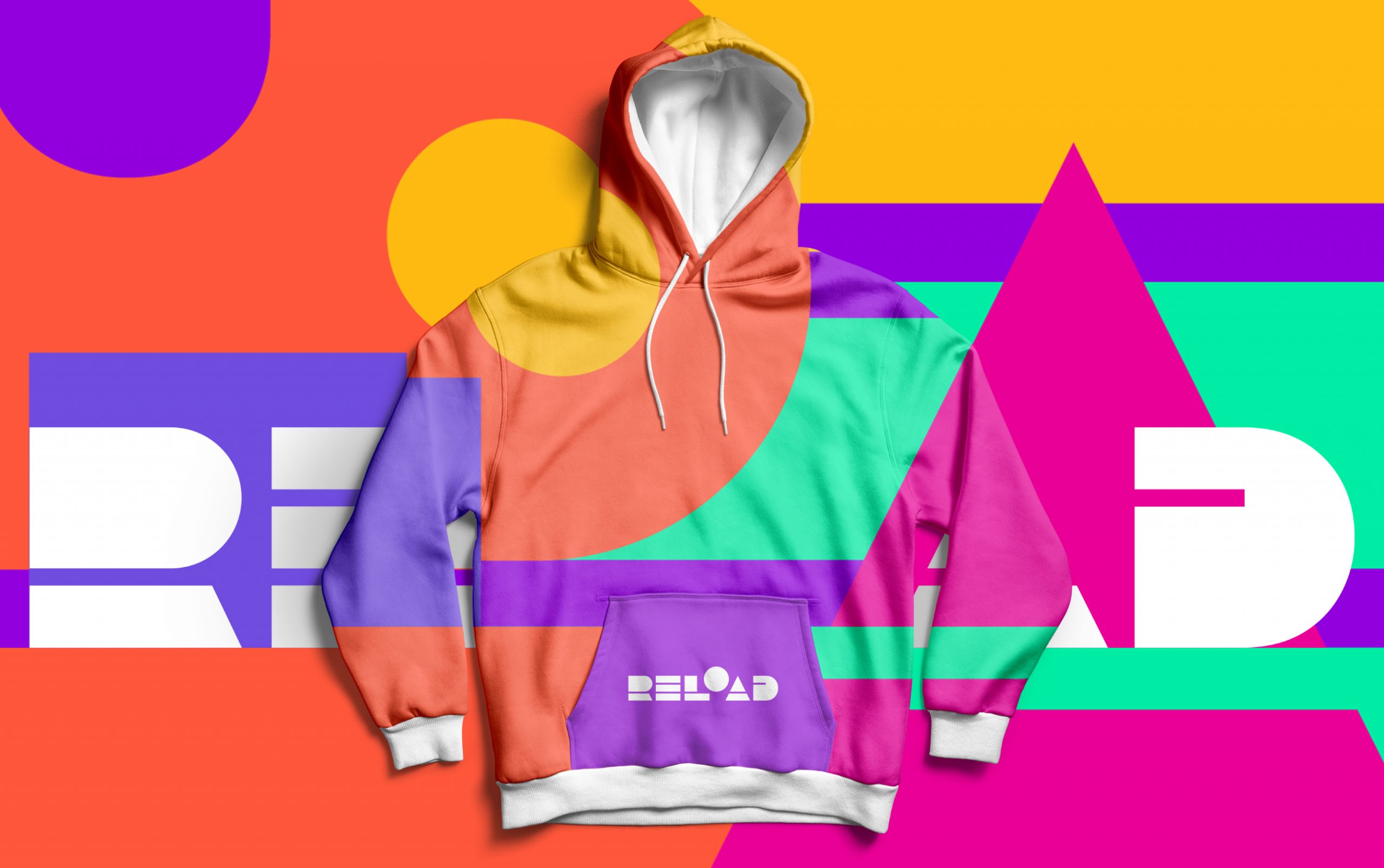
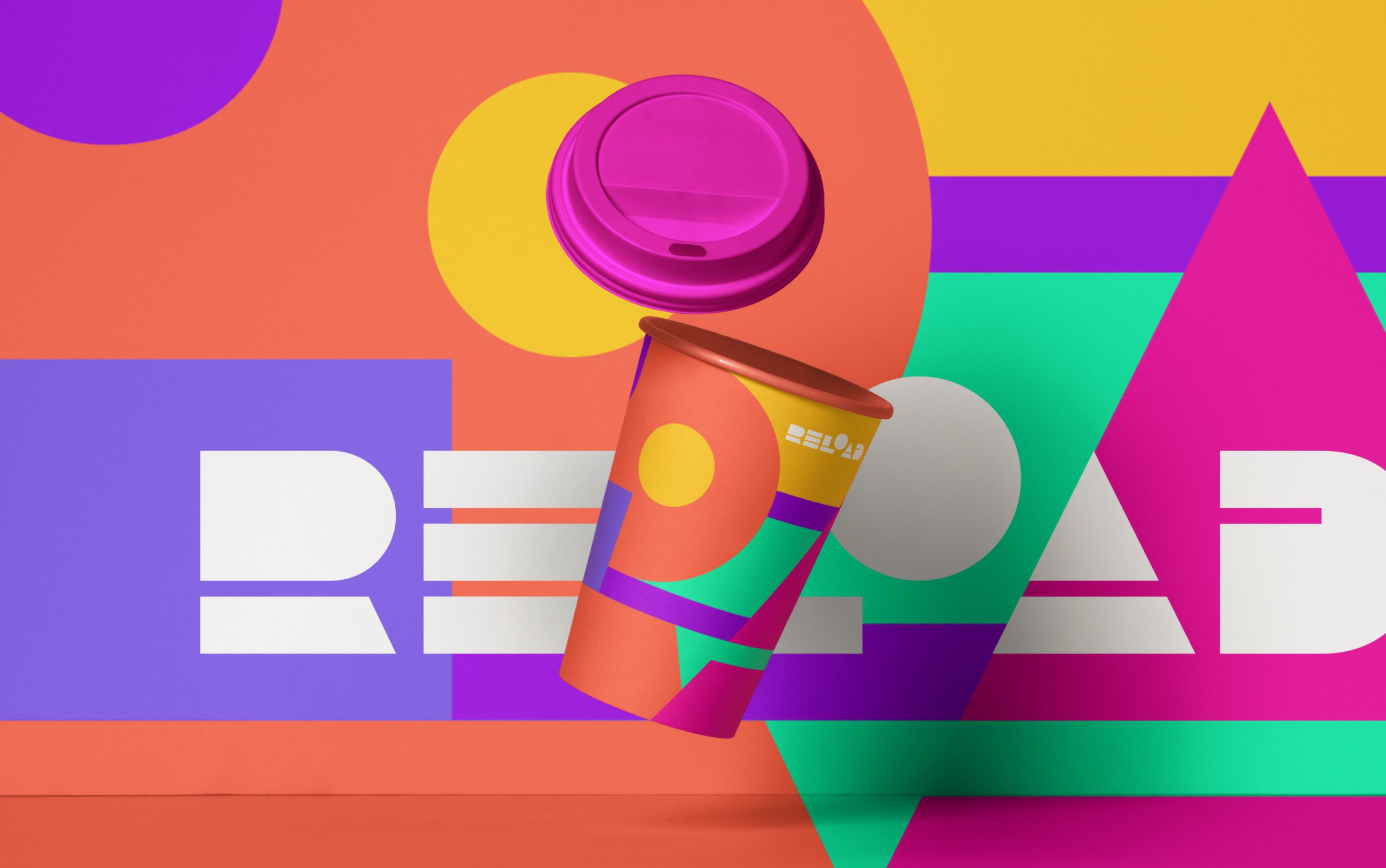
It was brought on by the team to capture what makes a program like RELOAD so unique in the industry. Spontaneity was a contributing factor and in result, this resembled through the array of colours selected by the designers, the concepts likewise, fitted the favoured colours.
The initial concept colour ‘red’ is displayed to connect with the point at which a camera begins to record, binding the act of capturing the events that happen during the program. Green is used to symbolise a charging battery which can also be linked to the burst of energy. Orange represents the sun’s optimism, activity, in succession the sun rises and sets every day linking the name of the brand. The final concept identified was a play button with this came an idea to include a colour spectrum rather than a solid colour. The spectrum connected to the spontaneous nature of the program in that anything can happen at any time.
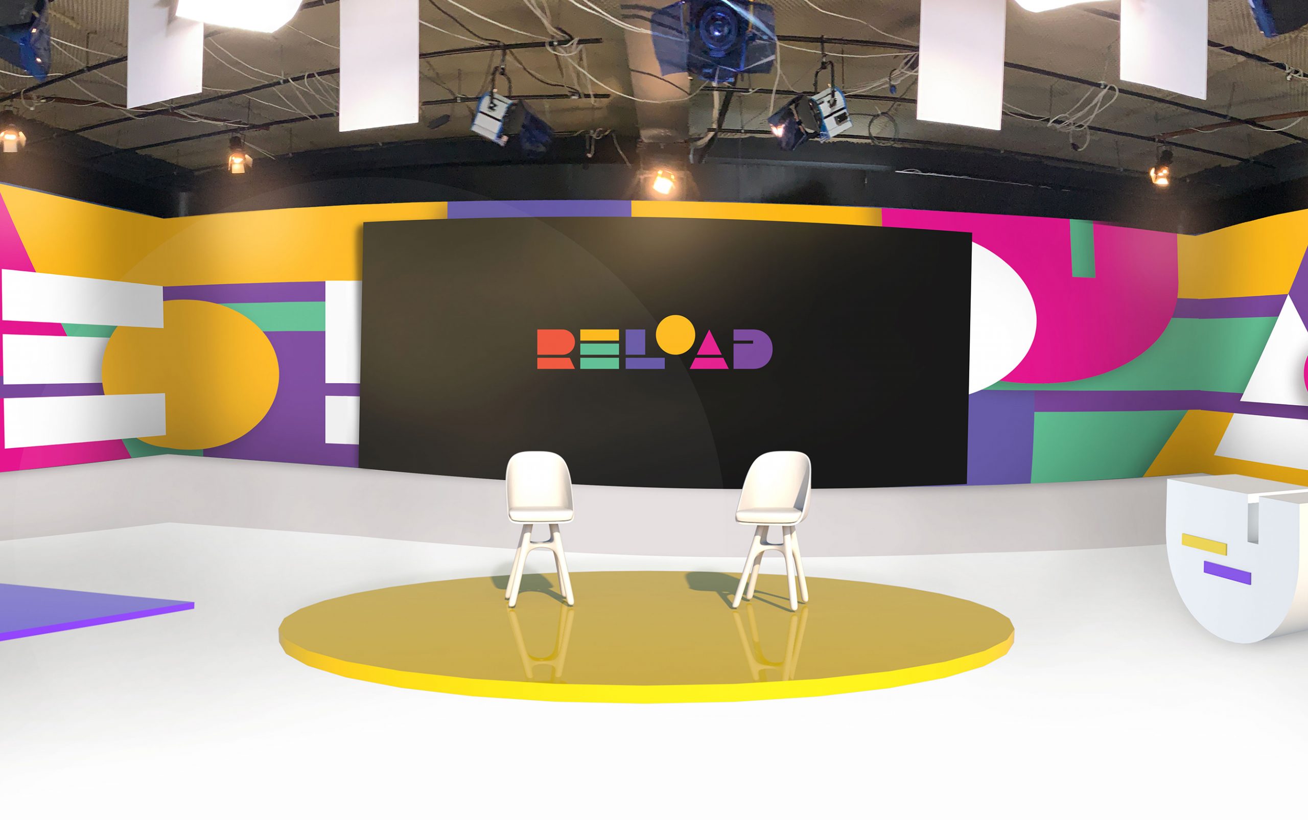
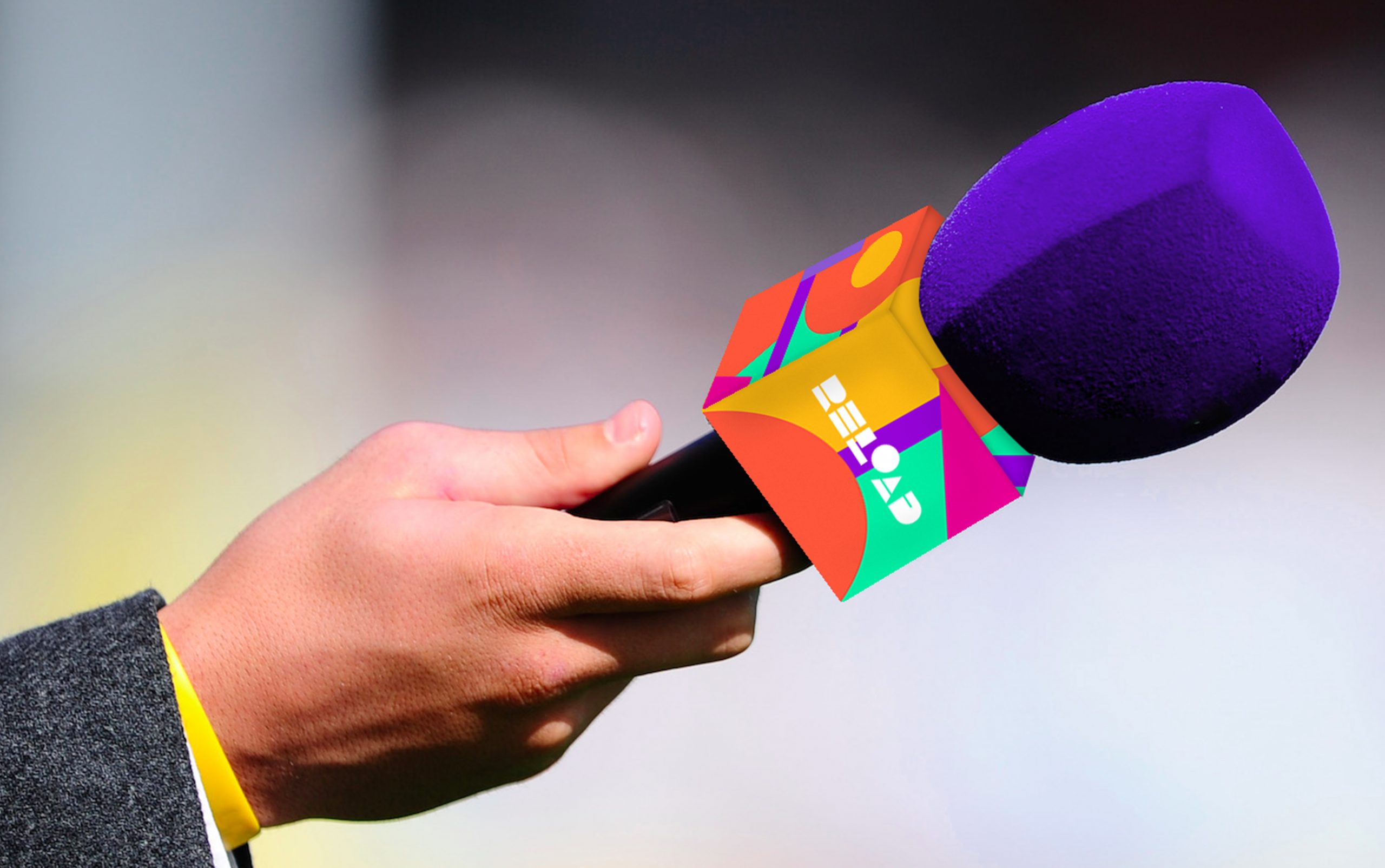
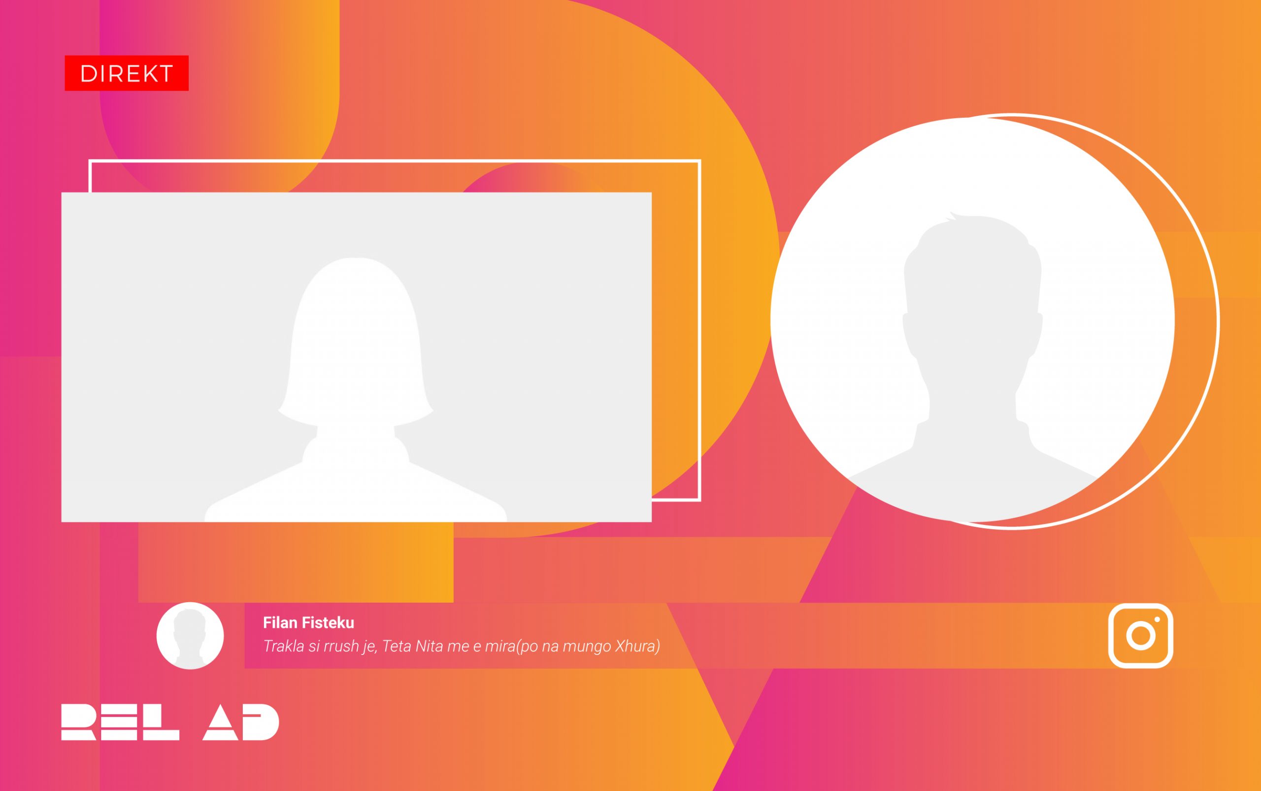
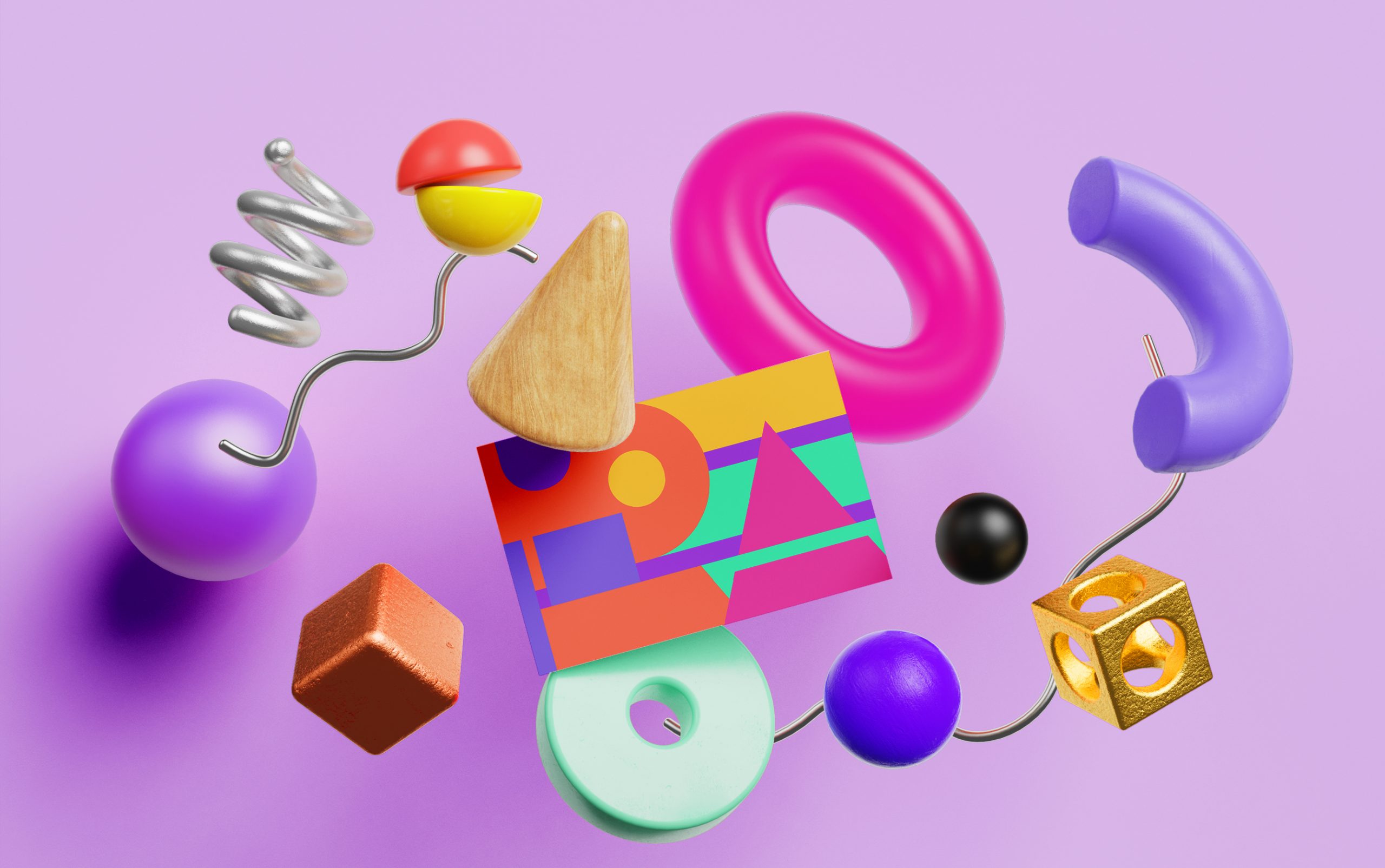
With the colours set in stone, it was the designer’s creativity that led to experimenting with a range of shapes that collage together on various final prints and digital.