July 2022 |
Rebranding and website for swiss auto tuning company Peparts
The rising demand for high-quality tuning equipment and accessories, mainly after the sequels of the Fast and Furious movies, has become a massive trend for many young Swiss. Among the leading companies in this sector is Peparts.
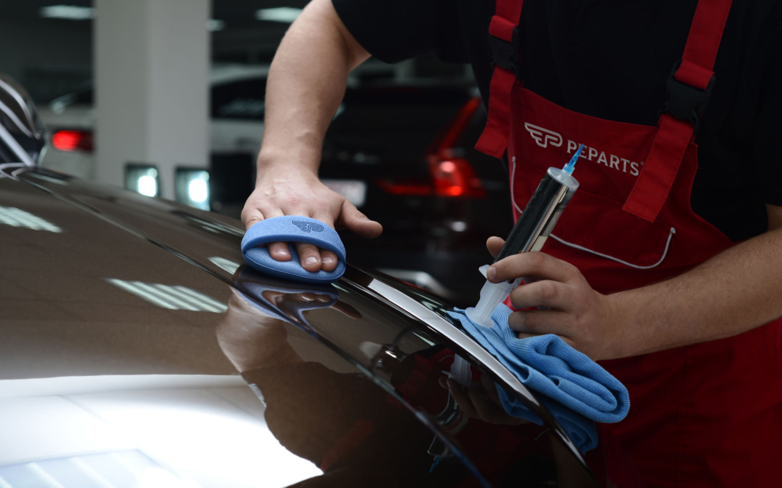
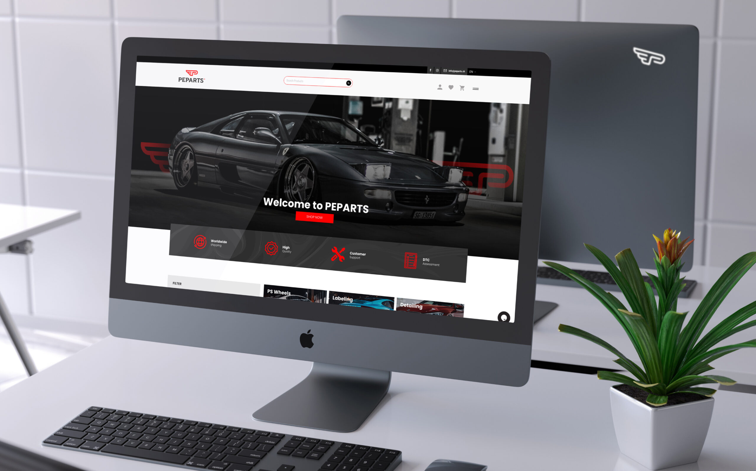
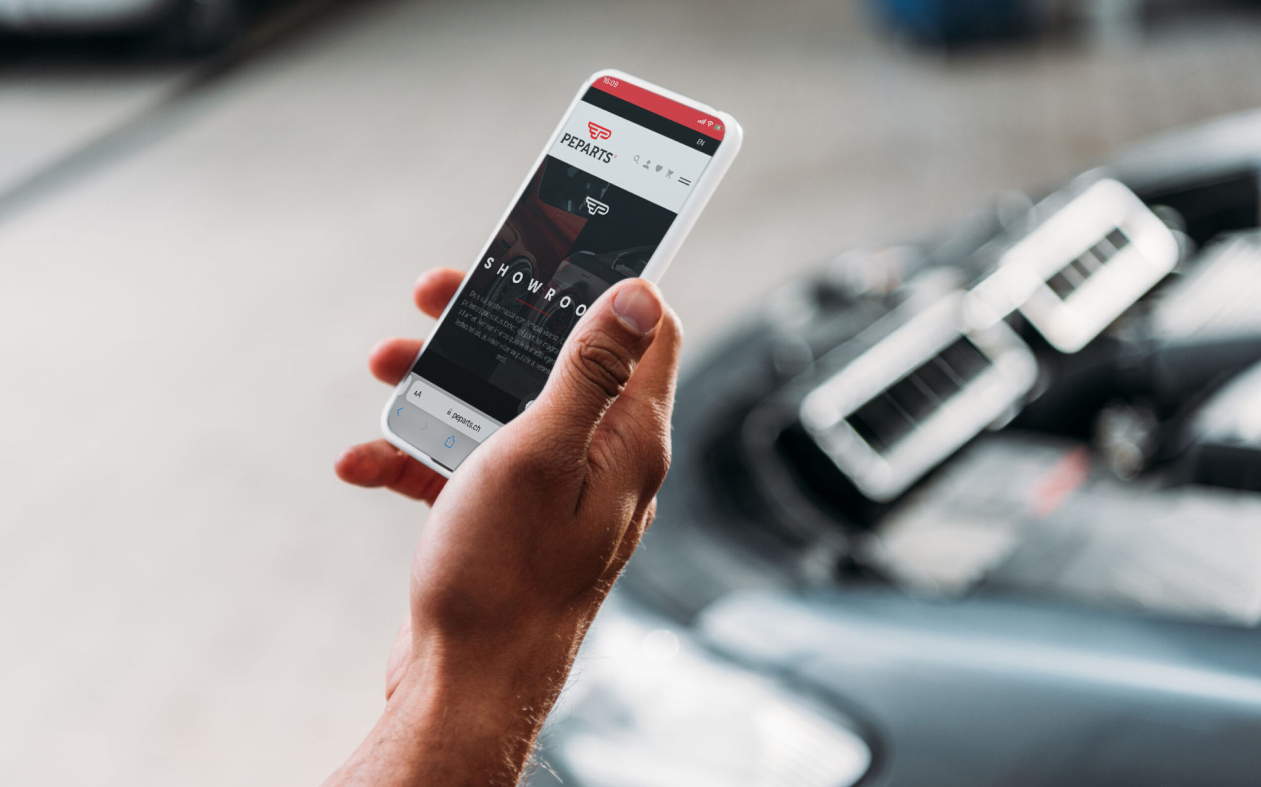
The rapid increase in demand for Peparts services and accessories made this company consider rebranding. This was the right moment to redefine Peparts’ identity as one of Switzerland’s key players in the tuning car industry.
Trokit carefully considered the elements of the existing brand. The team also listened carefully to every single detail of the new direction that its owner, Petrit, wanted to give the company in the next decade.
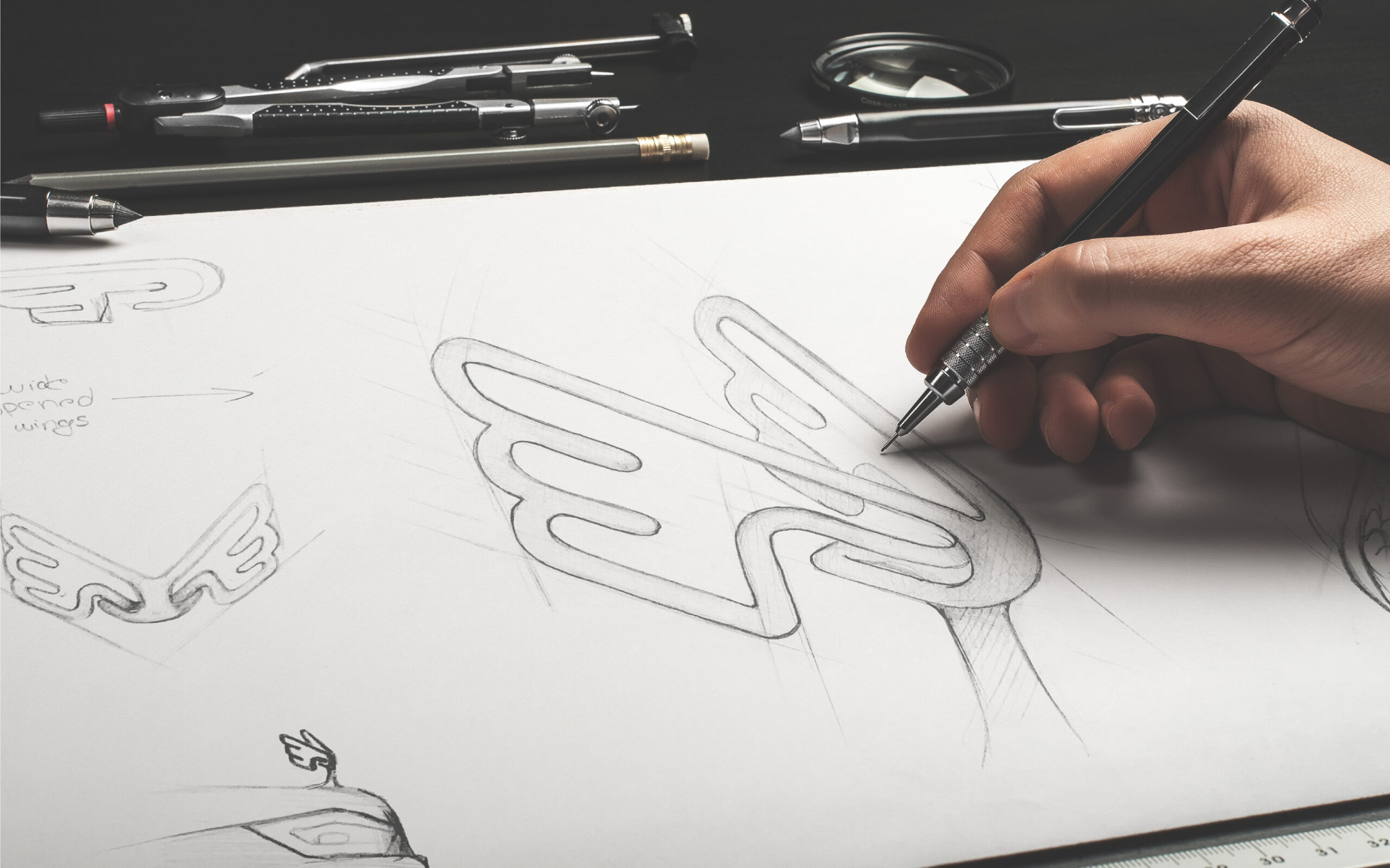
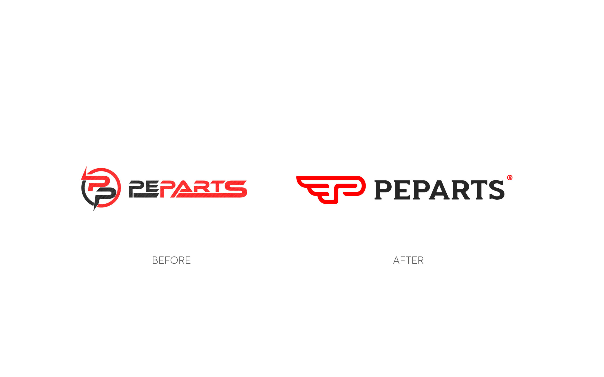
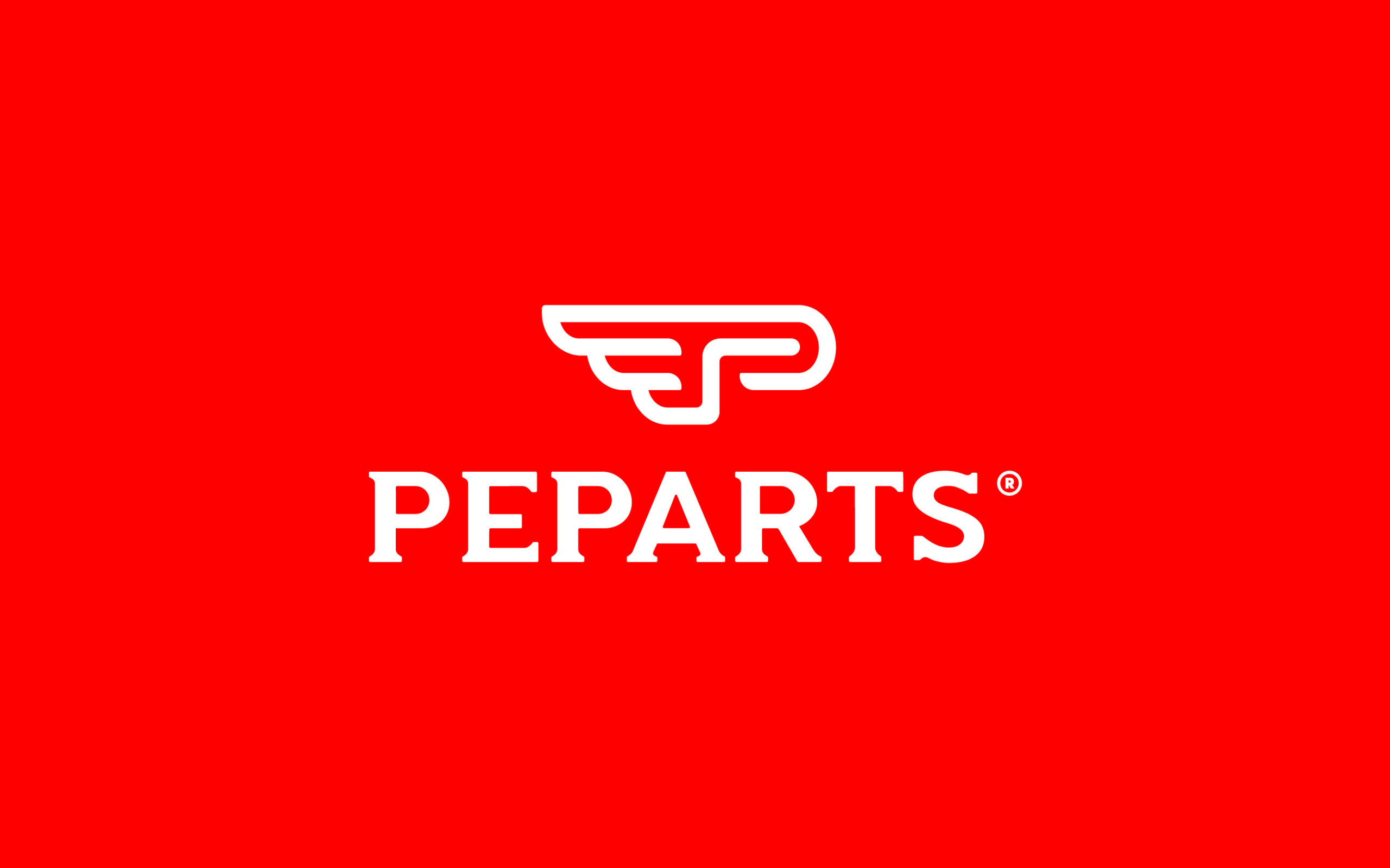
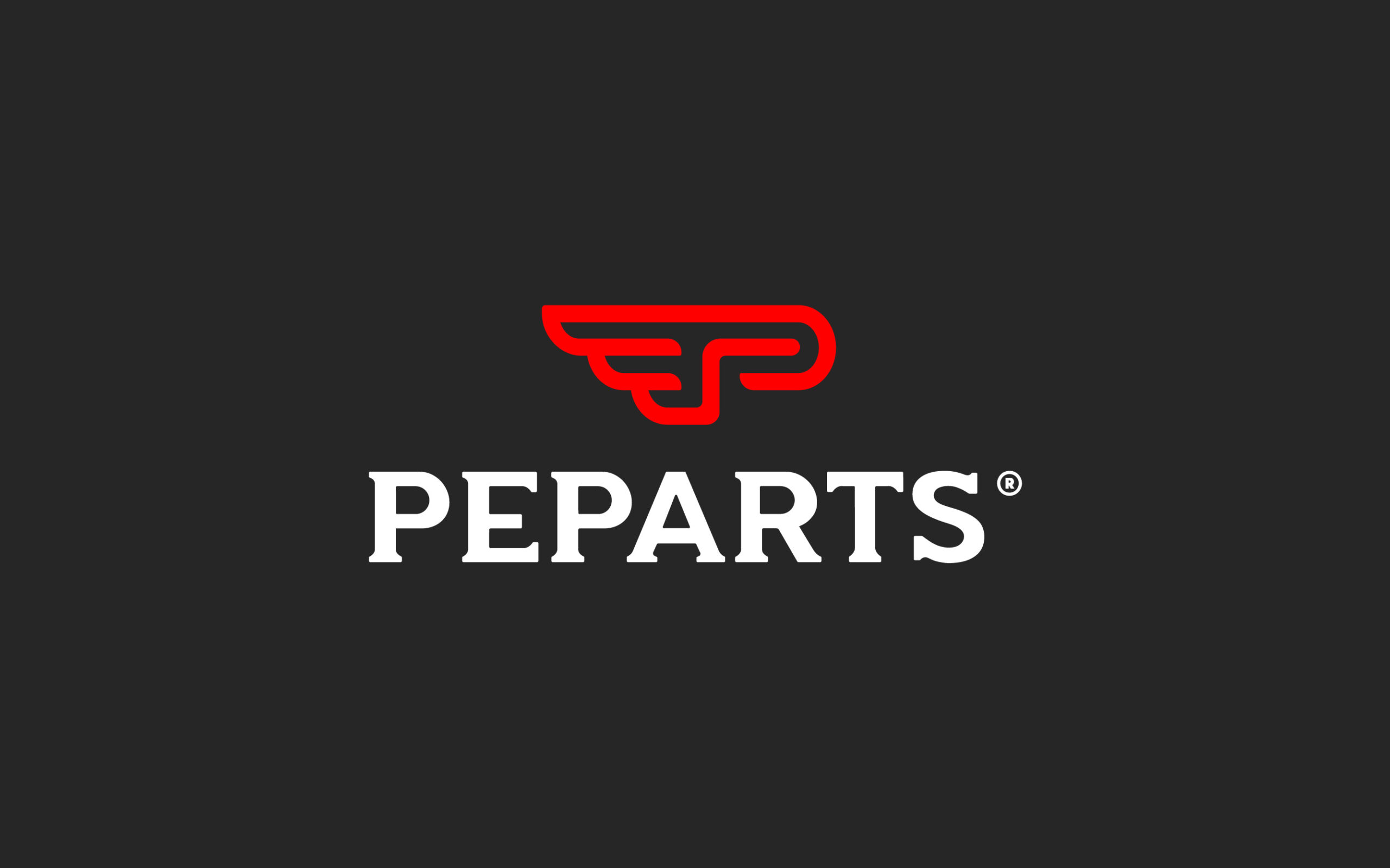
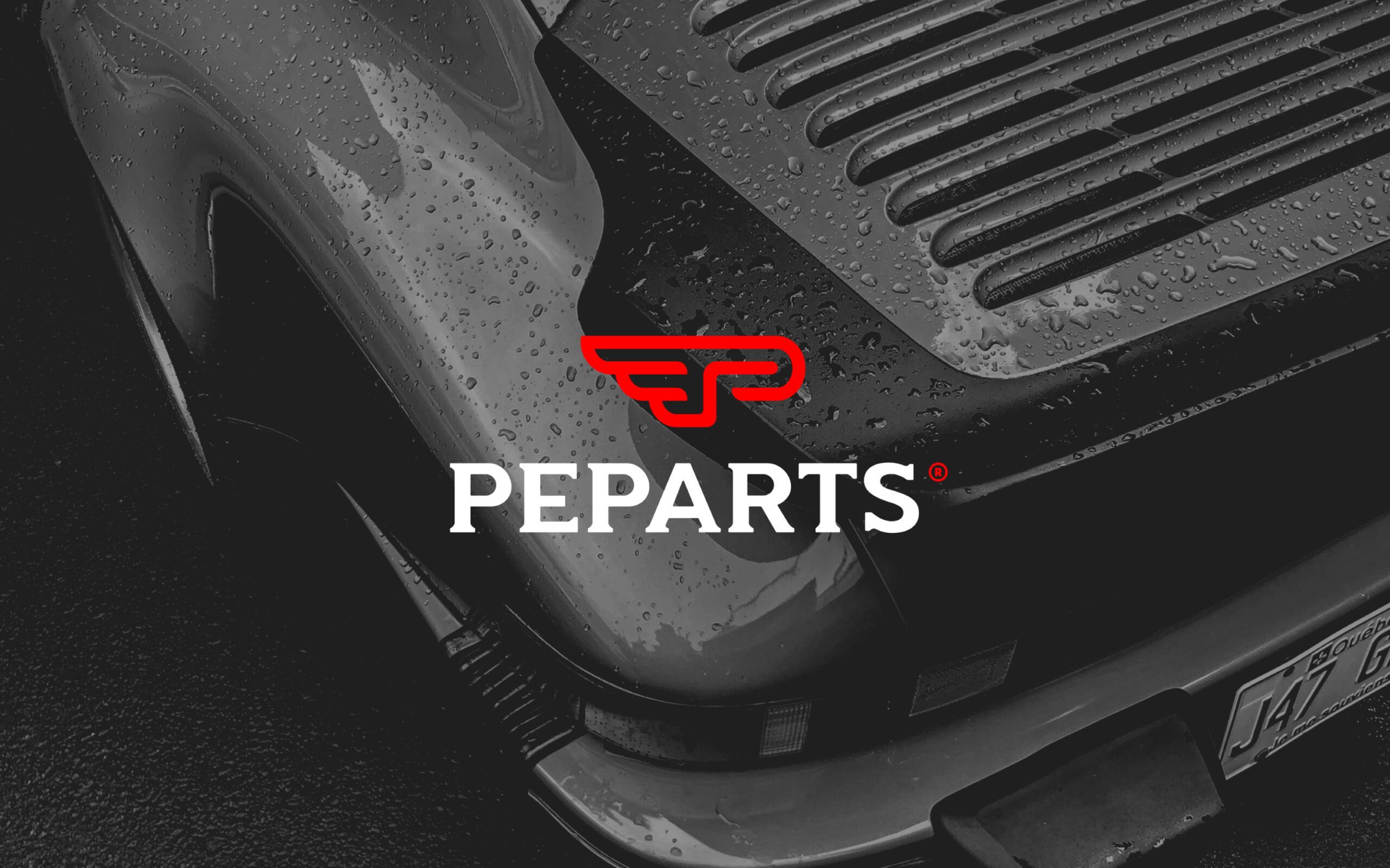
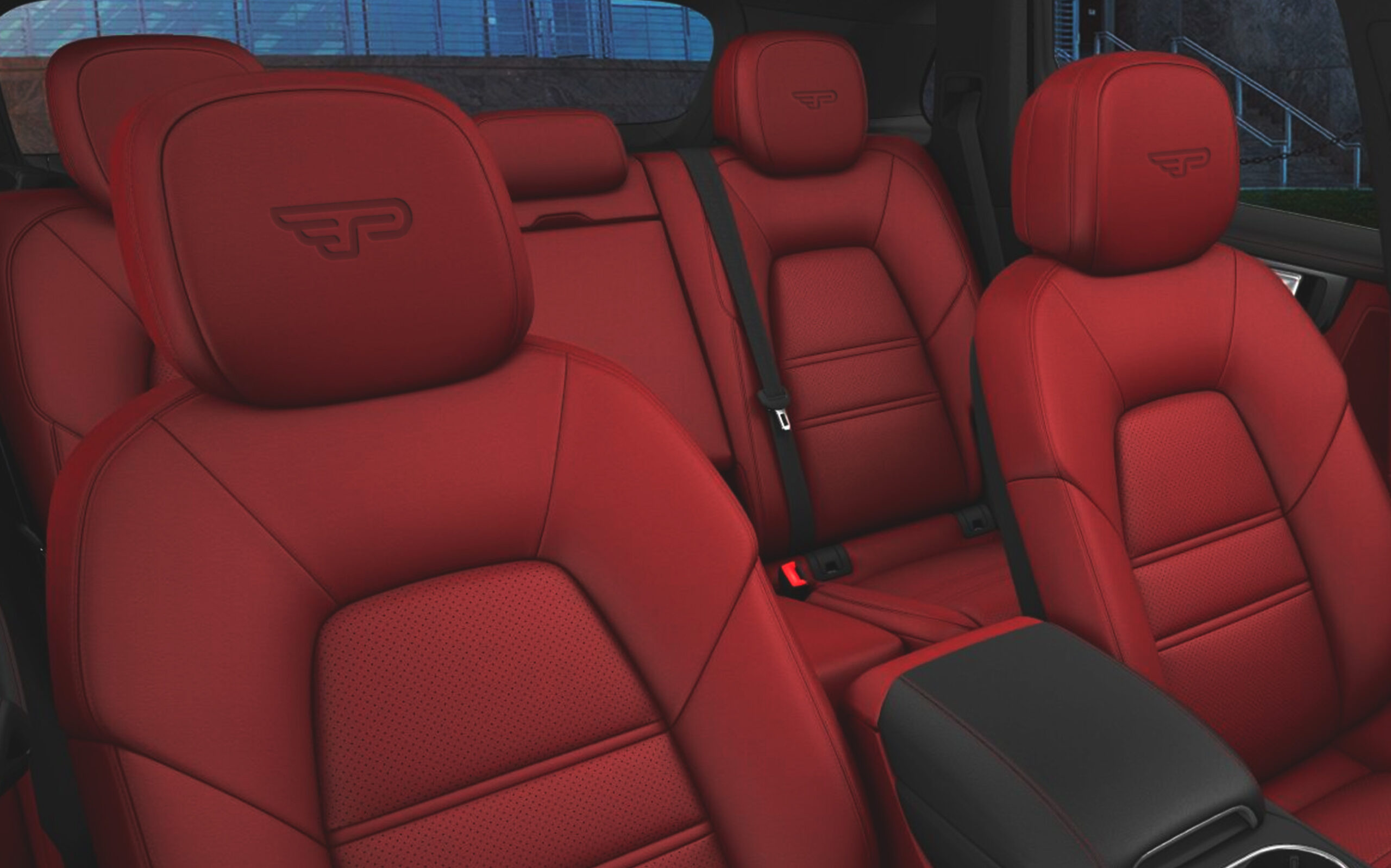
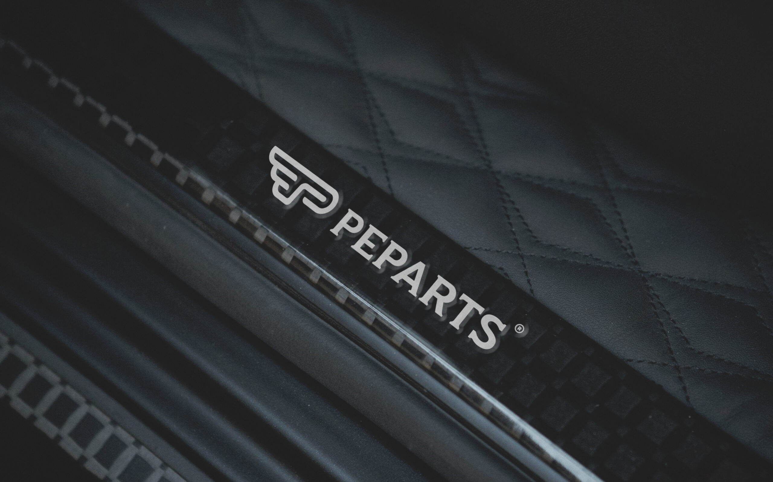
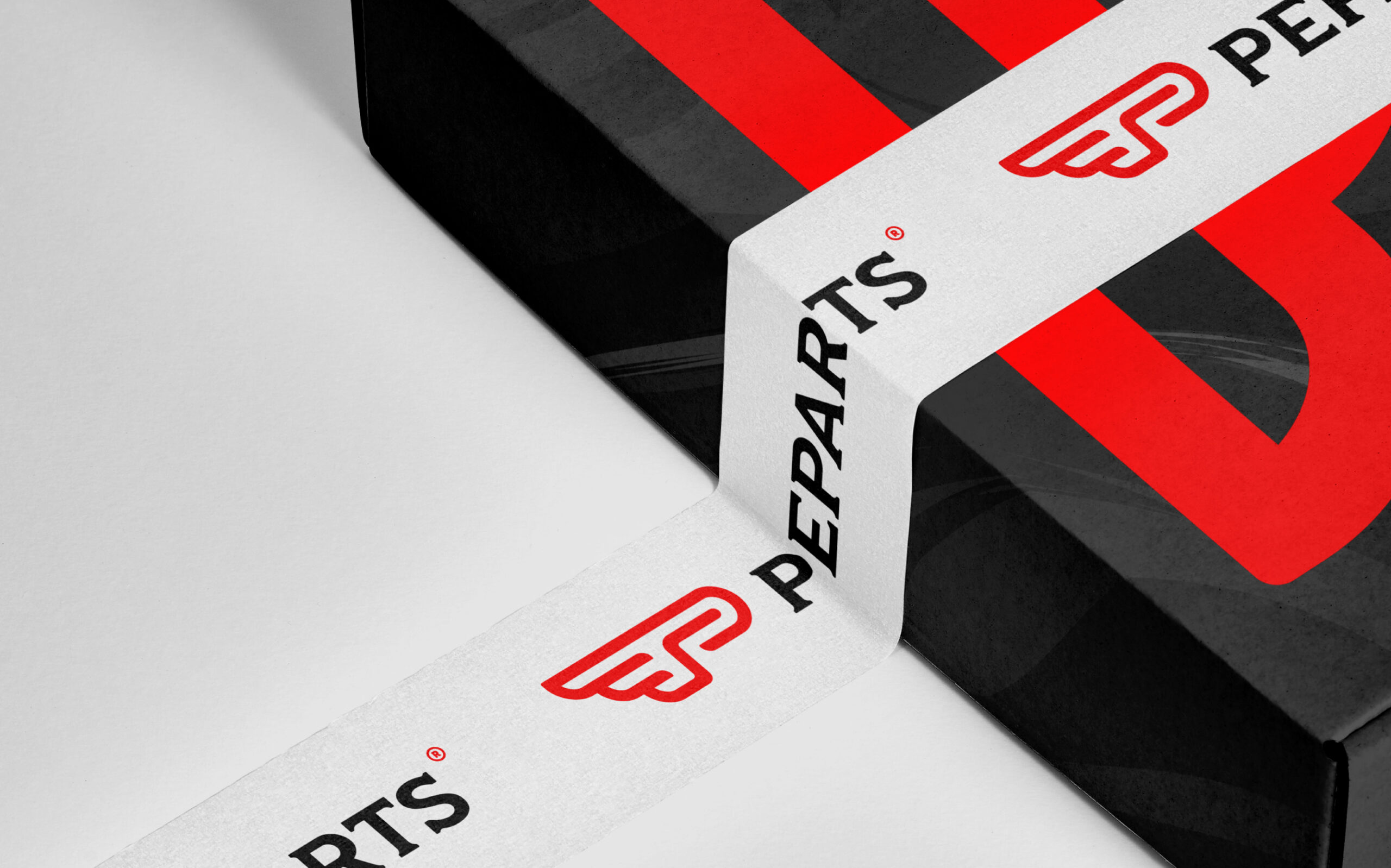
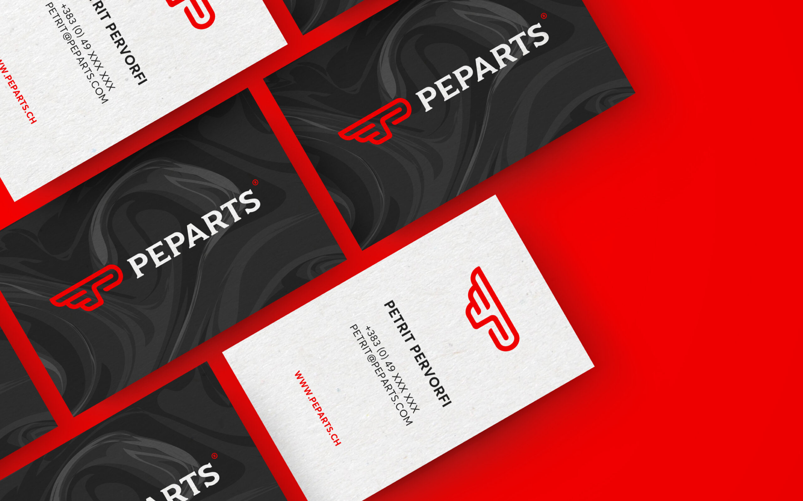
The symbol was redrawn by the design team to make it suitable on offline and online platforms. Designers “gave wings” to the initials PE. In the symbol, there are traces of two crossed racing flags. To further define the adrenaline and speed that these modified cars provide, the letter E was flipped. The red color does not differ from the previous brand except that it is more lighted up. The unique, careful serif typography represents durability and finesse, both of which are at the core of the brand.
All the elements of the new brand have been developed in such a way as to produce a brand system identity that brings out the unforced yet emblematic Peparts. The new visual identity represents an important step for this company, turning it into a reference in the ever-growing trend of car modifications.