March 2024 |
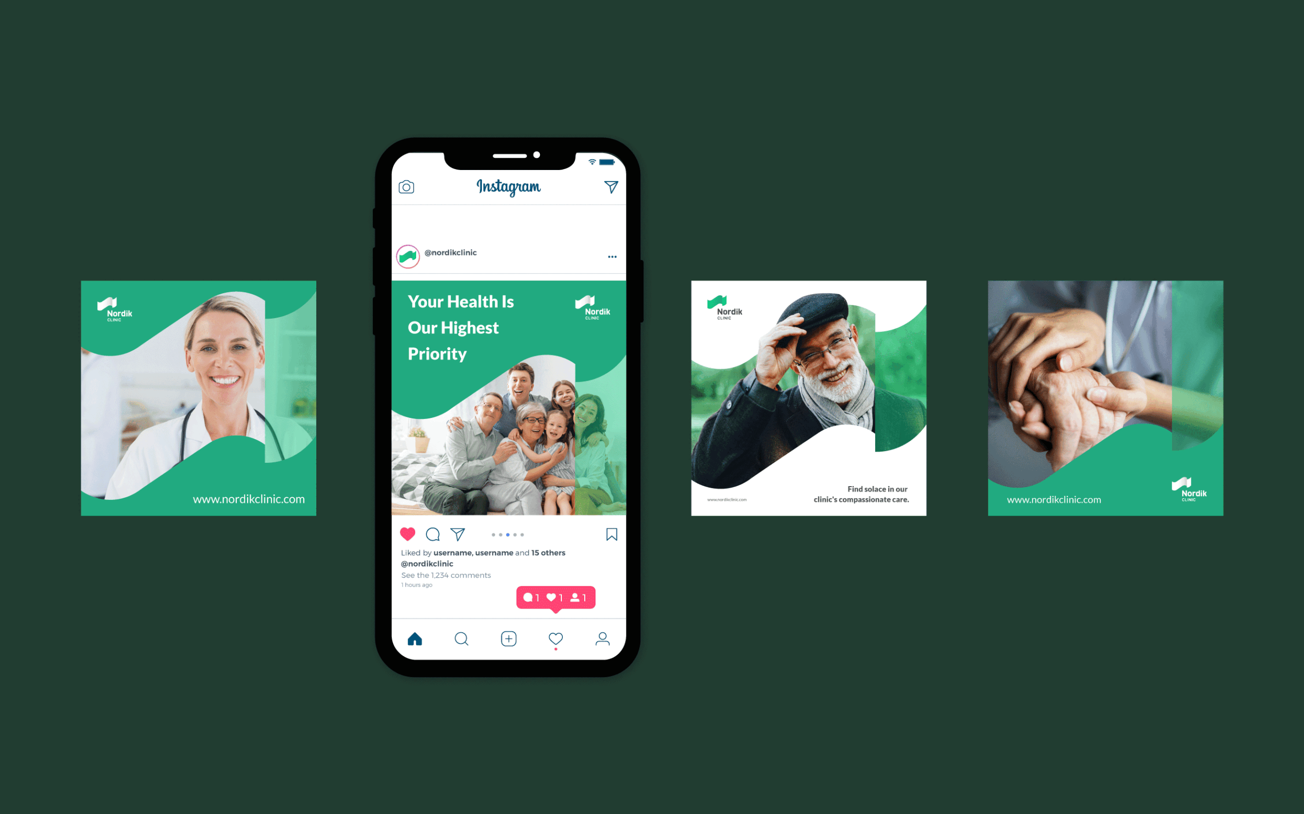
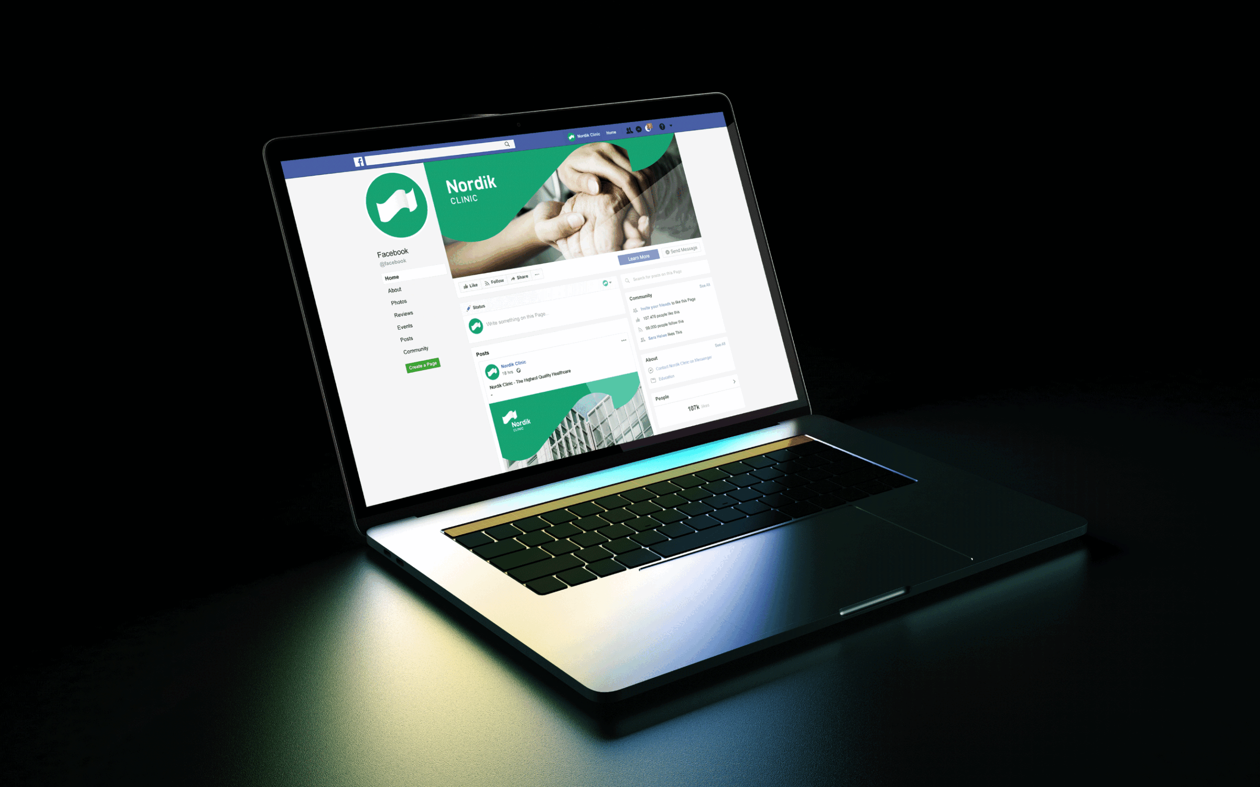
Brand system identity for Nordik Clinic, a new Swedish medical experience in the Balkans
The Aurora Borealis or Northern Lights is a fascinating display of light in the night sky, occurring at the North Pole. Occasionally, the space weather interacting with Earth allows the auroras to extend even farther from the poles, ranging from 60 to 600 miles in altitude. These multicolored lights constantly change in shape and intensity, from faint and scattered to intensely bright.
Medicine is a field that undergoes daily changes, similar to the auroras that never appear in the same form. They are connected to solar activity, just as we humans cannot live without its energy. This is where our inspiration comes from.
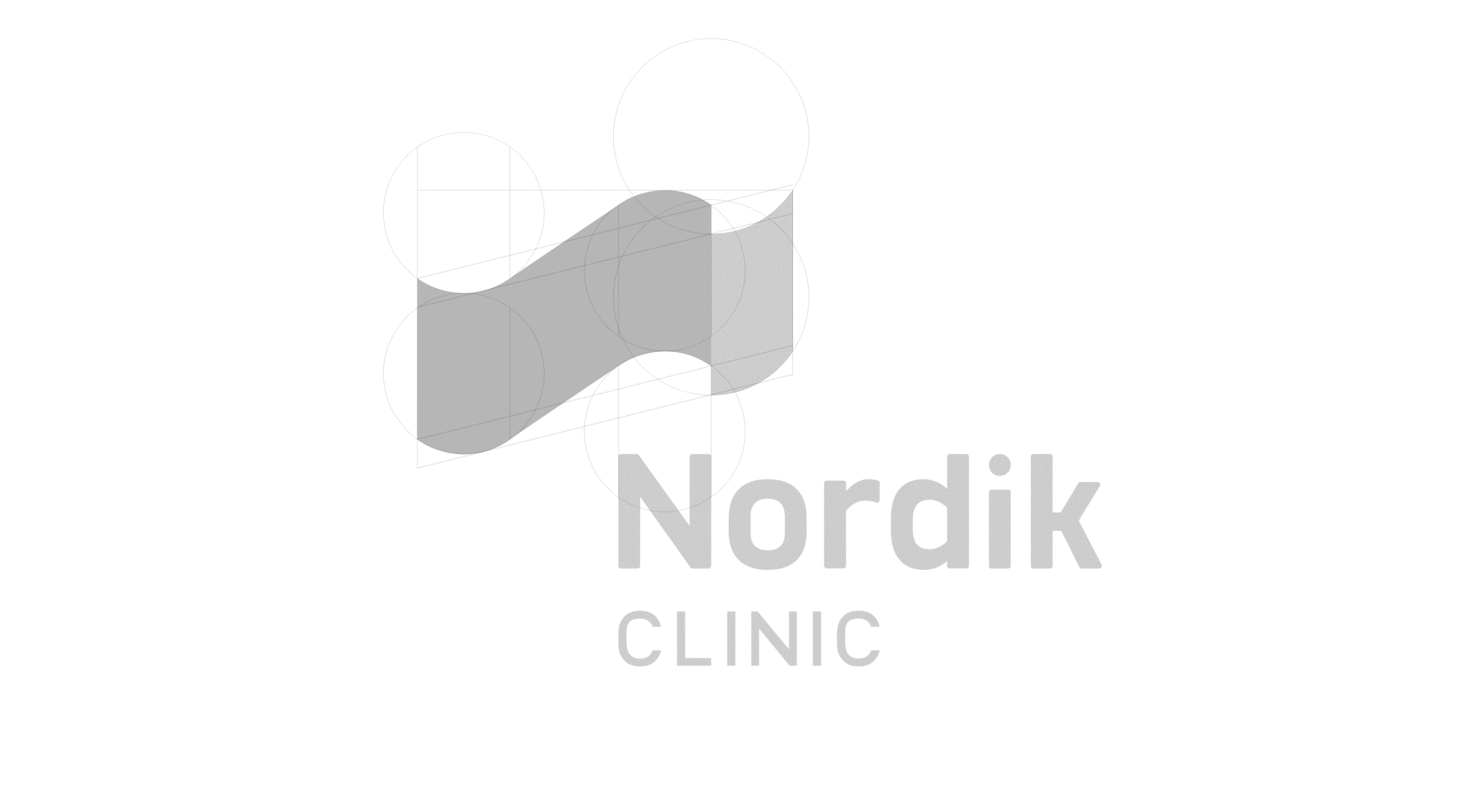
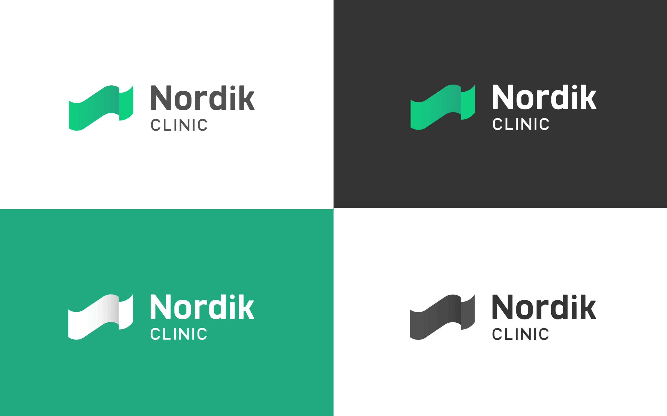
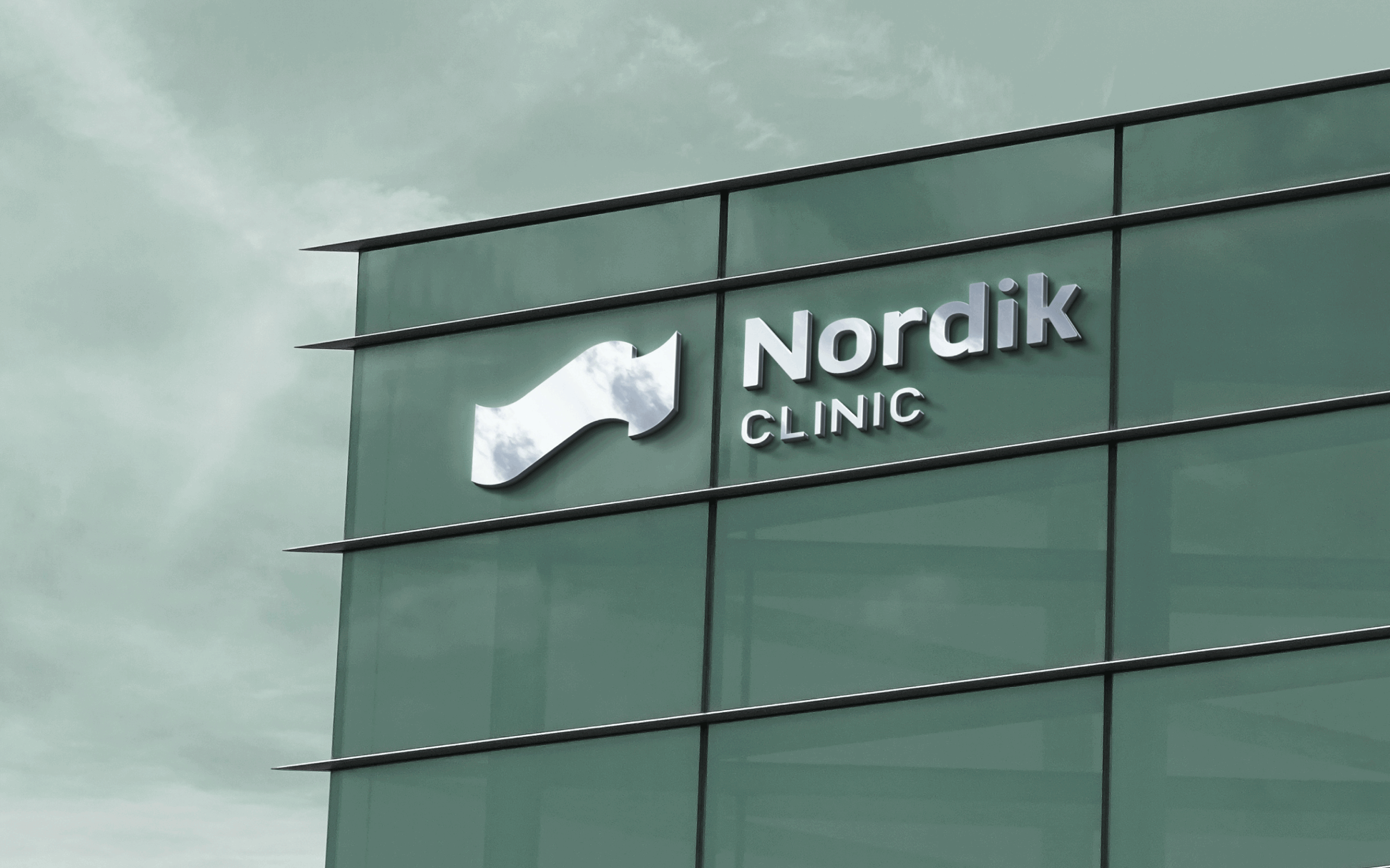
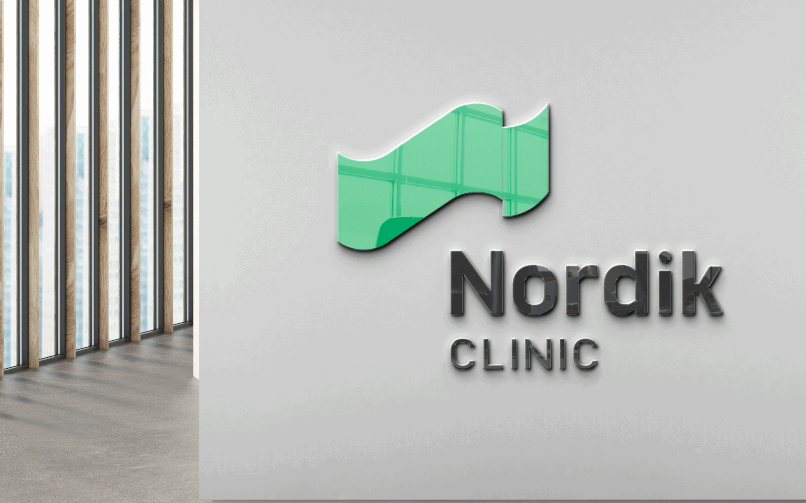
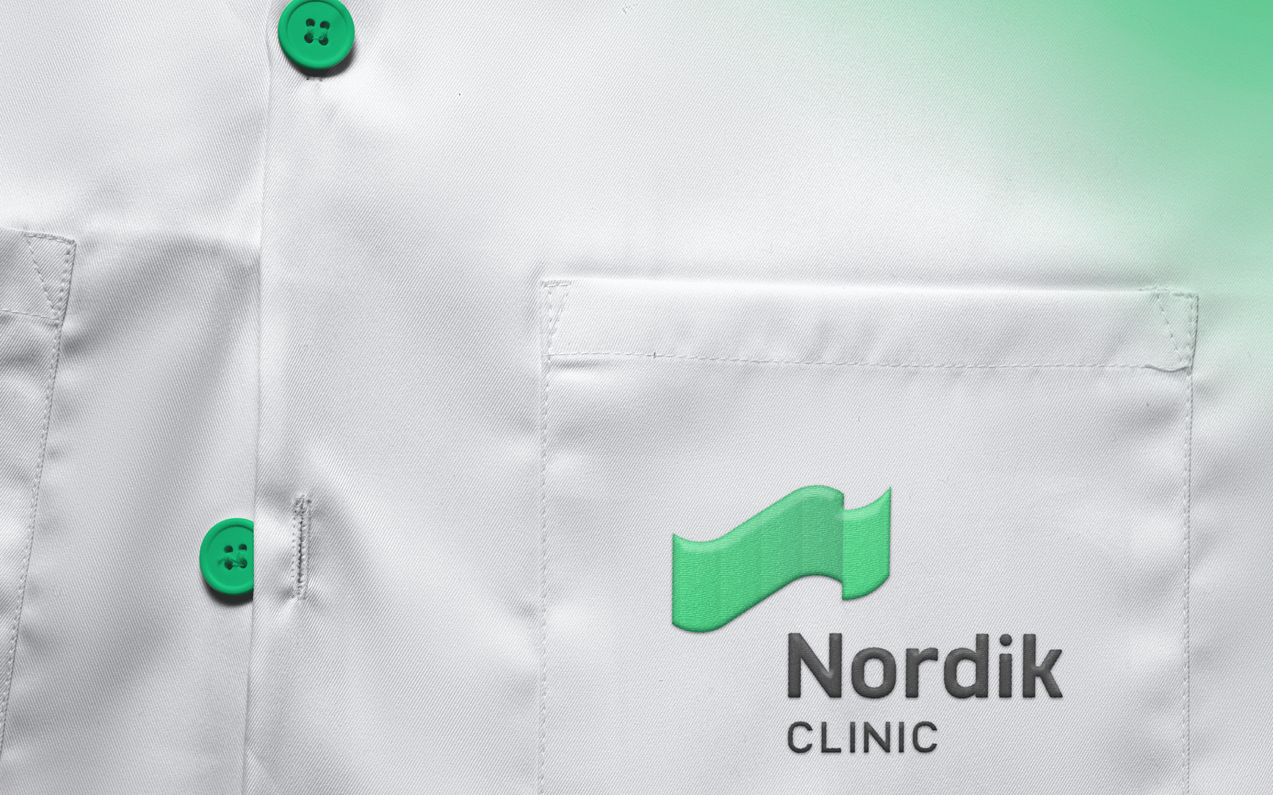
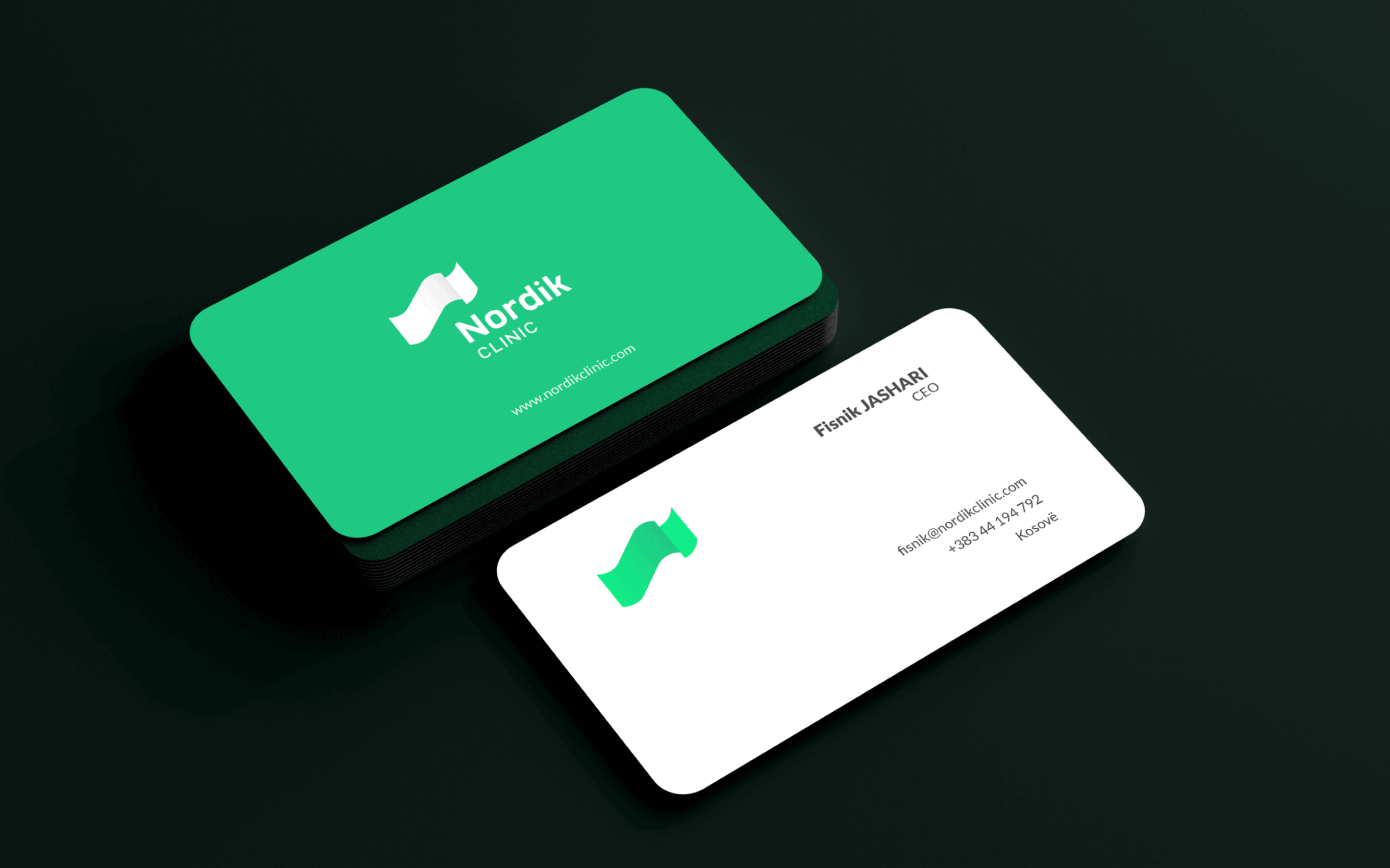
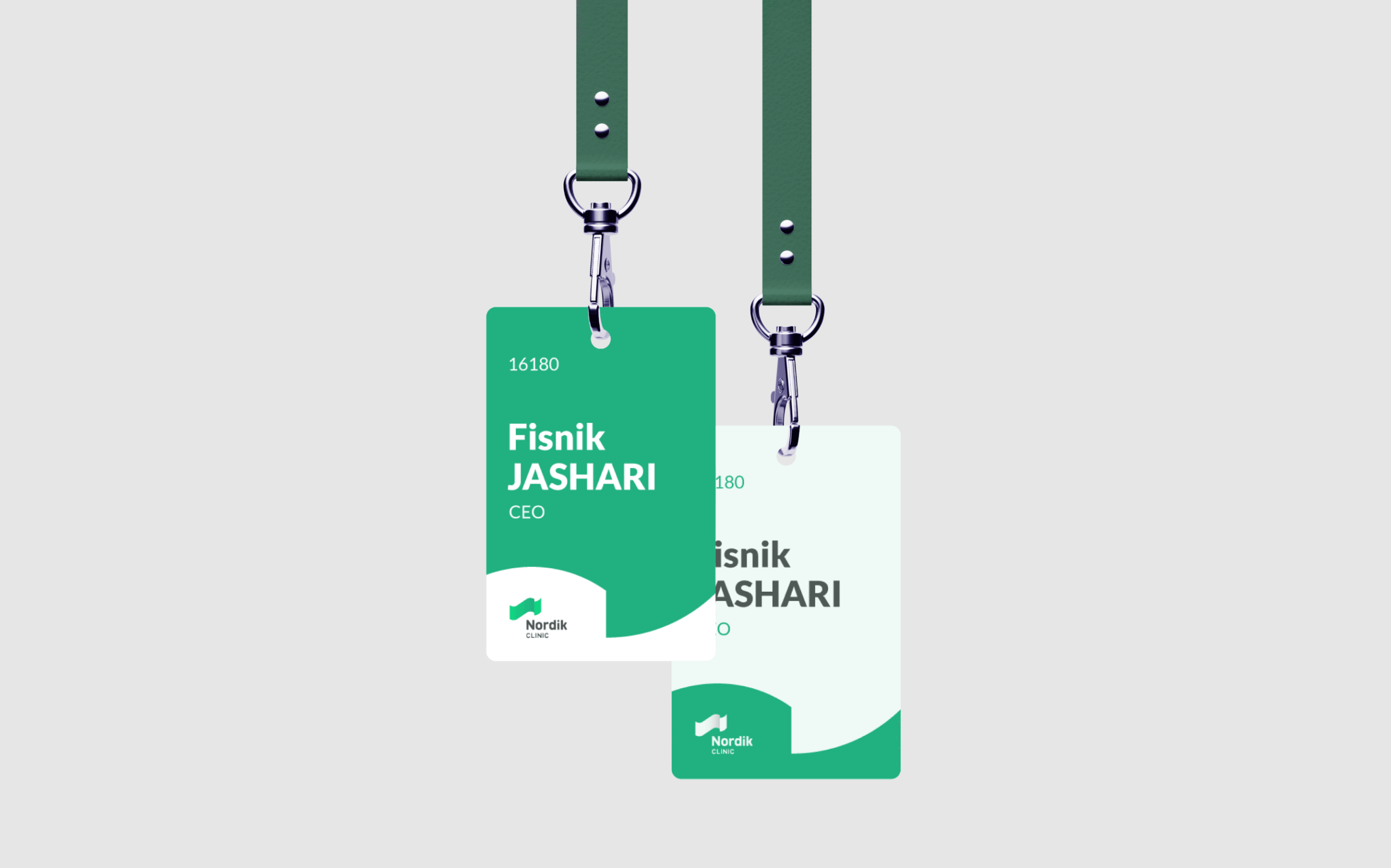
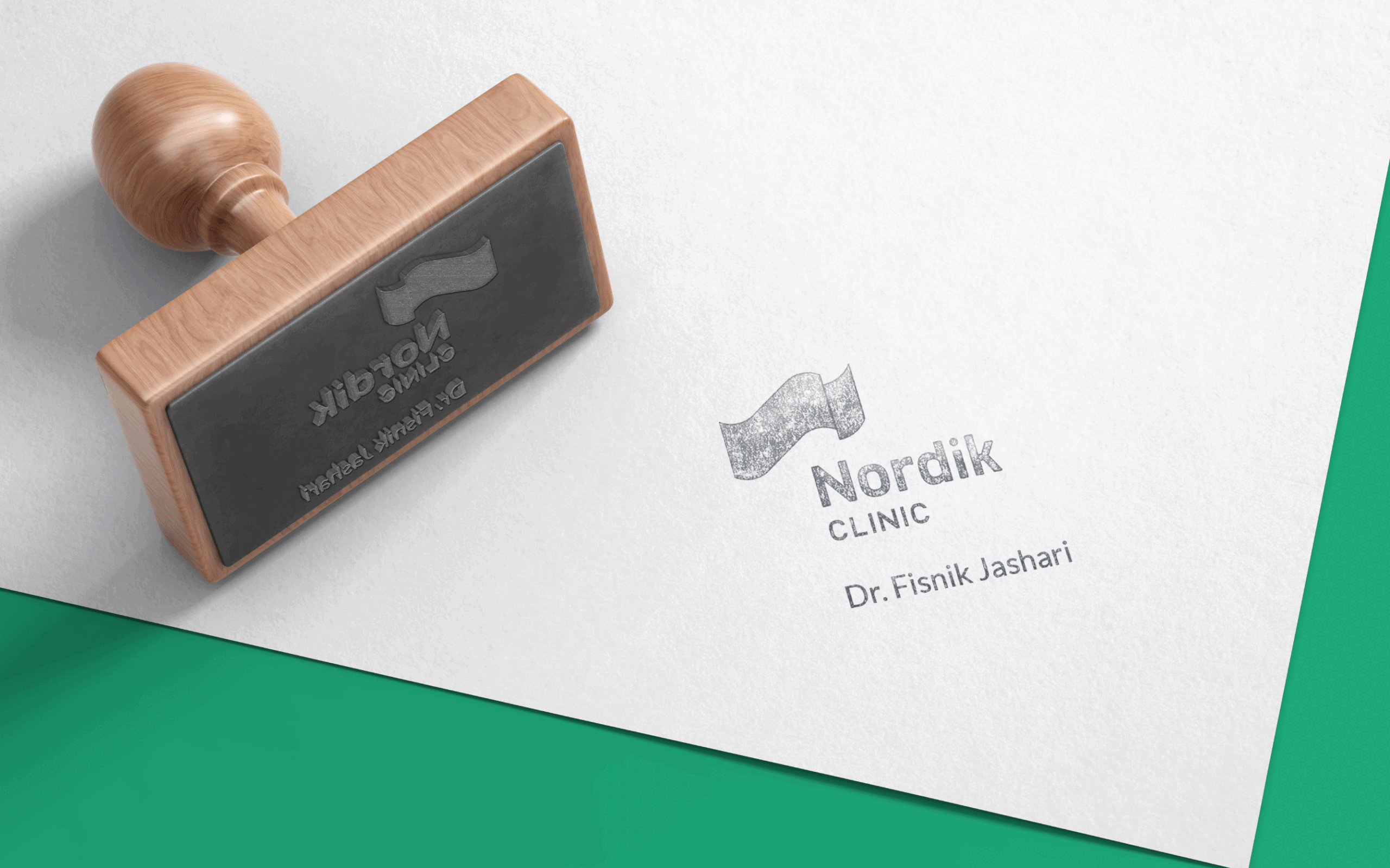
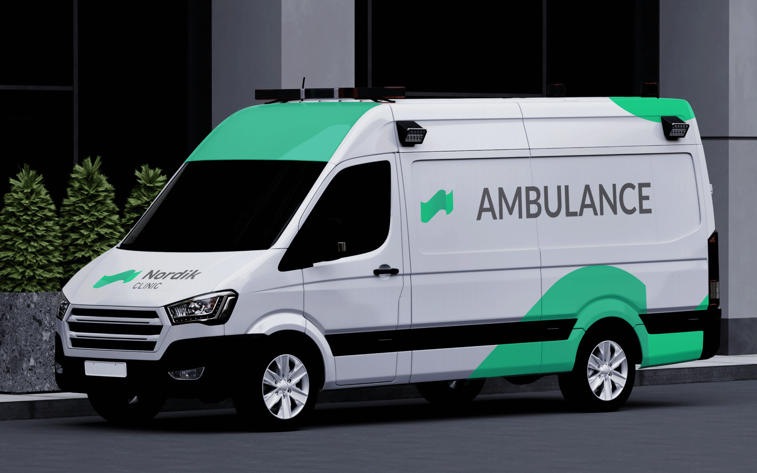
Developing a brand is the visualization of a name. The Trokit team, as in this case, remains loyal to this concept. Therefore, finding it is very close to the name – Nordik. Instead of using traditional elements that have already become a typical visual language for health, clinics… like a snake, a rod, a cross… our proposal goes far beyond these. It is based on a small abstract “n” inspired by the shapeless form of the aurora and its dominant green hues.
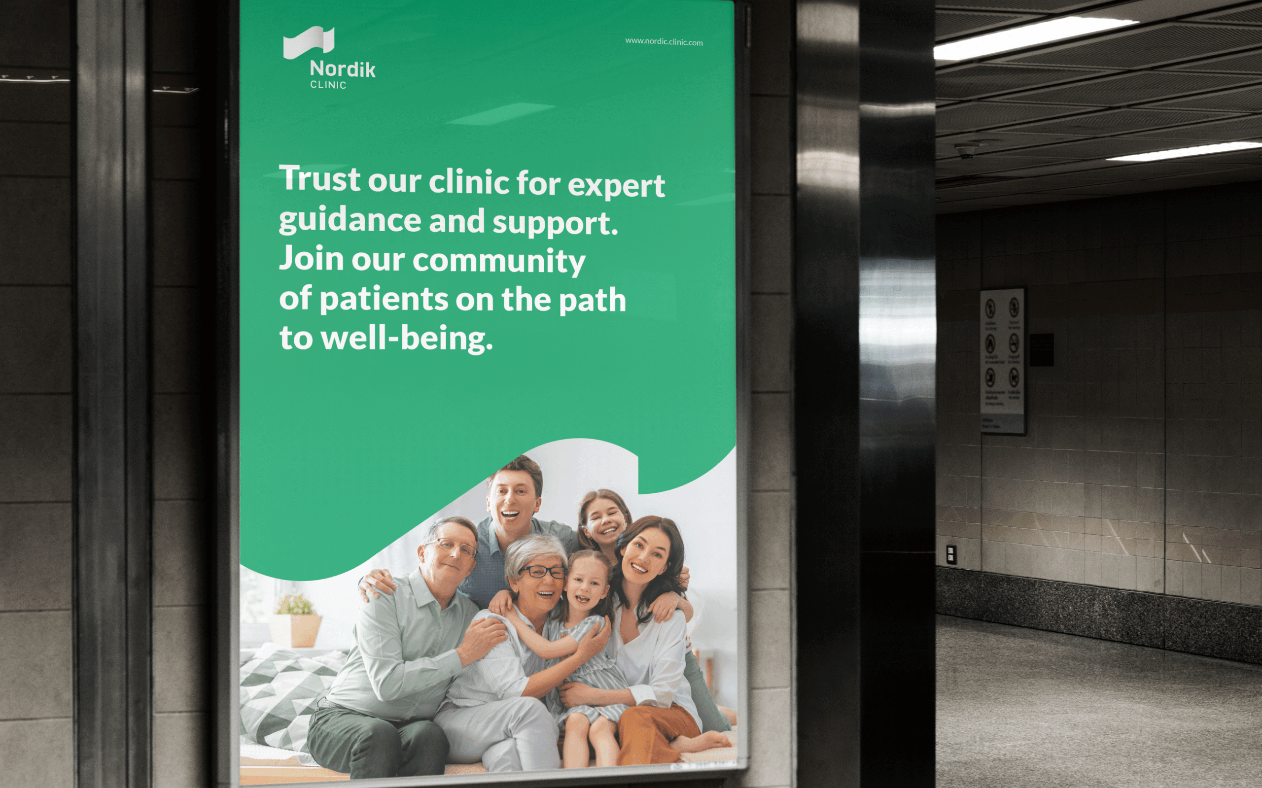
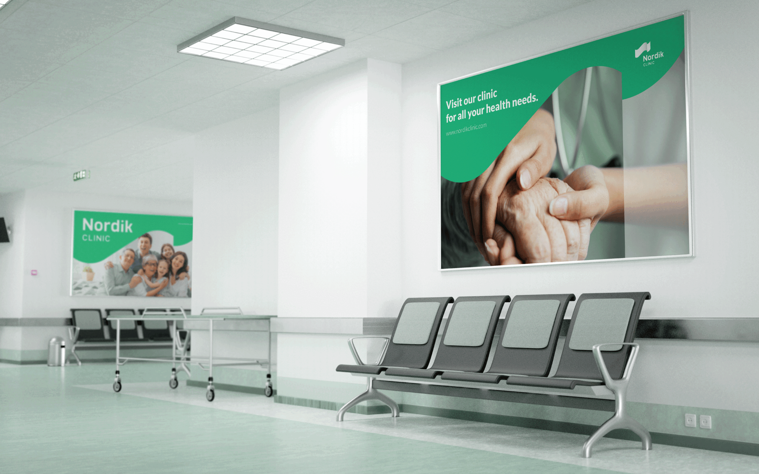
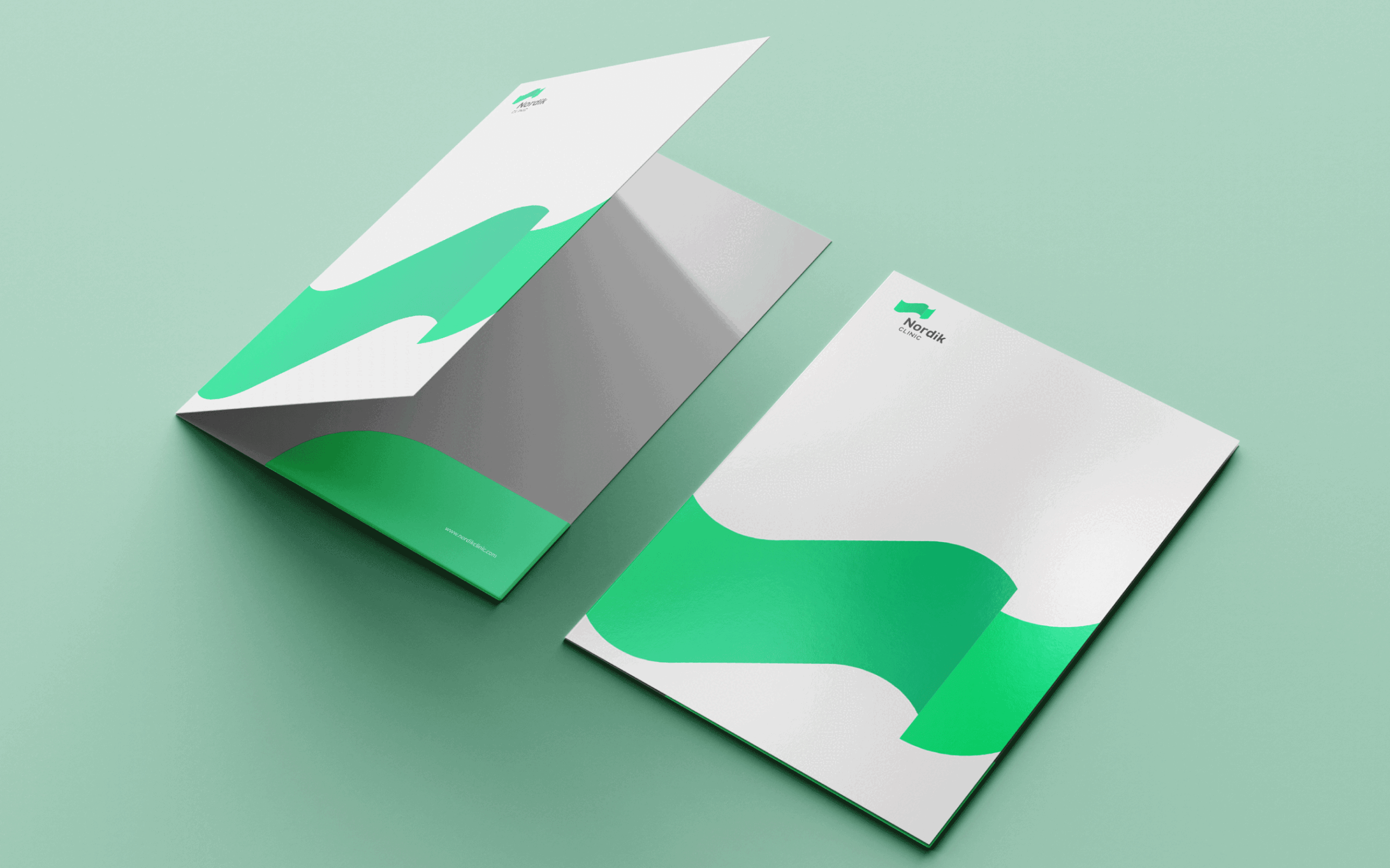
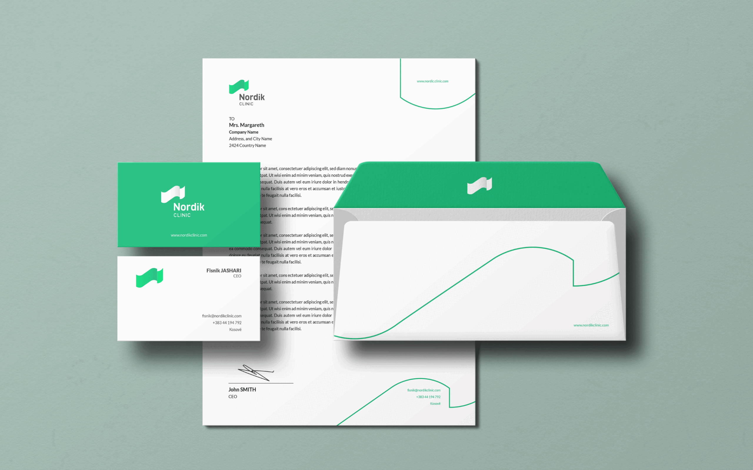
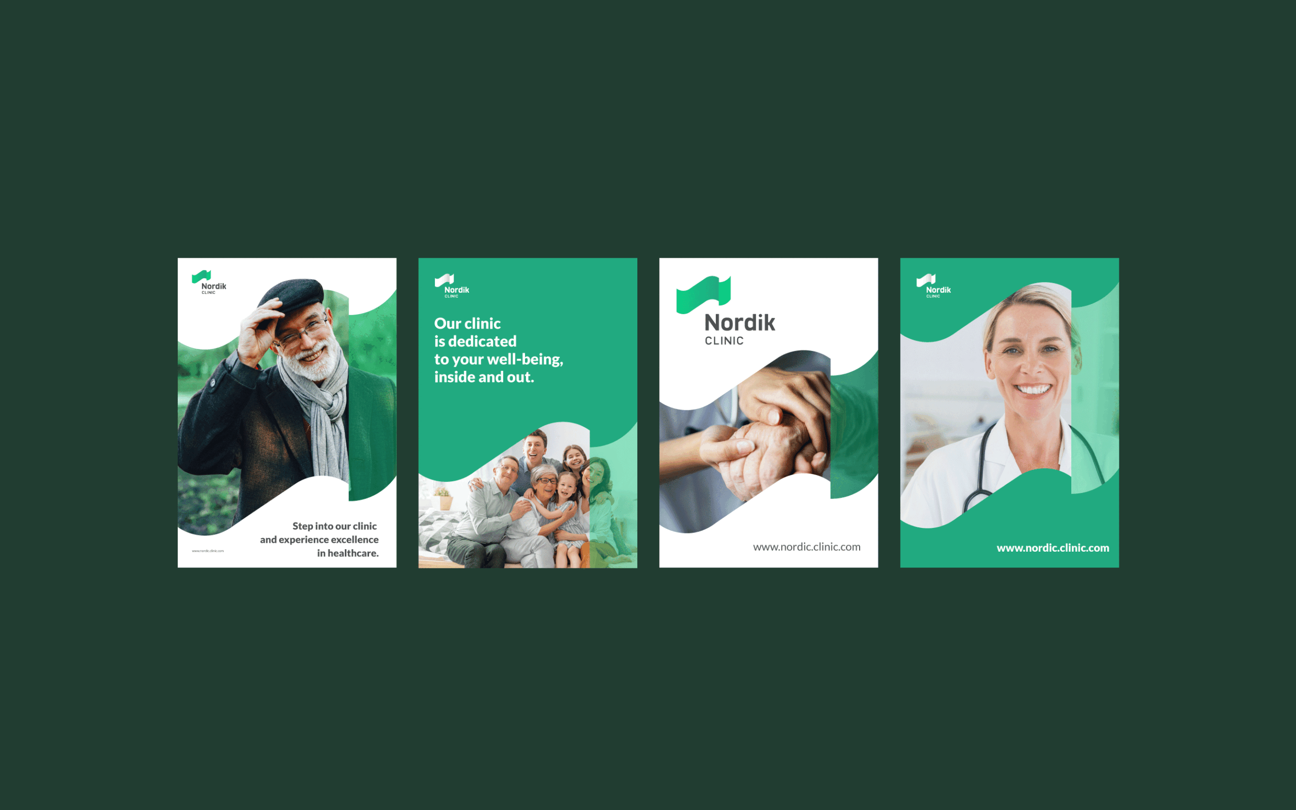
Creating a vibrant brand is the pursuit of every digital artist. This is because in the multitude of endless brands, today it remains a great challenge to ‘stand out’. Fluidity, vitality, modernity, facing the times, and not necessarily indicating that it is a health object have been our guidelines for this brand. We believe that these have been achieved at Nordik Clinic.