August 2022 |
Branding for Swiss architectural/planning studio
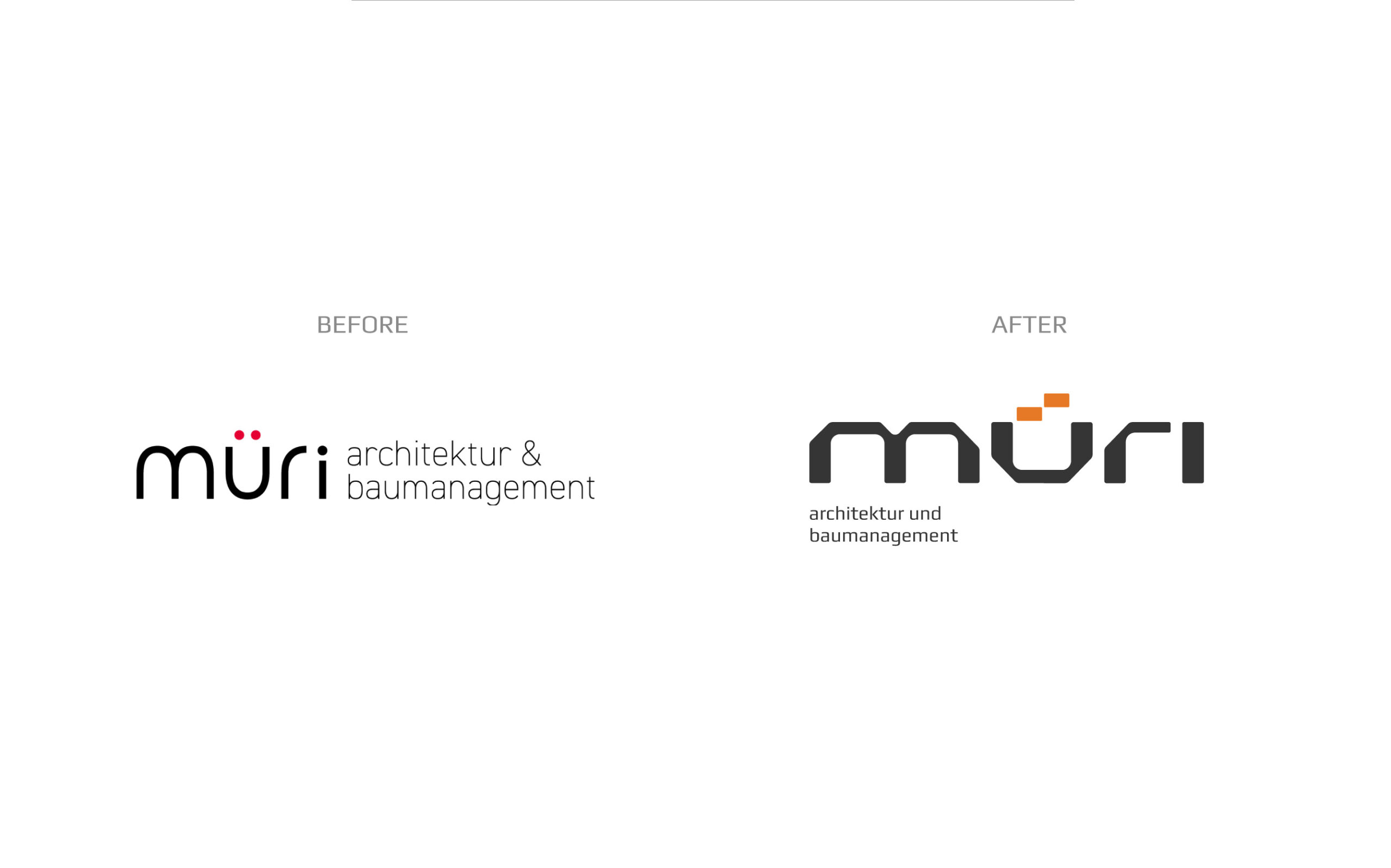
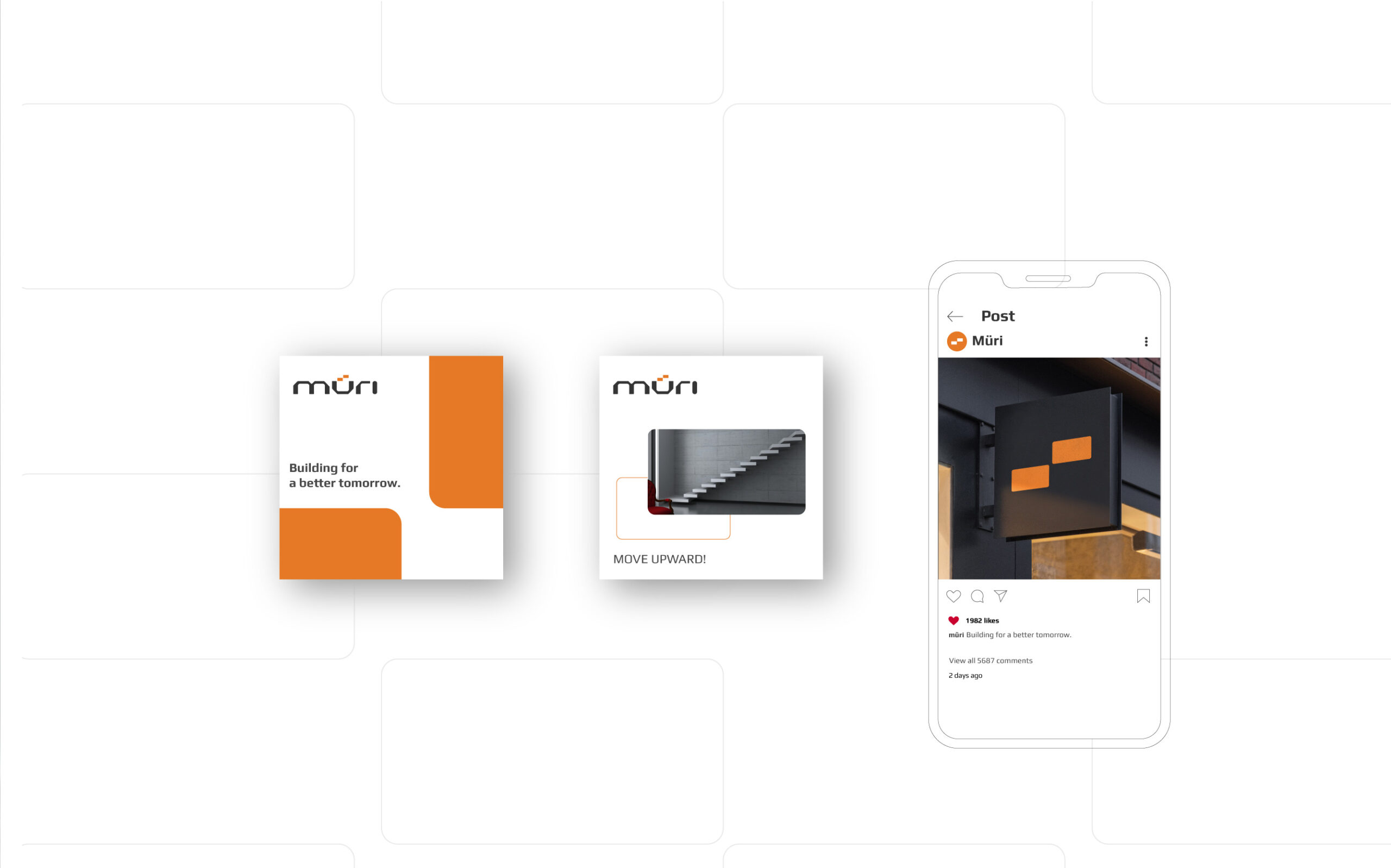
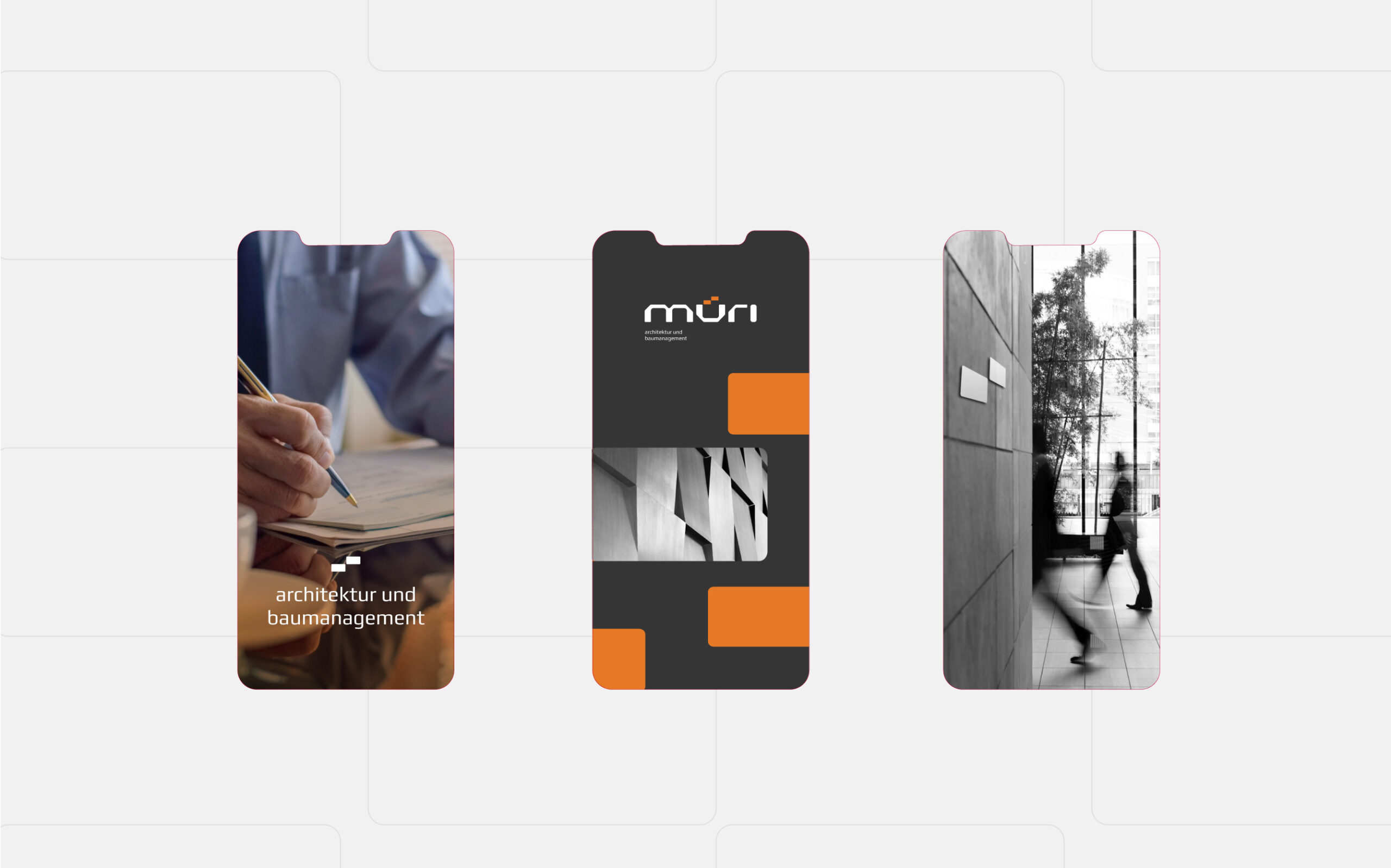
A talented team of professionals who have excelled in several significant design and construction projects in Switzerland. This is Müri! When it comes to branding a new company like Müri, the first thing that comes to mind is modern style. The typography is “sewn” exactly in this style.
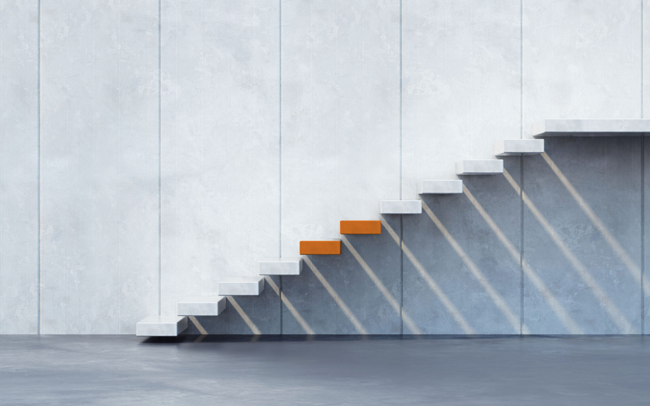
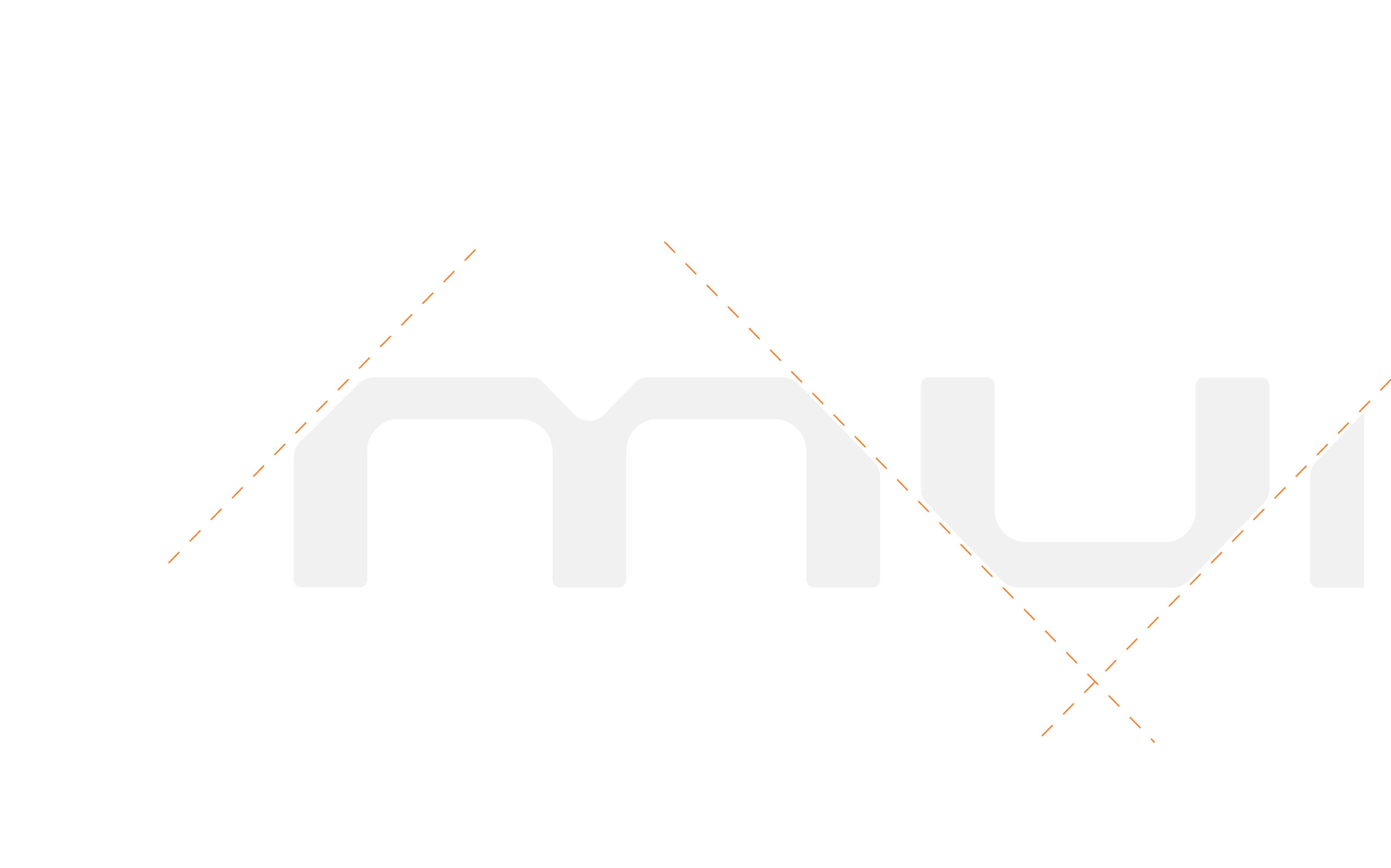
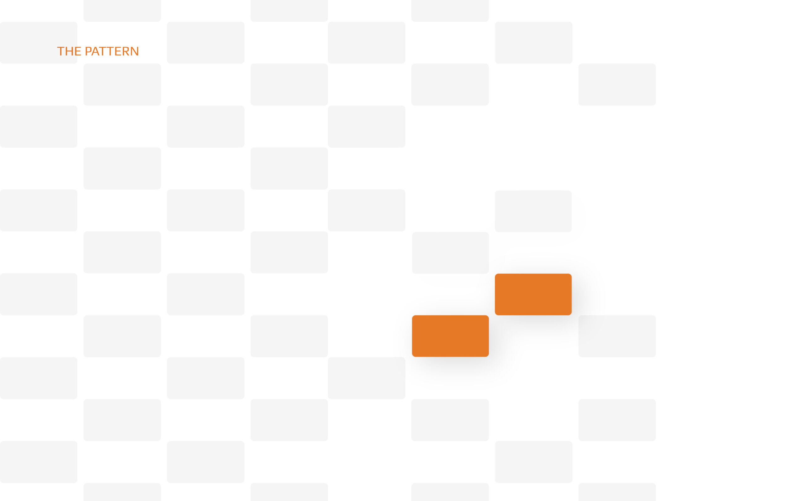
The broad-cut letters characterize the shapes and architectural objects, while the two points of ü are presented in the form of stairs since climbing the stairs represents growth, development, and change, which are the values that Müri intends to bring. The orange dots of ü show the enthusiasm and energy that the new team has, as well as offer colleagues and clients comfort and firm connection.