April 2020 |
Brand identity development for the French retail market
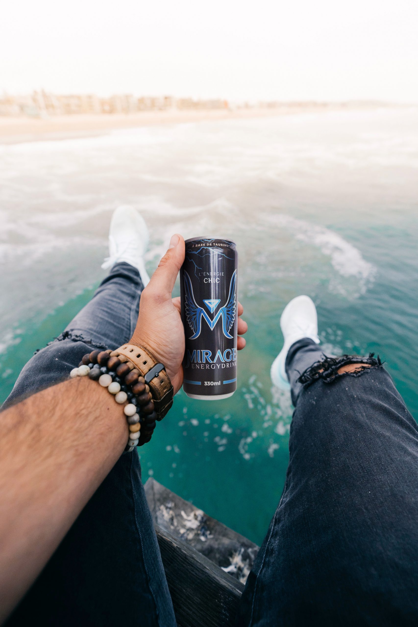
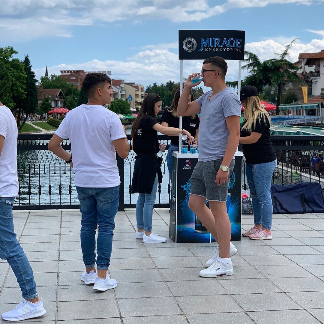
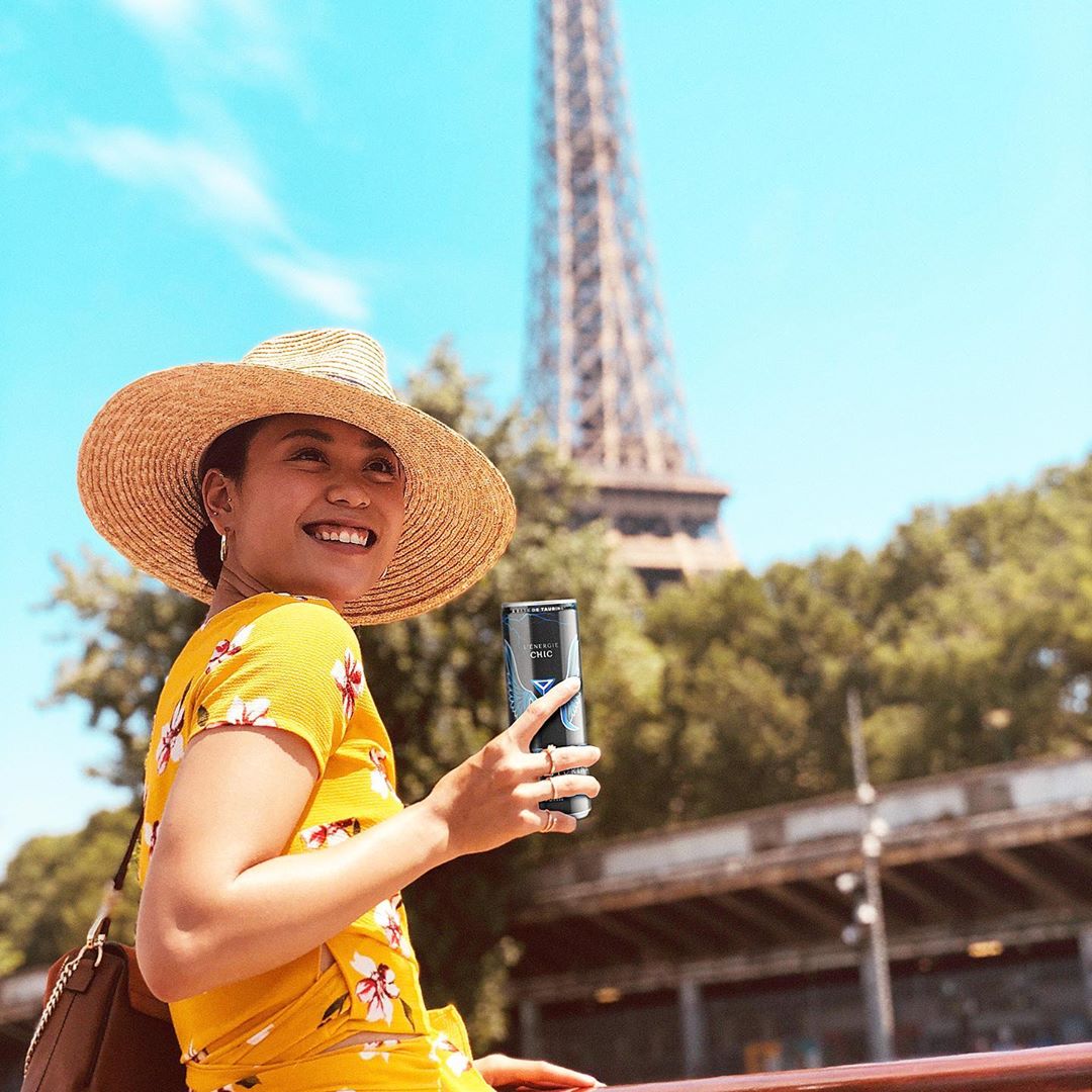
Mirage is a French brand energy drink. In a short period, this energy drink is dominating the French market. It is the third most consumed energy drink in “Hexagon”.
TROKIT designed the brand identity, packaging and launched the main marketing campaign.
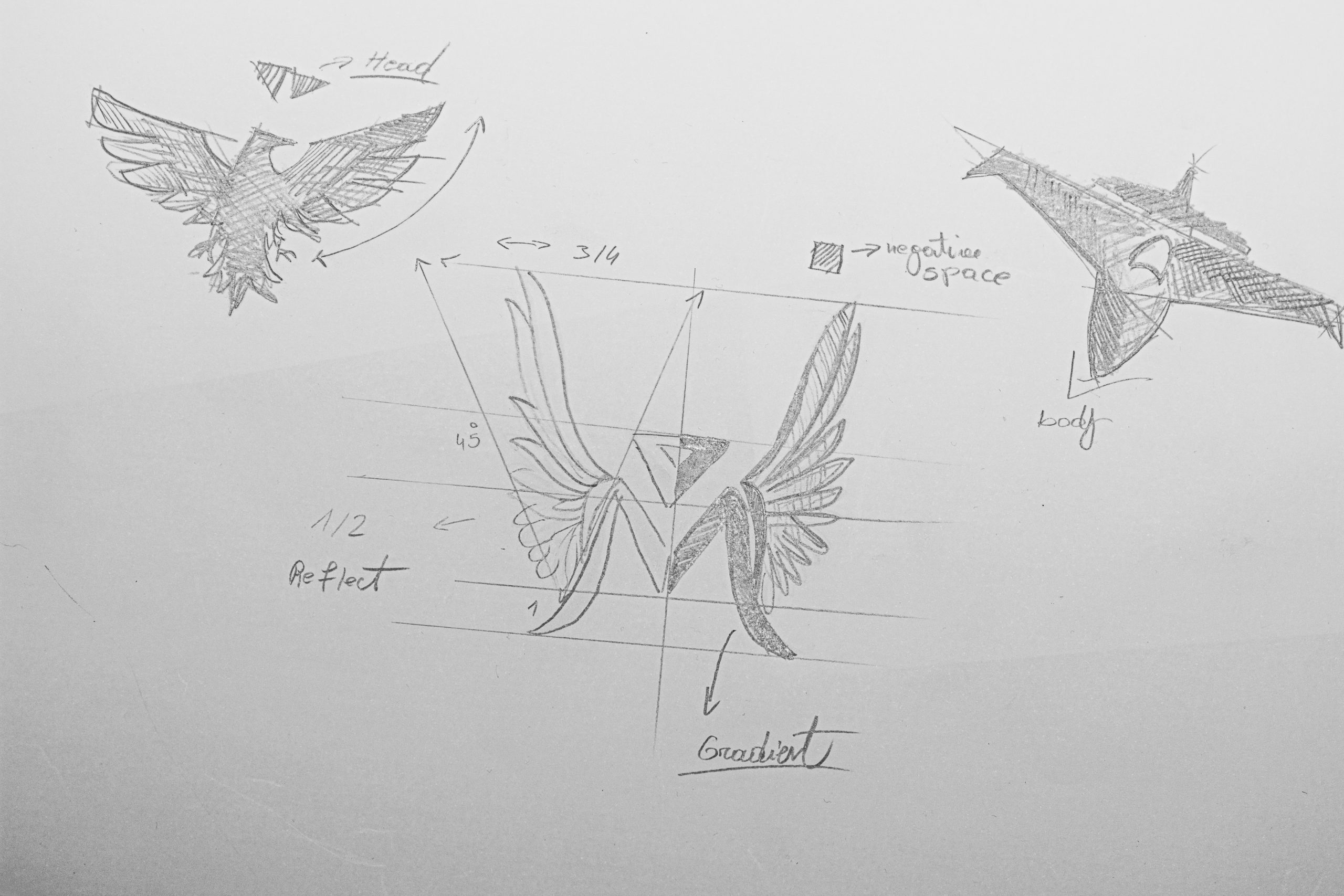
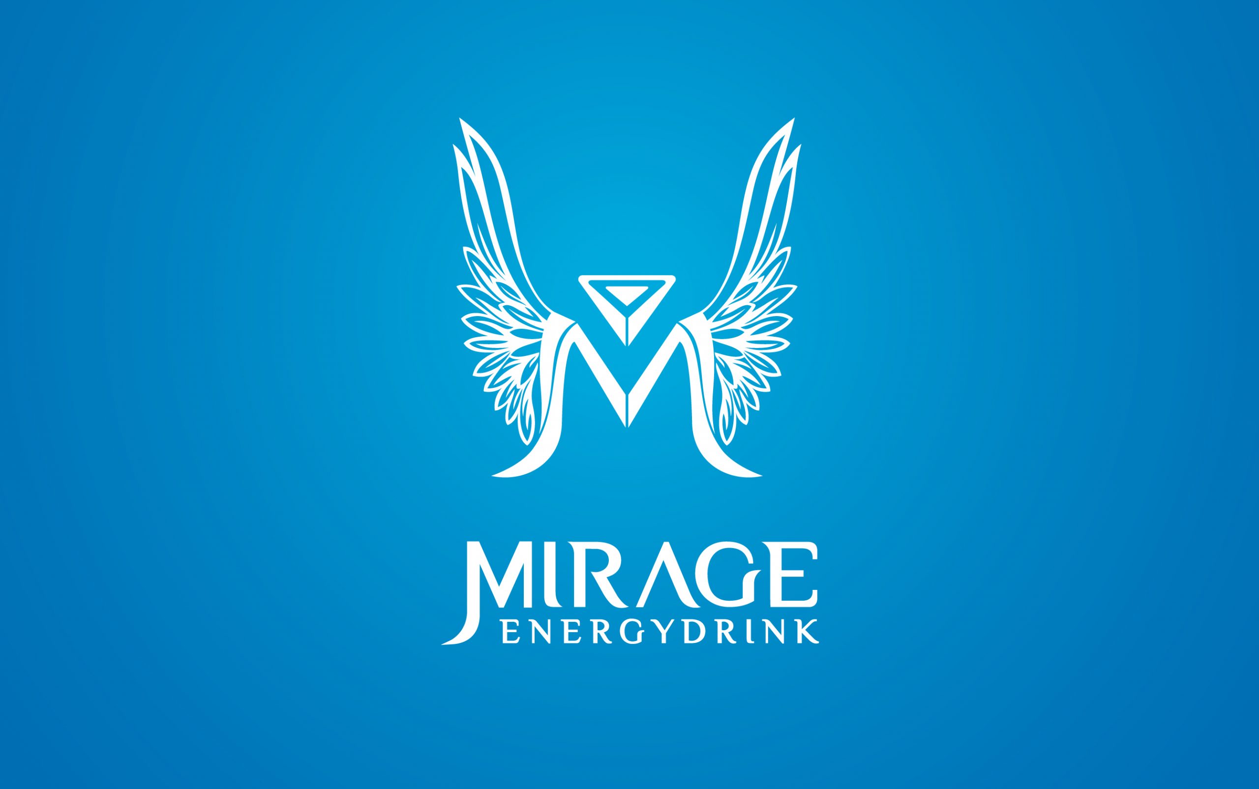
Bearing in mind that Mirage is solely designated as a French brand, this determined the direction in which the brand identity of this product was designed. The name of the brand was borrowed from the famous fighter jet MIRAGE, also TROKIT extracted some elements of the MIRAGE and incorporated it into the visual identity.
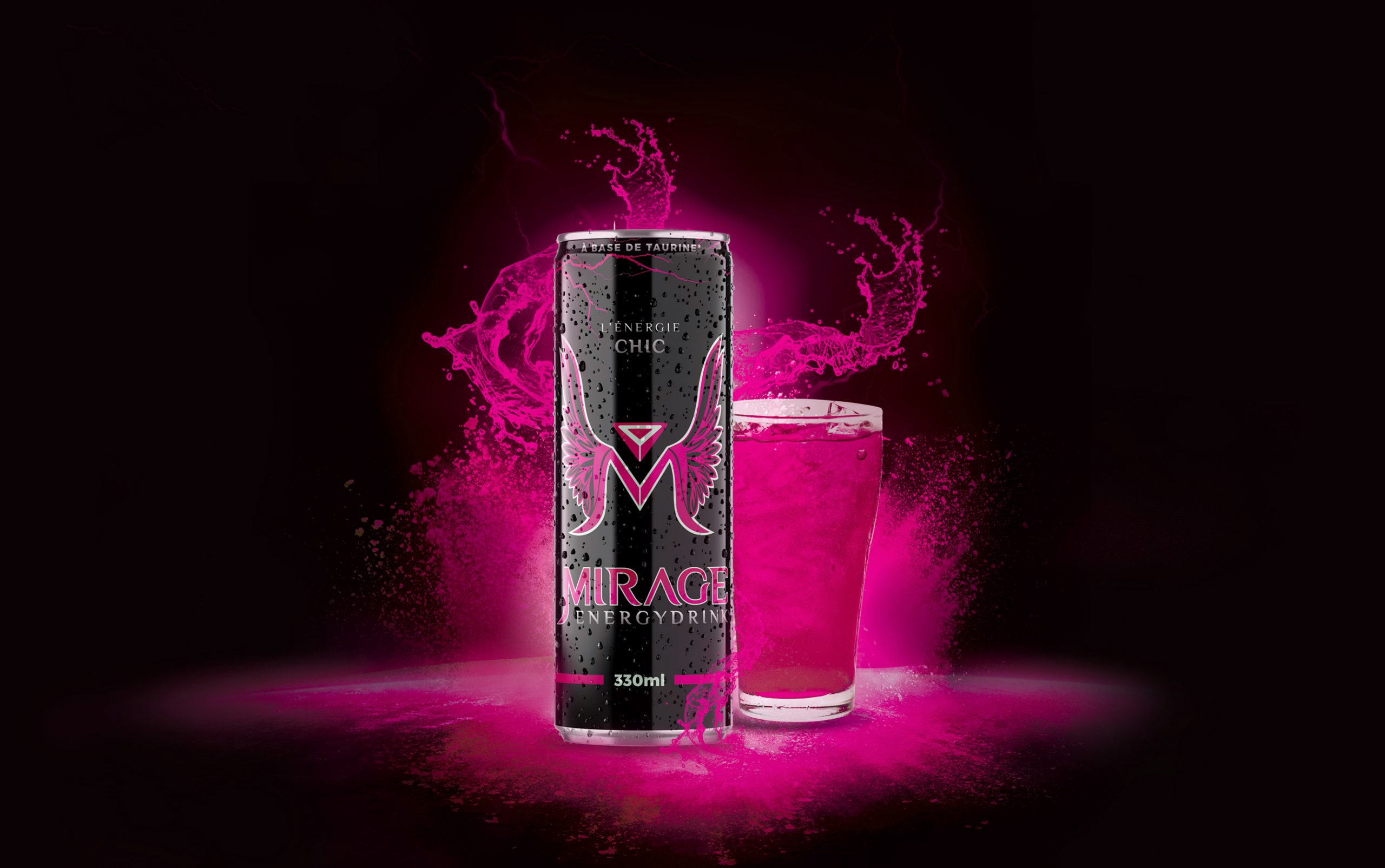
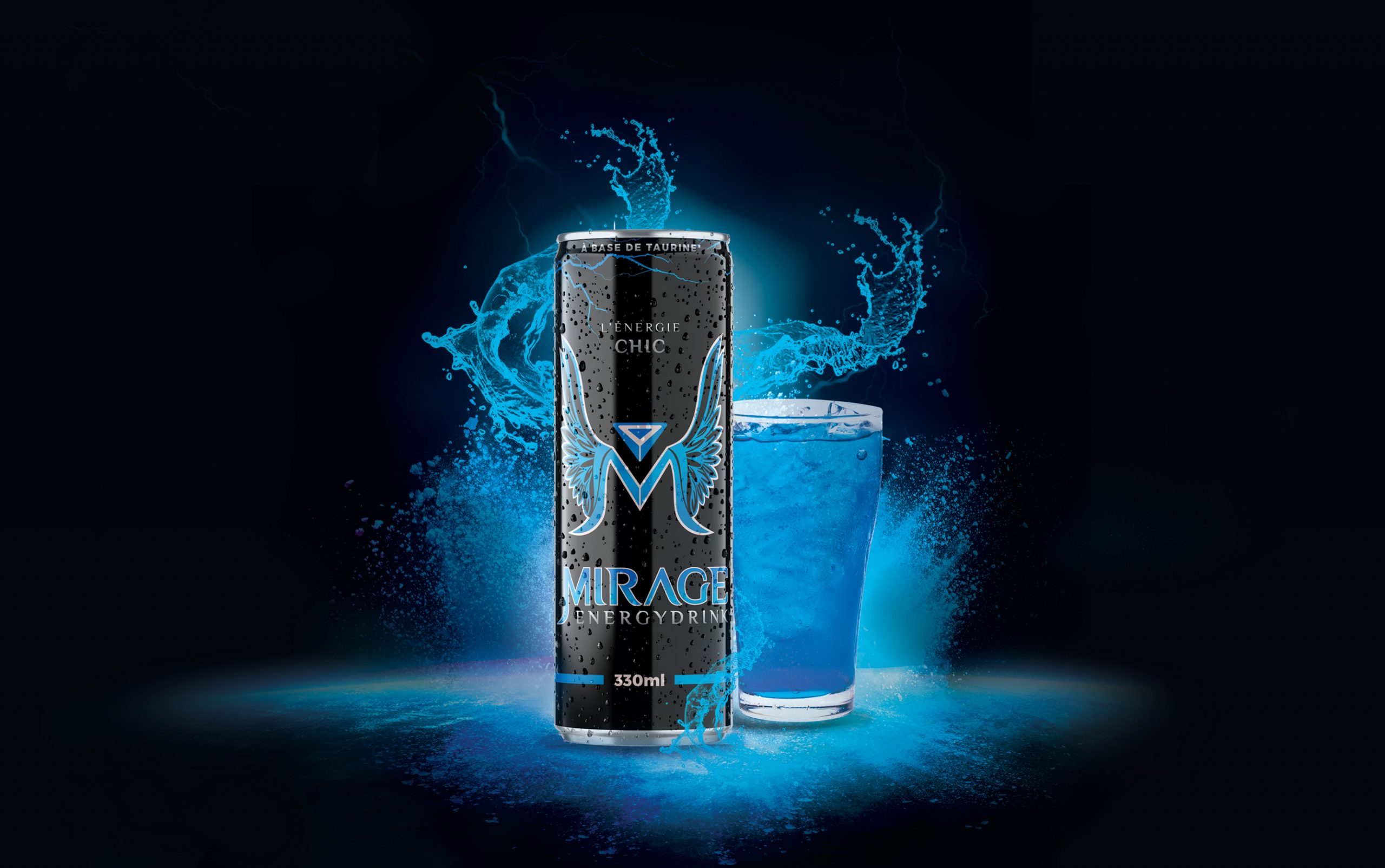
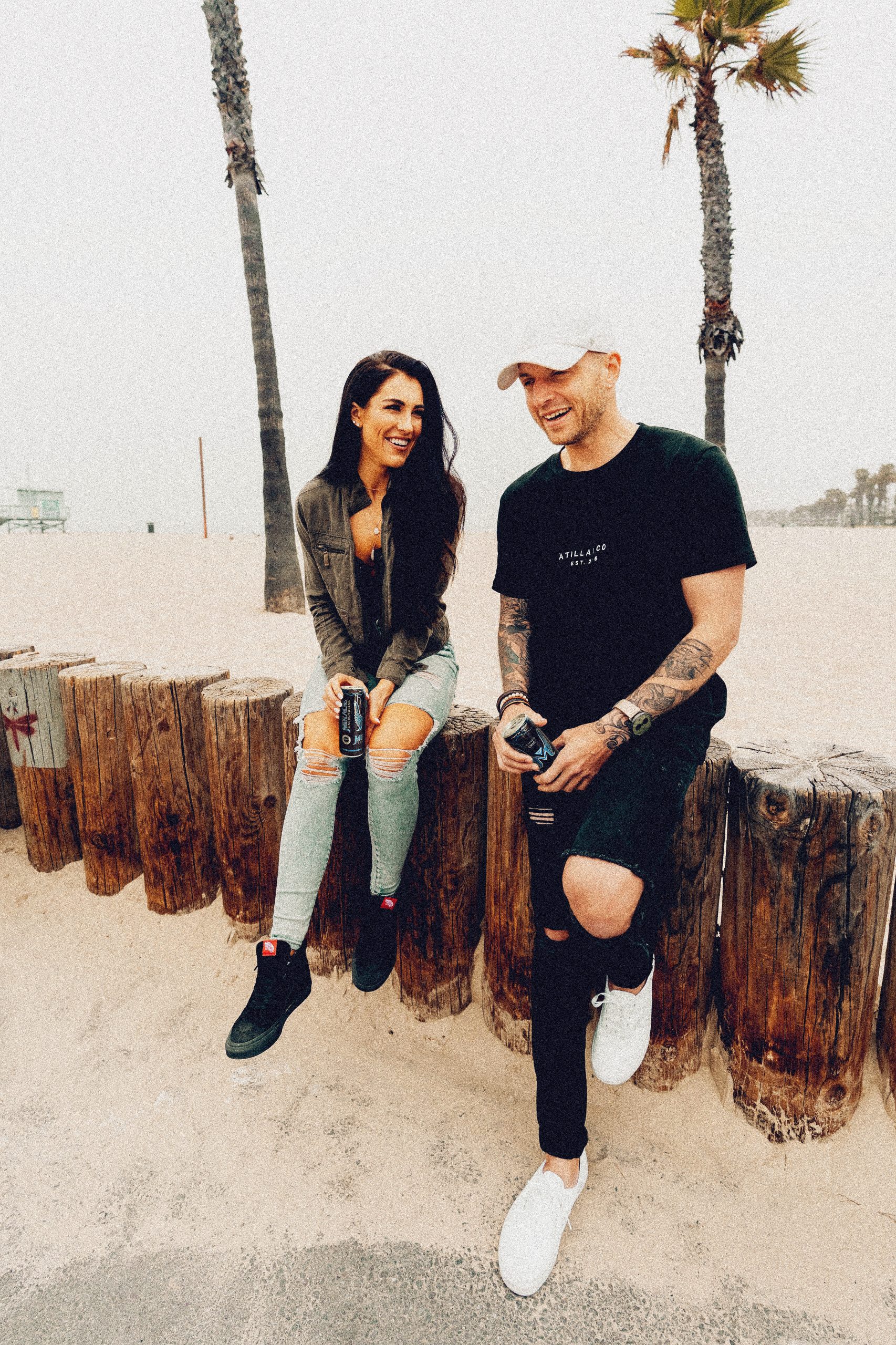
The visual identity and typography contain contemporary elements, knowing that this drink has the possibility to please two target audiences, men and women in the French retail industry. Based on this, TROKIT inspired the brand to develop two flavours for these two target audiences. With two target audiences in mind, TROKIT had then utilised the colours of the French national flag to develop the variant drinks. The left ribbon of the French national flag inspired the colour for the men’s variant in the can, whereas the right ribbon inspired the women’s flavour which is different even in colour and the taste of the liquid inside.
The colour black is chosen for Mirage canned drinks. Against this background, blue and rose logos are embossed in a black tin can which makes this product look sophisticated to our current and new customers.