The challenge
Develop an identity that communicates Fixposition’s navigation technology offering.
Our approach
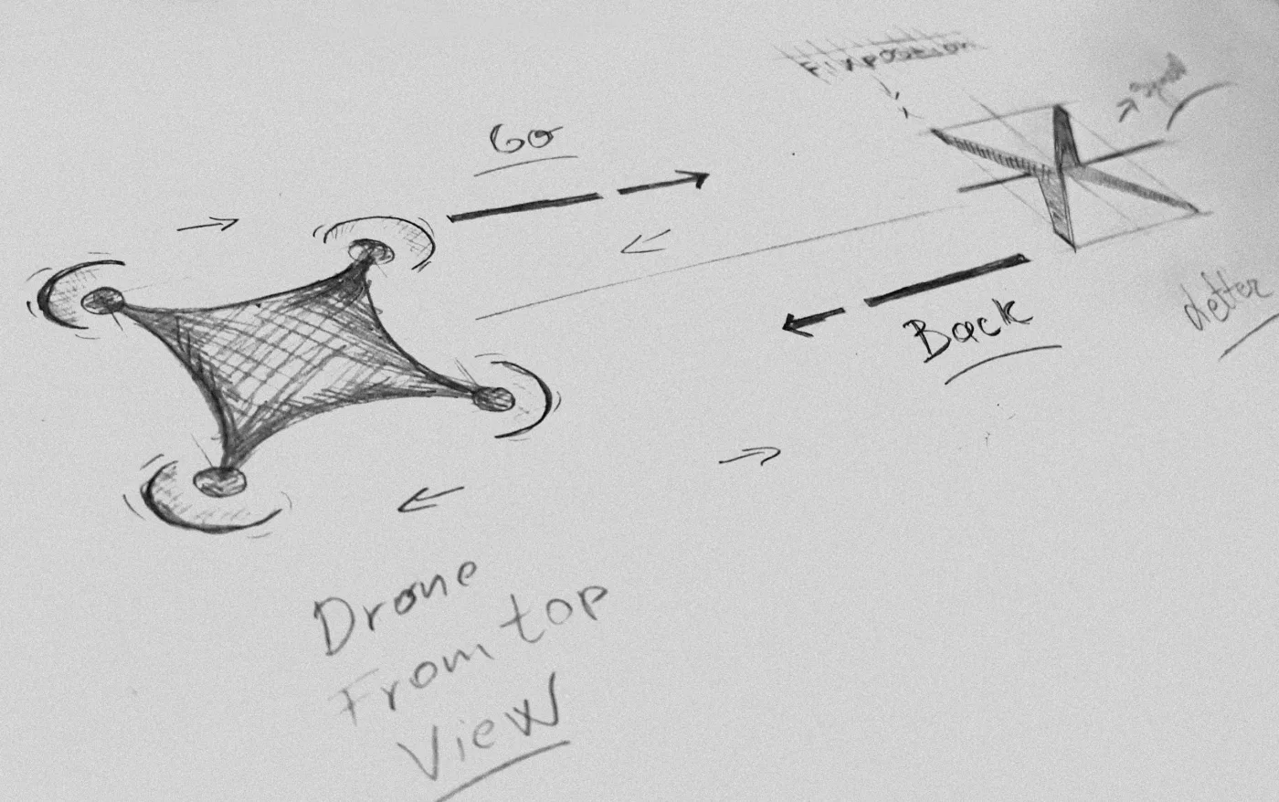
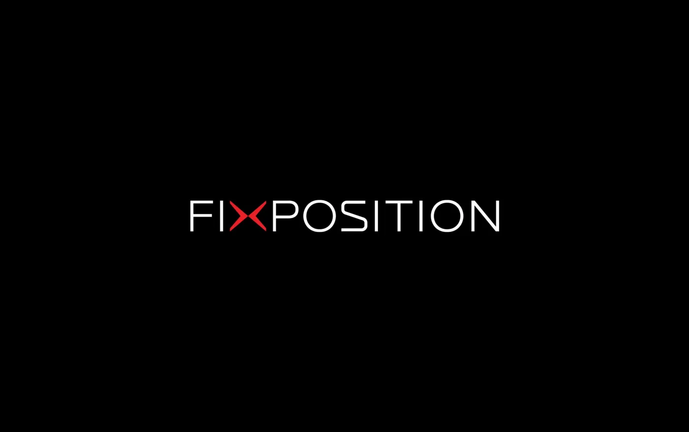
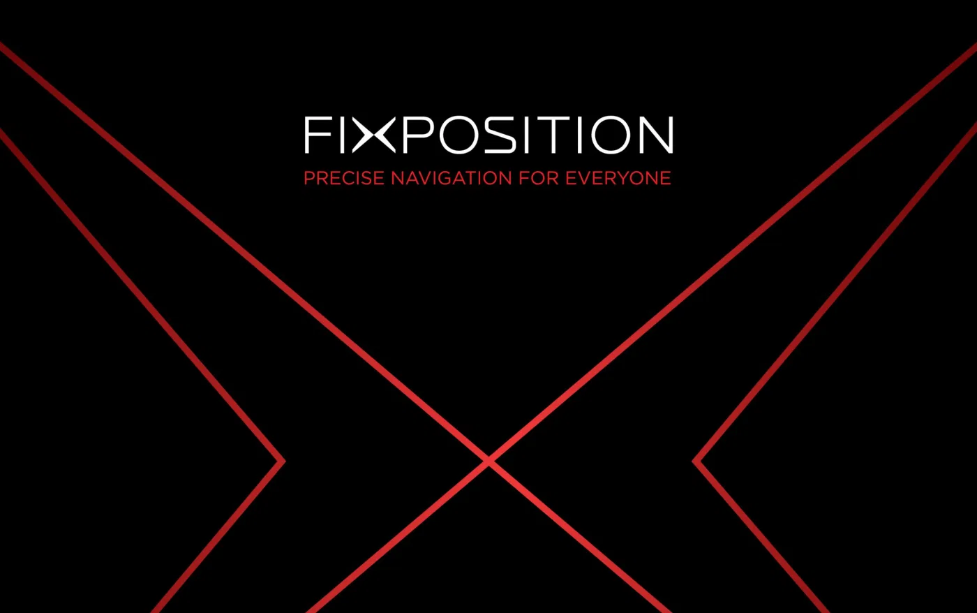
The logo builds on the X in Fixposition. A split through the symbol creates two opposing arrows, connecting the mark with movement and direction. Clean typography completes the visual system.
What we delivered
Logo and symbol design
Typography direction
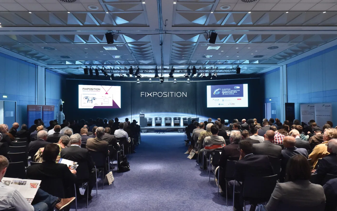
Visual identity

Explore the services behind this project
Related projects
Have a project in mind?
Discuss your project with TROKIT