March 2021 |
Branding
Over the past years, Copper Net has been growing its working portfolio, operating with well-known Swiss telecommunications companies, as a trusted contractor.
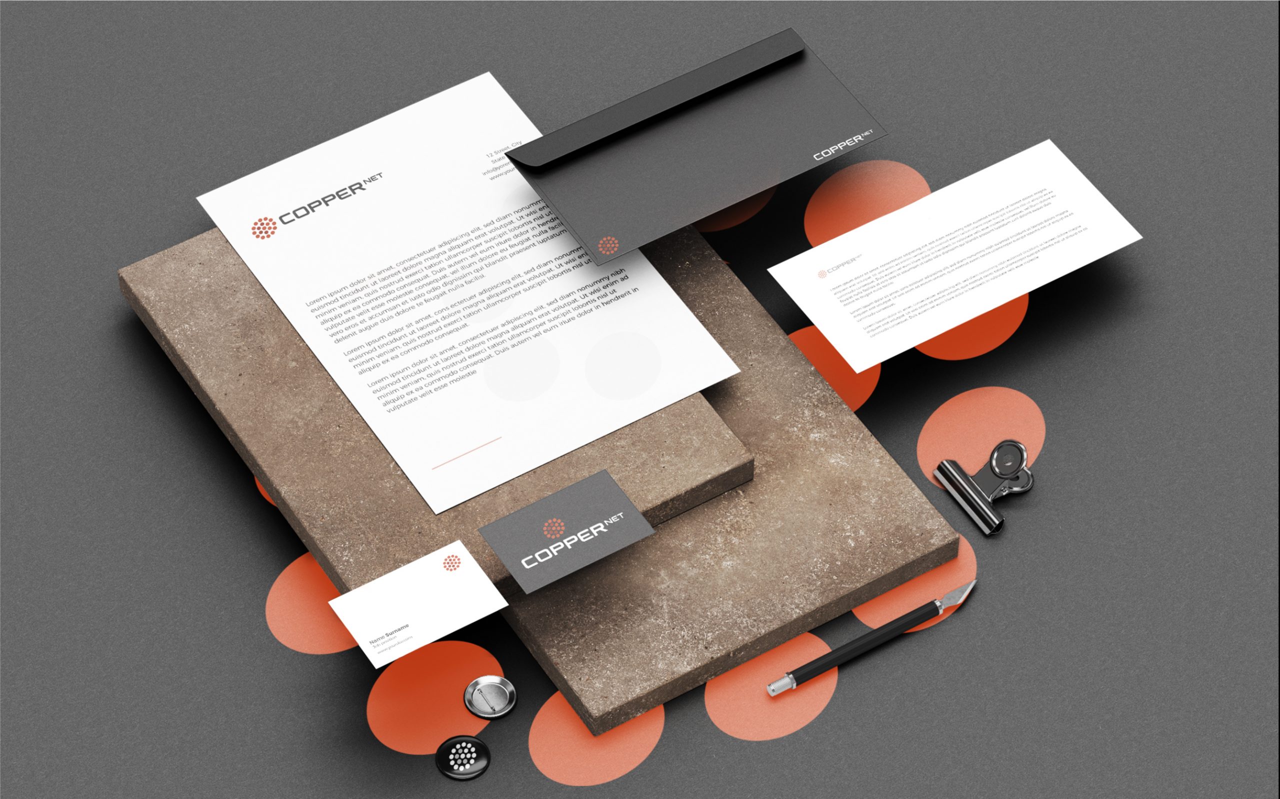
This brand identity represents the evolution e Copper Net and their main product/service, which is copper cabling. In line with the strategic positioning, and designed to support their presence in Swiss market, the visual identity had to be simple, to give a clear message, and to be identified from their competitors.
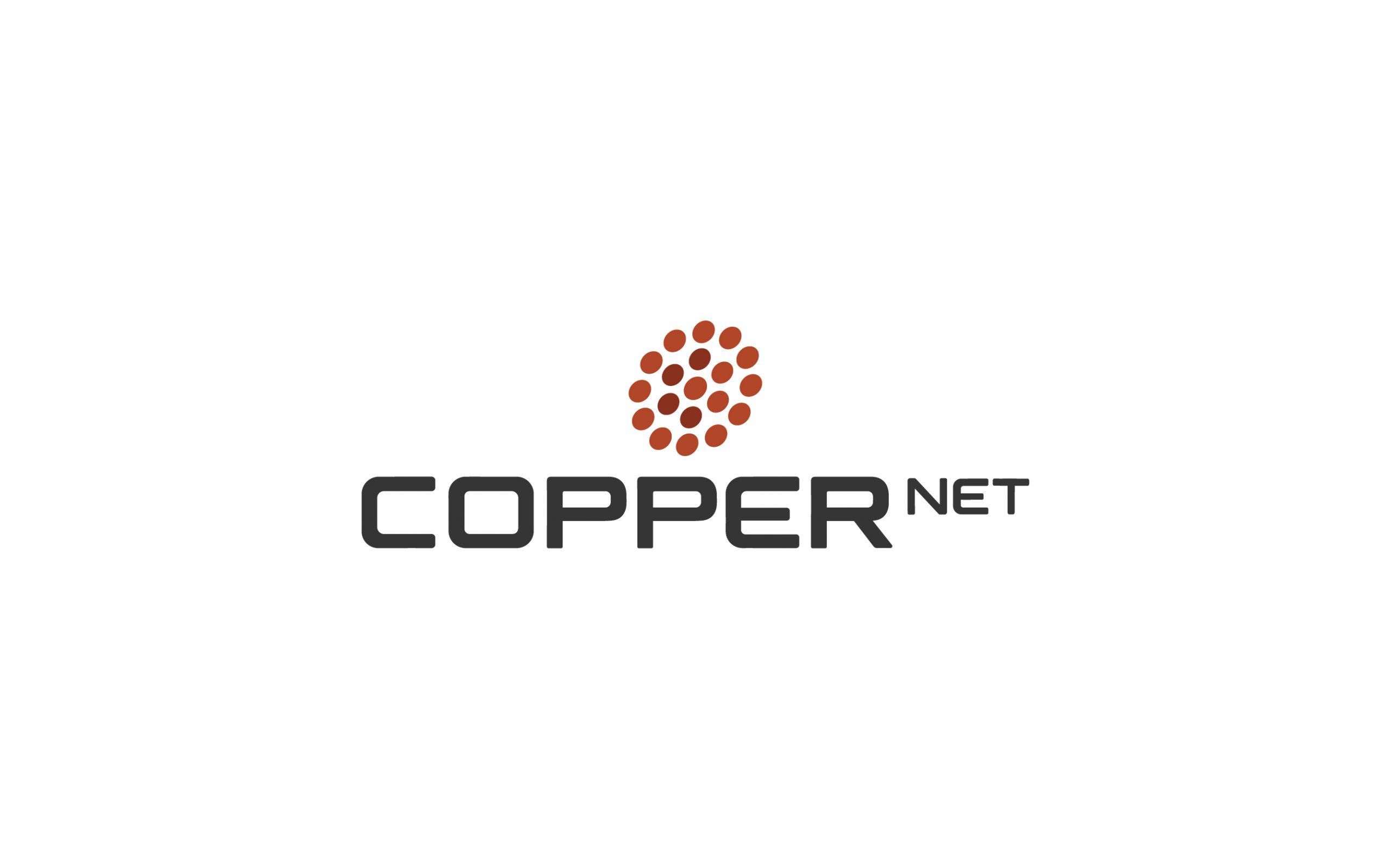
Logo is made of dots, inspired on the cross-section of copper wires grouped into a common jacket, whereas inside the clutch, with some darker nuances it’s shown the letter C, which represents copper cables.